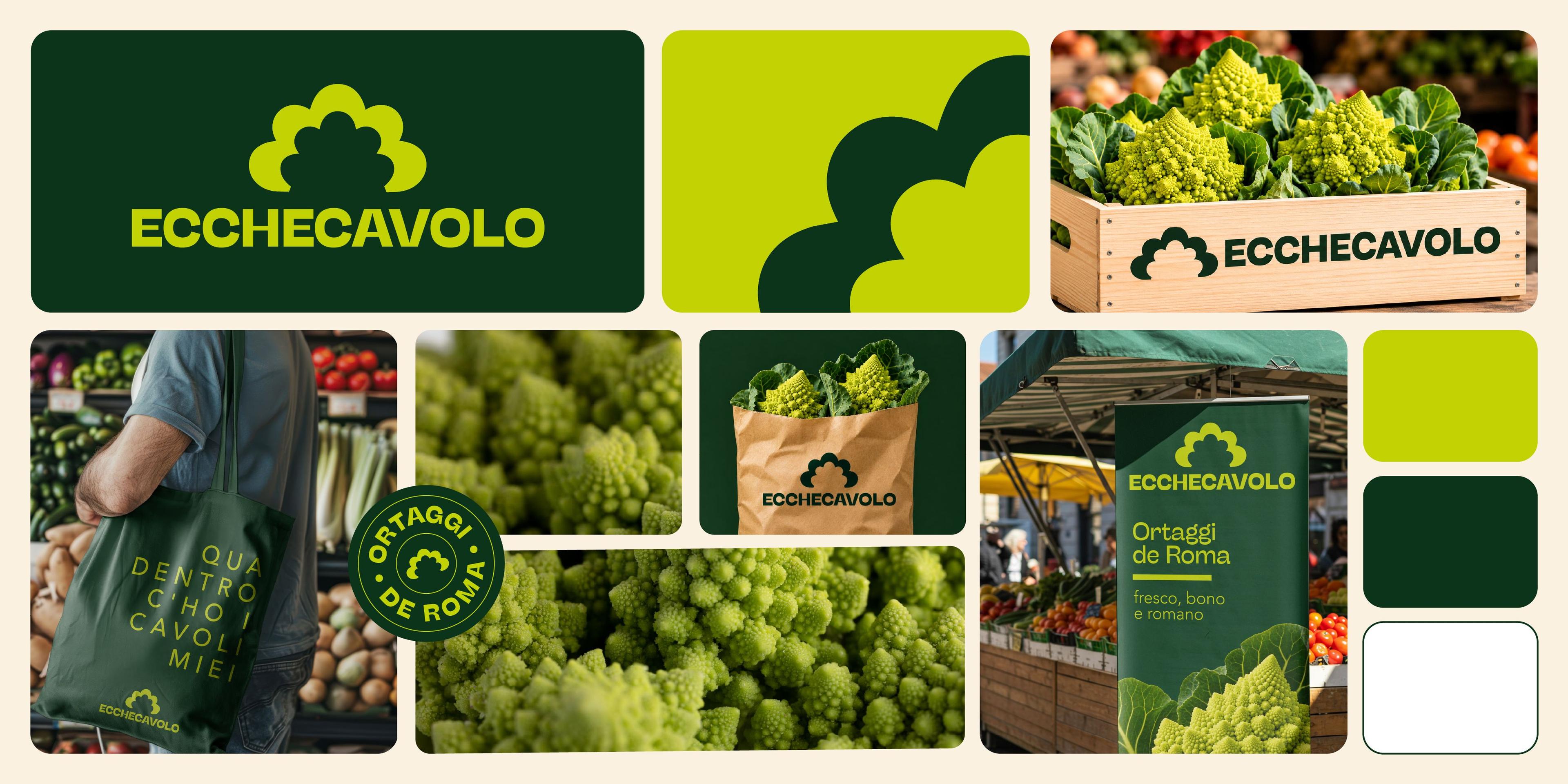
Visual identity for local producers: how to avoid folklore and clichés
Visual identity for local producers must communicate origin, quality, and connection to the territory without falling into predictable solutions. Using a rough texture, a calligraphic font, an illustration of fields, or a beige and green palette is not enough to communicate authenticity.
The risk in the food and agrifood sector is turning every local product into a similar representation: rustic, nostalgic, and generically artisanal. However, an oil mill, a farm, a dairy, a winery, a beekeeper, or a preserve producer can have very different stories, methods, and audiences.
An effective visual identity does not need to perform "tradition" at all costs. It must make what is genuinely specific recognizable: the product, the supply chain, the place, the working method, the company's character, and how the producer wants to present themselves to the market.
Local Does Not Necessarily Mean Rustic
One of the most common mistakes is confusing local with rustic. Many visual identities for agrifood products end up using the same symbols: hand-drawn illustrations, natural paper, stamps, crests, decorative frames, earth tones, and photographs of hands and fields.
These elements can work, but only if there is a reason for them. When used automatically, they become clichés. A local producer can be familiar, contemporary, technical, elegant, everyday, experimental, essential, or deeply tied to agricultural research. Not everyone needs to communicate in the same way.
The point is not to remove every reference to the territory, but to make it less predictable. Overly "typical" design may seem reassuring at first, but risks making the brand look like many others. The identity should instead help the producer stand out, not blend into a familiar visual backdrop.
Starting from Product, Method, and Territory
Before designing a logo, labels, or promotional materials, it is necessary to understand what makes the producer specific. Territory is important, but it is never an isolated element. What matters is the type of product, the cultivation or processing method, the company's scale, distribution, relationships with customers, family history, positioning, and price point.
The FAO guide Linking people, places and products speaks of origin-linked products as the result of a relationship between place, people, local knowledge, natural resources, and collective reputation. From this perspective, territory is not a romantic backdrop, but a set of practices, skills, and relationships that shape the product.
To build a less predictable visual identity, it helps to clarify:
- what truly distinguishes the product;
- which elements of the territory are relevant rather than decorative;
- which audience needs to be reached;
- which materials will be needed: labels, packaging, website, markets, catalogs, social media.
This stage avoids starting from a generic style. When an identity stems from precise information, it can be simpler, more recognizable, and more credible.
Avoiding Folklore Does Not Mean Losing Warmth
Avoiding clichés does not mean creating a cold or distant image. A local producer often needs to communicate closeness, care, quality, manual labor, connection to the land, and trust. The challenge lies in how to do it.
Folklore appears when cultural symbols are used superficially: dialect as decoration, stereotyped illustrations, overused regional symbols, generic landscapes, or references to tradition without real substance. The result may seem authentic, but in reality, it communicates very little.
A stronger identity focuses on concrete details. It can start from the shape of a product, a stage of processing, a word actually used in the business, an element of the landscape, understated typography, or a system of signs tied to the supply chain. Warmth does not depend on the amount of ornamentation, but on the precision of the narrative.
Narrating Without Overloading
Local producers often have a lot to say: origin, ingredients, breeds, methods, certifications, seasonality, sustainability, awards, and family history. The risk is putting everything on the front of the label, in the brochure, on the website, or in market materials.
The Slow Food Foundation, through its narrative label project, pairs mandatory information with a broader story about producers, varieties, territories, and cultivation, breeding, or processing techniques. This concept clearly shows how important the product story can be, provided it is organized with clarity.
Design must establish levels. Certain information must be immediate: name, product, variety, weight, origin, brand. Other details can live on the back, in an info sheet, a QR code, a catalog, on the website, or in social media content. Telling a story well does not mean saying everything in the exact same spot.
For this reason, it is important to design a hierarchy between identity, mandatory information, narrative, and technical details. A crowded label may seem rich, but it makes the product harder to understand. An orderly system allows every piece of content to find its place on the most suitable medium.
A Visual System for Multiple Contexts
A local producer does not communicate through packaging alone. Sales can happen in markets, shops, restaurants, e-commerce platforms, trade fairs, events, buying groups, specialized stores, or through direct sales. Each context requires different materials.
Because of this, the identity must be conceived as a system, not a single label. Logo, colors, typography, photography, illustrations, icons, patterns, tone of voice, and printed materials must be able to work together, adapting to both small and large formats.
A visual system should include:
- logo and variations for labels, stamps, signage, and digital profiles;
- guidelines for packaging, catalogs, product sheets, and sales collateral;
- photography or illustrations consistent with the brand's tone;
- materials for markets, trade shows, shipping, tastings, and social media.
For producers, farms, and agrifood businesses, Studio Polpo can develop branding and visual identity projects capable of communicating territory and product without relying on overused solutions.
Photography, Words, and Tone of Voice
A local producer's visual identity does not depend on the logo alone. Photography, copy, and tone of voice also build perception. An overly glossy photo can create distance. An overly amateurish photo can weaken the product. Text that is too poetic can sound generic, while text that is too technical can feel cold.
Communication should find a voice consistent with the producer. Some companies can present themselves with a direct, everyday tone. Others need more elegance. Others still can focus on technical expertise, research, supply chain, biodiversity, territory, or connection to cooking.
Open-access research in the Journal of Business Research on local food purchasing behavior links consumer decisions to a sense of place, tradition, and relationships with nature and territory. In a producer's visual narrative, these aspects can emerge without becoming stereotypes, as long as they are tied to real elements of the company.
The right tone comes from a balance between approachability and professionalism. A local identity can be warm without feeling improvised, contemporary without losing its roots, and simple without becoming anonymous.
The Most Frequent Errors
The most common mistakes in visual identity for local producers occur when attempting to communicate authenticity through overly automatic formulas.
Errors to avoid include:
- using territorial symbols in a generic or decorative way;
- choosing a rustic style even when it does not truly represent the company;
- filling labels and materials with too much unorganized information;
- copying visual codes that are already widespread in the sector;
- designing packaging without considering the website, markets, trade shows, and sales collateral.
Added to these is a more strategic mistake: thinking that being "local" is enough to stand out. Today, many producers communicate territory, quality, and craftsmanship. The difference lies in how these elements are made specific, credible, and recognizable.
Conclusion
Visual identity for local producers must avoid folklore and clichés because territory is not a backdrop. It is a collection of people, knowledge, products, places, methods, and relationships. Communicating it well means choosing precise marks rather than accumulating typical symbols.
A strong identity does not erase tradition; it interprets it. It does not make the product generic; it sets it apart. It does not overload packaging; it organizes information. It does not stop at the label, but builds a system capable of working across direct sales, trade shows, digital media, promotional materials, and brand storytelling.
If you want to build or rethink the visual identity of a local producer, you can contact Studio Polpo to develop a project consistent with your product, your territory, and how you want to present yourself to the public.
FAQ
What does visual identity mean for local producers?
It means designing the logo, colors, typography, packaging, promotional materials, photography, and visual tone in a way that is consistent with the company's product, territory, and positioning.
How do you avoid folklore in agrifood graphics?
By starting from real elements of the producer: method, supply chain, raw material, location, history, and audience. Traditional symbols only work if they are specific and not used as generic decoration.
Does visual identity only involve the label?
No. The label is important, but a producer also communicates through their website, social media, markets, trade shows, catalogs, secondary packaging, sales materials, and photographic storytelling.


