TV Title Sequences: How Motion Graphics Build a TV Show's Identity
TV title sequences are not just simple introductions. They are the first encounter between the viewer and the show: a few seconds in which graphics, rhythm, imagery, music, and editing must convey the broadcast's tone, genre, and atmosphere.
An opening sequence can prepare the audience for a lighthearted story, a crime investigation, a docu-reality, a comedy show, or a more informative format. It does not need to explain everything, but it must orient the viewer. Even before the episode begins, the audience must sense what kind of world they are entering.
ACMI, the Australian museum dedicated to screen culture, explains how television title sequences have transitioned from a more direct function—introducing tone, backstory, and cast—to a more ambitious dimension, capable of placing the viewer inside the world of the series or program. In television broadcasting as well, a good title sequence does not merely accompany the beginning: it builds a visual promise.
What a TV Title Sequence Is For
A TV title sequence must make a show recognizable in a rapid way. It is a threshold: it separates what comes before from the broadcast, introduces the tone, and prepares the audience. For this reason, it must be designed with care, not just edited as a mere sequence of images.
The title sequence works on multiple levels. It gives an identity to the format, creates continuity between episodes, helps the audience immediately recognize the show, and can become an element of memory. Some title sequences stick in the mind precisely because they synthesize an atmosphere well: a color, a piece of music, an editing rhythm, a typographic treatment, or a recurring image.
An effective title sequence should bring out:
- the genre of the program;
- the emotional or narrative tone;
- a recognizable visual identity.
This applies even when the intro is short. Long or highly elaborate sequences are not always necessary. Sometimes a few well-constructed elements are enough: an animated logo, a transition, an image treatment, coherent music, and a closing that successfully leads into the episode.
Motion Graphics and Format Identity
Motion graphics allow a television format to be transformed into a visual language. It does not stop at animating a logo: it builds a system made of rhythm, typography, transitions, textures, images, colors, and recurring signs.
Every show has its own logic. A docu-reality needs a different intro than a true crime show. A comedy program requires different timing, colors, and graphic solutions than an investigative broadcast. Motion graphics serve precisely to give shape to these differences.
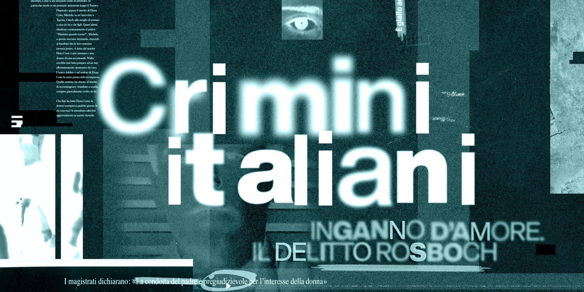
In Studio Polpo's work on title sequences for shows like Il Castello delle Cerimonie, Detectives, Crimini Italiani, Data Comedy Show, and Pigiama Rave, the theme changes every time: the docu-reality requires an identity more closely tied to the characters and the format's atmosphere; a crime-story program needs a more sober and tense language, capable of suggesting mystery, reconstruction, and in-depth analysis without falling into sensationalism; comedy can afford rhythm, surprise, and a freer use of graphics. If you need to develop a title sequence or the visual identity of a TV show, Studio Polpo can help you translate the genre, tone, and structure of the format into a coherent graphic language.
Tone, Genre, and Narrative Promise
A title sequence should not just be generically beautiful. It must be right for that specific show. Tone is decisive: an intro that is too elegant can cool down a popular format; an intro that is too light can weaken a crime program; an intro that is too dramatic can betray a comedy broadcast.
In true crime, for example, the visual language can work on details, fragments, documents, maps, photographs, clues, shadows, and a controlled rhythm. The goal is not just to create mystery, but to build a pact with the viewer: here you are entering a story of investigation, memory, and reconstruction.
In a docu-reality, on the other hand, the opening sequence can center on environment, characters, rituals, and the recognizability of the narrative world. In a comedy broadcast, the rhythm can become faster, transitions more explicit, typography more prominent, and the editing closer to the punchline.
The same technique can change meaning depending on the context. A glitch can communicate tension in a crime show, energy in a comedy program, or modernity in an informative format. The design lies in choosing the right code, not in using the most obvious effect.
Title Sequences and Broadcast Graphics
The title sequence does not live in isolation. It is part of a broader system of broadcast graphics, which means the entirety of the visual elements used in a television program: logo, intro, bumpers, lower thirds, full-screen graphics, transitions, internal charts, promos, and on-air assets.
The Ravensbourne BBC Motion Graphics Archive collects examples of opening titles, promotional trailers, stings, idents, and program graphic sequences, showing how television motion graphics are not an isolated element but a part of the overall communication of channels and formats. The archive also emphasizes the role of motion graphics in promoting television brands and in engaging, entertaining, and informing the audience.
For this reason, a title sequence should be designed while also thinking about what will follow. The same language can generate episode bumpers, section cards, logo animations, social media graphics, trailers, and promotional materials. When the intro is well-constructed, it becomes the starting point for a broader visual identity.
Rhythm, Music, and Editing
The title sequence is an audiovisual object. The graphics cannot be separated from music, editing, and duration. A daily show, a weekly format, a crime series, or a comedy broadcast have different timings and require a different rhythm.
Rhythm is not just about speed. It is about how images enter, cut away, repeat, accelerate, or leave breathing room. A comedy intro can build rhythm through quick cuts, sudden changes, and visual micro-surprises. A crime intro can work on suspensions, details, and progression. A docu-reality can give more space to recognizable faces, environments, and gestures.
In her interview with CreativeFuture, Karin Fong describes working on title sequences as a process guided by ideas and the lens of design, capable of speaking to the essence of a story. She also highlights the importance of transitions and the ability to distill a story or a tone in a very short amount of time.
When the Title Sequence Must Change Language
There is no single formula for designing a television title sequence. The language changes based on the genre, the audience, the network, the duration, the time slot, the host's tone, and the type of footage available.
An opening sequence can be:
- narrative, when it introduces a world or a story;
- graphic, when it works primarily on typography, signs, and rhythm;
- hybrid, when it combines live-action footage, archival material, illustration, and motion graphics.
This choice must be made at the beginning. If the show has a strong visual universe, the intro can start from real places, objects, faces, and details. If the format is more abstract or informative, graphics can build the world from scratch. If the program relies heavily on rhythm and tone, as often happens in comedy, editing and typography can become central.
The important thing is not to confuse language with decoration. An intro must not look "televisival" in a generic way. It must look like it belongs to that specific program and no other.
The Most Frequent Errors
Many errors arise when the title sequence is designed as a piece of content separate from the format. A visually strong sequence is constructed, but it bears little connection to the actual tone of the program, its structure, or the audience it addresses.
The most frequent errors are:
- using visual effects that are inconsistent with the genre;
- designing the title sequence without thinking about the broadcast system;
- building a rhythm that is detached from the music, editing, and tone of the broadcast.
To these is added a more strategic error: wanting to say everything in the title sequence. A good opening does not have to summarize the entire show. It must prepare, suggest, and make it recognizable. If it tries to explain too much, it risks losing its power.
Conclusion
Television title sequences are a central tool in a TV show's identity. In a few seconds, they must build recognition, introduce a tone, suggest a genre, and prepare the viewer for the episode.
Motion graphics allow this function to take shape through rhythm, typography, imagery, music, transitions, and editing. But the quality of an intro does not depend solely on technique. It depends on the ability to read the format and transform it into a precise visual language.
Every title sequence requires a different grammar: the rhythm, the relationship with the music, the weight of the typography, the treatment of the images, and the way the program wants to present itself to the public all change. Studio Polpo has been working on title sequences and visual identities for television programs for years: if you are developing a new format or want to give more visual strength to an existing broadcast, we can help you build a recognizable, coherent intro that is perfectly suited for broadcasting.
FAQ
What is a TV title sequence for?
It serves to introduce the program, make it recognizable, communicate tone and genre, and prepare the viewer for the episode.
What role do motion graphics play in a TV intro?
Motion graphics build the rhythm, visual identity, transitions, typography, and animations that help give shape to the program.
Does a title sequence always have to be highly elaborate?
No. It depends on the format. Some intros require a rich and narrative language, while others work better with a short, essential, and highly recognizable solution.