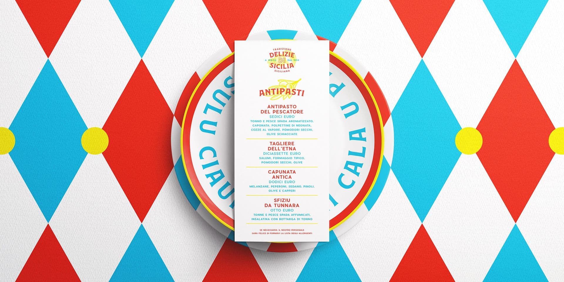
Restaurant graphics: how to build a recognizable visual identity, from logo to menu
Restaurant graphics are not just about the logo or the menu. They are about how a venue presents itself, how it is remembered, and how it builds expectations even before the customer tastes a dish. Signage, menus, business cards, coasters, window decals, takeaway packaging, social media, photographs, and dining room materials all contribute to the perception of the restaurant.
A well-designed visual identity must make the venue more recognizable, consistent, and closely aligned with its actual offering. A contemporary trattoria, a gourmet pizzeria, a bistro, a fine dining restaurant, or a wine bar cannot all speak with the same graphic language.
In her interview with Eye Magazine, Louise Fili talks about her work for restaurants, explaining that she often starts from details like color, texture, or architectural elements of the space. It is an approach that shifts graphics from mere decoration to an interpretation of the atmosphere: the visual identity stems from how that place is meant to be experienced.
Visual identity: not just a logo
When people think about restaurant graphics, the first element that comes to mind is often the logo. This is understandable, but reductionist. The logo is important, but on its own, it does not build the experience. A venue becomes recognizable when all materials speak a consistent language: menu, signage, typography, colors, photographs, texts, printed materials, and digital content.
A visual identity for restaurants should tie together:
- name, logo, signage, and dining room materials;
- menu, wine list, business cards, packaging, and printed materials;
- photography, social media, website, and digital content.
This consistency does not mean repeating the exact same mark every time. It means building a recognizable system, capable of adapting to different formats without losing its tone. A menu can be more editorial, a social media post more immediate, a sign more essential, but they should all convey the same idea of the venue.
If you are opening a restaurant or want to make an existing identity more recognizable, Studio Polpo can help you build a consistent visual system, from logo to menu, without separating graphics, atmosphere, and communication.
The menu as a central object
The menu is one of the most important objects in a restaurant's communication. It is not just a list of dishes and prices: it is a direct point of contact with the customer, often the first material that is read carefully once they are seated.
The graphics of the menu must reflect the tone of the venue. A menu that is too rigid can cool down an informal place. A menu that is too decorated can weaken an essential restaurant. A menu that is hard to read can make choosing a struggle, even when the culinary offering is excellent.
A good menu helps the customer navigate, understand the structure of the offer, and perceive the level of the venue. Hierarchy, spacing, format, materials, and text all contribute to this experience. The wine list, tasting menus, daily specials, and counter materials should also follow the same logic, without looking like elements added at different times.
Graphics and venue atmosphere
A restaurant's graphics must be consistent with the physical space. A highly elegant identity can feel distant if the venue has a warm, informal, and familiar atmosphere. Conversely, graphics that are too spontaneous can weaken a restaurant that focuses on precision, research, and service.
The article Can you taste design? by It’s Nice That reflects on the relationship between the dining experience and visual design, citing elements such as interiors, menus, and typography. Eating out is a multisensory experience: graphics do not replace the kitchen and service, but they contribute to how the venue is perceived.
For this reason, graphics should stem from a simple question: what kind of experience does the restaurant promise? If the answer is clear, every choice becomes more precise. Typography, color palettes, illustrations, and printed materials are not chosen just because they "look good," but because they reinforce the character of the venue.
Legibility and information
Restaurant graphics must be recognizable, but also functional. The menu must be readable under real conditions: lighting that is not always perfect, small tables, short decision times, and customers of different ages and habits. Creativity should not hinder reading.
The menu must help to:
- distinguish sections, dishes, descriptions, and prices;
- make ingredients, allergens, and important indications legible;
- maintain order even when the offering changes frequently.
The Food Standards Agency, in its guidance for food businesses, highlights the need to provide allergen information in an accessible and up-to-date manner. Even without entering into the regulatory details of every country, this serves as a reminder that restaurant materials are not just aesthetic tools: they must help the customer choose with awareness.
From the venue to social media
Today, a restaurant's identity does not live solely in the physical space. Many customers encounter the venue online first: on Instagram, Google, a website, a newsletter, a review, or a photo shared by others. If the venue's graphics and those of its digital channels do not communicate with each other, the experience can feel fragmented.
This does not mean turning every restaurant into a glossy brand. It means recognizing that how a venue appears online influences expectations and decisions. Consistent graphics can help make social media columns, events, seasonal menus, special nights, closure notices, new openings, or photographic content more recognizable.
Consistency between the dining room and digital platforms is particularly important for venues that work with reservations, events, tastings, delivery, product sales, or local communication. The customer should find the exact same tone in the menu they hold in their hand, in the post they see on their phone, and in the sign they encounter upon arrival.
Positioning and perception of value
Graphics contribute to the positioning of the restaurant. A venue can be accessible, popular, sophisticated, experimental, traditional, or informal, but it must communicate this clearly. If the visual identity promises an experience different from reality, a gap is created.
Graphics that are too generic can make even a good restaurant look unrefined. Graphics that are too staged can make a venue that thrives on simplicity feel artificial. The key lies in giving shape to a credible identity, not in following the trendiest style.
For this reason, the graphic project should start from the reality of the venue: kitchen, space, service, target audience, price range, local area, and the owners' personality. When these elements are translated into a consistent visual system, graphics stop being an accessory and become part of the experience.
The most frequent errors
Many errors in restaurant graphics stem from the lack of an overall direction. A logo is designed, then a menu, then a post, then a sign, then a flyer, but each element follows a different logic.
The most frequent errors are:
- designing the logo without thinking about the menu, signage, and actual materials;
- using a menu that is hard to read or inconsistent with the tone of the venue;
- separating the restaurant's graphics, photography, and social media communication.
To these is added a more subtle error: imitating visual languages that are widespread in the food sector without asking if they are suitable for one's own venue. Not all bistros have to look the same, not all trattorias need to use a nostalgic aesthetic, and not all contemporary restaurants have to look cold and minimal.
Conclusion
Restaurant graphics serve to build recognition, consistency, and trust. They are not just about the logo, but about everything that connects the venue with the customer: menus, signage, dining room materials, social media, photographs, packaging, and daily communication.
An effective visual identity does not overshadow the restaurant's personality, but makes it clearer. It helps communicate the type of experience, the positioning range, the tone of service, and the care behind the culinary project.
For a restaurant, a contemporary trattoria, a pizzeria, a bistro, or a wine bar, working on graphics means giving shape to a more recognizable and consistent experience. Studio Polpo can support this journey by designing a visual identity capable of working in the physical space, in printed materials, and in digital communication.
FAQ
Why are graphics important for a restaurant?
Because they contribute to the first impression of the venue, make the identity more recognizable, and help build consistency between the menu, signage, dining room materials, and digital communication.
Is the logo enough to build a restaurant's identity?
No. The logo is important, but it must live within a broader system: menu, colors, typography, photographs, signage, social media, packaging, and printed materials.
When is it a good idea to rethink a restaurant's graphics?
When the venue has changed, the menu no longer represents the offering well, the image appears dated, or the materials are inconsistent with each other.