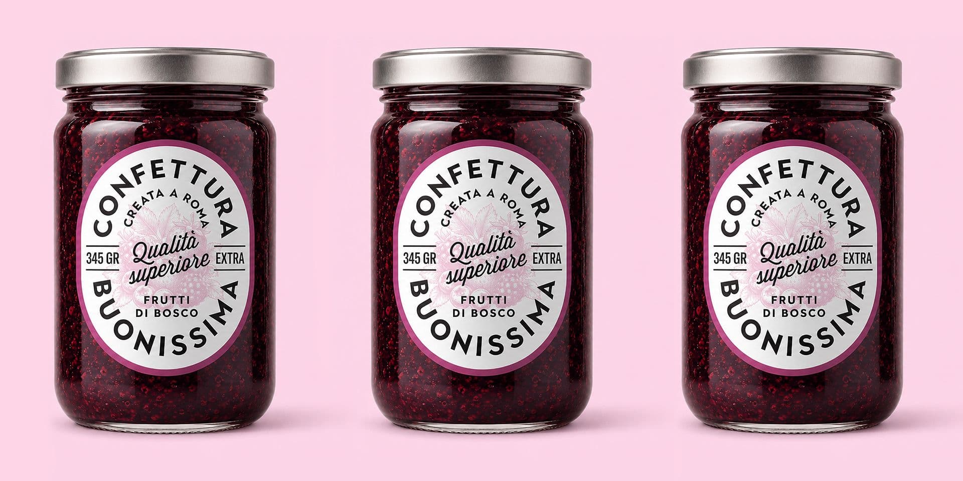
Product label restyling: when to update graphics without losing recognition
The restyling of a product label is a delicate step. On one hand, it can serve to make the product more contemporary, legible, and competitive. On the other hand, it can weaken elements that the public already recognizes: colors, logo, structure, name, photographic style, illustrations, materials, or small details that have become familiar.
Updating a label does not mean erasing everything and starting over. Often, the most useful work is understanding what is no longer working and what, instead, must stay. A label can be dated, unclear, or unsuited for the online world, but still contain very strong elements for product recognition.
NielsenIQ, on its page dedicated to packaging design, highlights that packaging design can generate significant returns when executed well, but also that 9 out of 10 redesigns do not produce a notable difference in the market. It is a data point that invites caution: restyling should not just be an aesthetic update, but a measured design choice.
When it makes sense to update a label
A label should be rethought when it no longer represents the product or the brand well. This can happen because the market has changed, the line has expanded, the price has gone up, new sales channels have emerged, or the graphics look less polished compared to competitors.
A restyling can be necessary when:
- the label appears dated compared to the current positioning;
- the product is not very recognizable on the shelf or in online photos;
- the main information is not organized with clarity.
A radical change is not always needed. Sometimes targeted interventions are enough: improving the visual hierarchy, correcting typography, simplifying certain elements, reorganizing information, or creating versions better suited for e-commerce and social media.
The point is to understand the problem before intervening. A label might not work for different reasons: lack of identity, poor legibility, informational confusion, inconsistent tone, unpolished materials, or the absence of a visual system. Every problem requires a different type of restyling.
Recognition: what must not be lost
The main risk of a restyling is losing the codes that the public uses to recognize the product. Often, these codes do not coincide with the logo alone. They can be a color, a shape, a composition, an illustration, a certain balance between positive and negative space, or a specific way of presenting the name.
Before redesigning a label, you need to understand which elements are truly distinctive. Some can be simplified. Others must be maintained or reinterpreted with great care. The consumer does not always remember every detail, but recognizes the whole: tone, colors, structure, visual presence.
A study published in SN Business & Economics describes packaging as a branding tool capable of attracting the consumer, guiding the purchase, and communicating the brand. Even though the research focuses on the cosmetics sector, the principle is broader: when packaging becomes part of the brand image, modifying it means intervening on a visual heritage that has already been built.
Light restyling or deep redesign
Not all updates have the same intensity. A light restyling works on what already exists: it cleans, rationalizes, and improves. A deep redesign, on the other hand, changes the language of the label more visibly and can modify structure, tone, composition, or the graphic system.
A light restyling can be suitable when the product is already recognizable but needs greater order. A deeper redesign can serve when the identity no longer supports the positioning, when the product line has evolved significantly, or when the product needs to enter a different market.
The choice should depend on three questions:
- which elements of the label are already recognized by the public;
- what real problems the new project must solve;
- how much change the brand can sustain without losing trust.
These questions help avoid two opposite errors: changing too little, leaving problems unresolved, or changing too much, breaking the bond with those who already know the product.
The Tropicana case: when changing too much becomes a problem
The Tropicana case is one of the most cited examples when discussing packaging redesign. In 2009, the brand starkly changed the packaging of Tropicana Pure Premium in the North American market. According to the reconstruction by The Branding Journal, after the launch of the new design, criticism poured in from consumers, sales dropped by 20% in two months, and the company returned to the previous packaging.
The point is not to use the Tropicana case to derive an absolute rule. Not all strong changes fail and not all cautious restylings work. The case is useful because it shows what can happen when too many recognizable codes are modified simultaneously: primary image, structure, visual tone, logotype, hierarchy, and overall perception.
In the restyling of a label, modernization must be legible as an evolution, not as an arbitrary replacement. If the consumer no longer recognizes the product, the new design might be cleaner and more contemporary, but it risks interrupting an existing relationship.
Label and product range
The restyling of a single label often becomes the opportunity to bring order to the entire range. If a brand has multiple products, variants, or sizes, the graphics must help users understand what belongs to the same family and what changes from one product to another.
A well-designed line must hold together coherence and differentiation. The consumer must recognize the brand immediately but also distinguish flavors, sizes, vintages, functions, ingredients, or price ranges. For this reason, the restyling should not be limited to the single label, but should consider the logic of the entire system.
This applies to food products, wines, oils, cosmetics, artisanal products, and many other categories. When the range grows without guidance, each new label risks adding complexity. A restyling can serve precisely to rebuild order: a clearer grid, a more stable hierarchy, consistent color codes, and a better relationship between brand and product.
The role of the graphic design studio
In the restyling of a label, the work of a graphic design studio does not consist solely of "making it more modern." First, it is necessary to analyze what exists: what works, what confuses, what is recognizable, what is superfluous, and what no longer holds up in new sales contexts.
From this analysis comes the correct level of intervention. Sometimes the project is mostly about legibility. Other times, it involves reorganizing the range system. In other cases, it is necessary to update the brand tone, make the product more credible in a higher price range, or prepare the label to live better online.
If you are considering the restyling of a label already on the market, Studio Polpo can help you figure out which elements to keep, which to update, and how to build clearer graphics without losing recognition.
Most frequent errors
Many restylings fail because they start from a superficial judgment: "the label is old, let's redo it." But a label can be old and still recognizable, or recent but poorly effective. The issue is not the age of the graphics, but the relationship between identity, legibility, and the market.
The most frequent errors are:
- changing too many visual codes at the same time;
- eliminating recognizable elements without understanding their value;
- updating the style without resolving hierarchy and clarity.
To these, a more strategic error can be added: designing the restyling as an isolated episode. If the label changes but the logo, packaging, website, product photos, and commercial materials remain inconsistent, the result risks weakening the perception of the product instead of strengthening it.
Conclusion
The restyling of a product label is needed when the graphics no longer communicate clearly, do not support the positioning, or do not work in the contexts where the product is chosen. But updating does not mean erasing. The recognition built over time is a heritage to be read carefully, so it can be preserved in the best possible way.
A good restyling distinguishes what must be kept from what can be improved. It can make the label cleaner, more legible, contemporary, and coherent, without breaking the link with the audience that already knows the product.
For an existing line, a new range, or a product that needs to grow in perception and competitiveness, Studio Polpo can guide the label restyling within a more solid visual system: from packaging to commercial materials, from photography to digital content.
FAQ
When is it best to restyle a product label?
When the label no longer represents the product's positioning, appears dated, is poorly legible, works badly online, or does not organize information well.
Does restyling mean completely changing the label?
No. It can be a light update or a deeper intervention. The choice depends on how recognizable the current label is and what problems the restyling itself needs to solve.
How do you update a label without losing recognition?
You must first identify the strongest visual codes: colors, logo, structure, images, composition, and tone. The restyling should preserve, simplify, or reinterpret them, rather than eliminating them without criteria.