The new euro banknotes: what they tell us about European identity design
The new euro banknotes are not just a graphic update. They are a public identity project intended for millions of people across different countries, diverse languages, and everyday contexts of use. Each banknote must be beautiful, recognizable, secure, accessible, and capable of representing a shared idea of Europe.
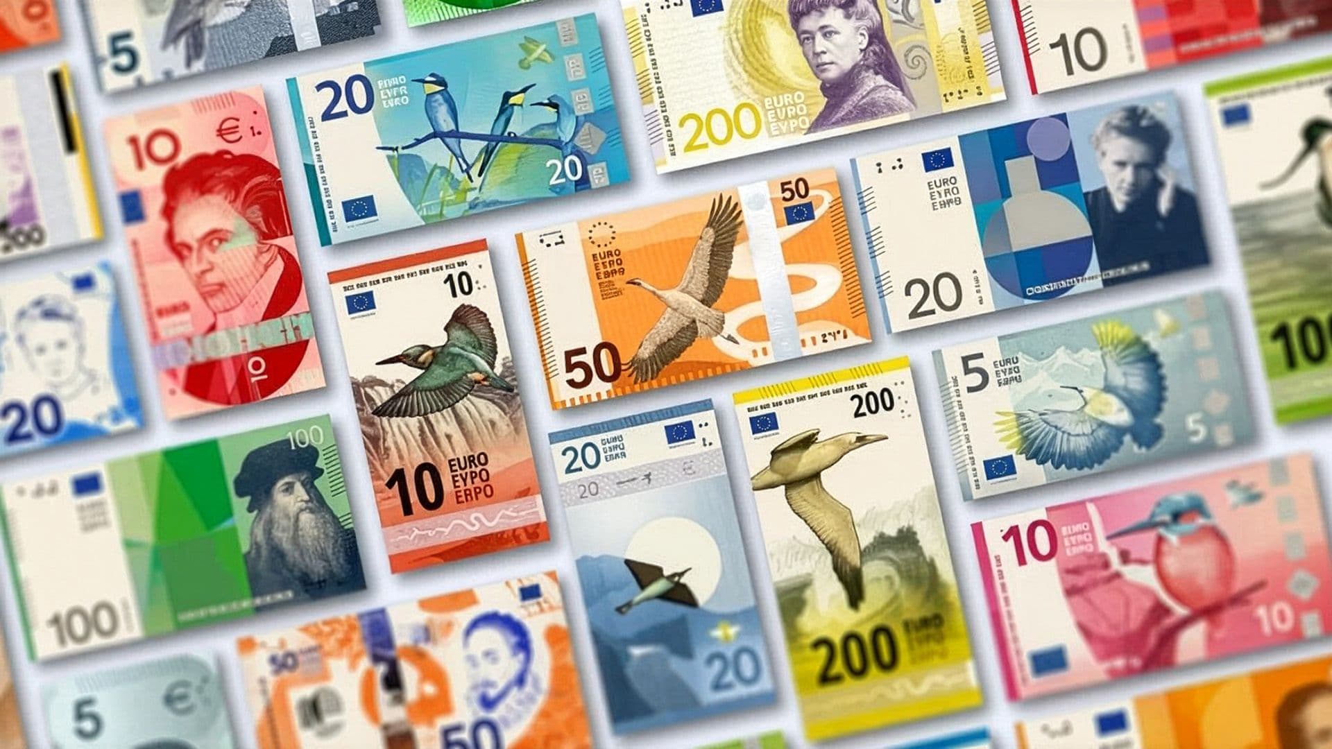
In 2026, the European Central Bank presented ten selected proposals for the future redesign of the euro, inviting citizens to express their preference through an online consultation open until September 21. Two themes are under consideration: "European culture" and "Rivers and birds".
This process shows how complex institutional design can be. A banknote cannot speak only to a specialized audience. It must work in the hands of everyone: citizens, merchants, tourists, elderly people, visually impaired individuals, automated systems, banks, and institutions.
A Banknote Is a Visual System
A banknote is not an illustration printed on paper. It is a visual system where numerical value, color, format, images, symbols, text, signatures, tactile elements, security features, and nearly invisible details coexist.
Every element has a function. Color helps distinguish denominations. The number must be instantly legible. Images build the symbolic narrative. Textures and microstructures make counterfeiting more difficult. Raised print aids recognition by touch. The layout must remain clear even under vastly different conditions of use.
For this reason, the euro redesign cannot be interpreted as a simple change in style. It is a project where aesthetics, technology, identity, and daily use must find a balance.
European Identity: Representing Without Oversimplifying
The hardest challenge is representing Europe. Not a single nation, not a dominant language, not a single tradition. European identity is made up of differences, landscapes, institutions, cultures, and shared values.
The current banknotes chose a cautious approach: windows, doorways, and bridges from different eras—no real buildings. It was a way to evoke openness, cooperation, and dialogue without favoring a specific country.
The ECB report for the new graphic look shifts the narrative to two themes. "European culture" proposes figures and places of shared culture: performing arts, music, schools, libraries, museums, and public squares. "Rivers and birds" instead focuses on nature, freedom, geographical continuity, and environmental responsibility. The jury's report describes these two themes as different ways of telling stories of identity, diversity, and belonging.
The choice is not purely aesthetic: culture and nature describe two different ideas of Europe—one founded on heritage and shared spaces, the other on ecosystems, crossed borders, and interdependence.
Symbols: Between Recognizability and Neutrality
A public identity must be recognizable, but also inclusive. For this reason, symbols are delicate: a famous face can create memory, but raises questions about representation; a natural landscape is more universally accessible, but risks becoming generic; an institutional building communicates stability, but can feel distant from daily life.
In the case of the new banknotes, the challenge is avoiding both excessive abstraction and overly didactic storytelling. The design must:
- simplify without impoverishing;
- represent without excluding;
- build memory without becoming rhetorical;
- remain readable even in everyday use.
For organizations, institutions, and cultural projects, Studio Polpo can develop visual identity systems capable of transforming complex content into clear, recognizable languages adaptable across different materials.
Color, Format, and Visual Habits
Euro banknotes are also recognized through color: gray for 5 euros, red for 10, blue for 20, orange for 50, green for 100, and yellow-brown for 200. This chromatic continuity is important because millions of people have learned to associate value with color.
In a redesign, changing too much can create disorientation. Changing too little can make the new design invisible. Color must therefore work as memory.
Format can also serve as a signal of change. Some proposals experiment with a more vertical use of the banknote, at least on one side. The ECB does not present this choice as a direct reference to smartphones, but it is hard not to read it within a world accustomed to vertical screens, mobile content, and hand-held interfaces. A vertical layout can suggest modernity and immediacy; at the same time, on a traditional object like a banknote, it must be evaluated against real-world use, wallets, cash registers, vending machines, and established habits.
Visual hierarchy remains decisive: a banknote must communicate value first, then denomination recognizability, then the visual story.
Accessibility and Real-World Use
Banknotes are among the most used graphic objects in daily life. They must work in pockets, at cash registers, in the dark, on the move, in the hands of elderly people, tourists, or visually impaired individuals. For this reason, accessibility and usability are not secondary details.
The ECB highlights several features designed for blind or visually impaired people: different sizes between denominations, higher contrast colors, large numbers, raised print, and tactile lines along the edges.
These elements demonstrate a fundamental point: good graphic design does not communicate through imagery alone. It also communicates through scale, touch, contrast, repetition, order, and perceptible differences. In public design, accessibility is not a final addition. It is part of the form itself.
Security: When Design Must Protect
A banknote must be recognizable, but also difficult to counterfeit. This adds another layer to the design: watermarks, holograms, special printing, microtext, optically variable elements, reliefs, and details integrated directly into the image.
Security cannot be separated from design. If protective elements look added as an afterthought, the banknote loses visual unity. If they are integrated into the composition instead, they become part of the visual identity.
Graphics serve not only to communicate a message, but also to guarantee trust. Every banknote must say "I am authentic" before it is even inspected. Trust relies on technology, but also on visual perception.
A Project for Millions of People
Few graphic design projects operate at the scale of a banknote. A corporate identity might speak to a defined audience. A campaign might have a limited duration. A banknote, however, enters the daily lives of millions of people for years.
This changes the way we design. The visual mark cannot just strike at first glance. It must withstand repetition, wear, familiarity, and distraction. It must be recognizable even when folded, partially covered, worn out, or viewed quickly.
The euro redesign reminds us that public visual identity is not made only of high-level symbols. It is also made of ordinary objects. Precisely because a banknote passes from hand to hand, its design becomes one of the most concrete forms of European identity.
The Most Frequent Errors
The most common mistakes in public identity projects occur when designers focus solely on the final image while forgetting use, context, and longevity.
Errors to avoid include:
- choosing strong but poorly inclusive symbols;
- prioritizing aesthetics without considering legibility and accessibility;
- changing too much, erasing previously built visual memory;
- changing too little, rendering the redesign insignificant.
Added to these is a more subtle mistake: assuming that identity is only what is represented. In reality, how it is used, recognized, touched, verified, and remembered matters just as much.
Conclusion
The new euro banknotes tell us a lot about European identity design. They speak of symbols, culture, nature, color, security, accessibility, and trust. Above all, they show how difficult it is to design a visual system intended for diverse audiences and daily use.
A banknote must be institutional yet familiar, secure yet legible, symbolic yet concrete, new yet recognizable. It must represent Europe without reducing it to a single, definitive image.
The euro redesign is a useful case study well beyond the monetary world: it serves as a reminder that every strong visual identity emerges from a balance between meaning, function, and real-world use.
FAQ
When will the new euro banknotes be released?
The ECB expects to select the final design towards the end of 2026. Following the selection, several more years will be required for development, production, and circulation.
What are the proposed themes for the new banknotes?
The two themes are "European culture" and "Rivers and birds": two different ways of representing identity, belonging, nature, and shared values.
Why do some proposals look more modern?
Because they experiment with less traditional visual languages: more concise compositions, a different use of imagery, greater attention to hierarchy, and, in some cases, more vertical orientations.