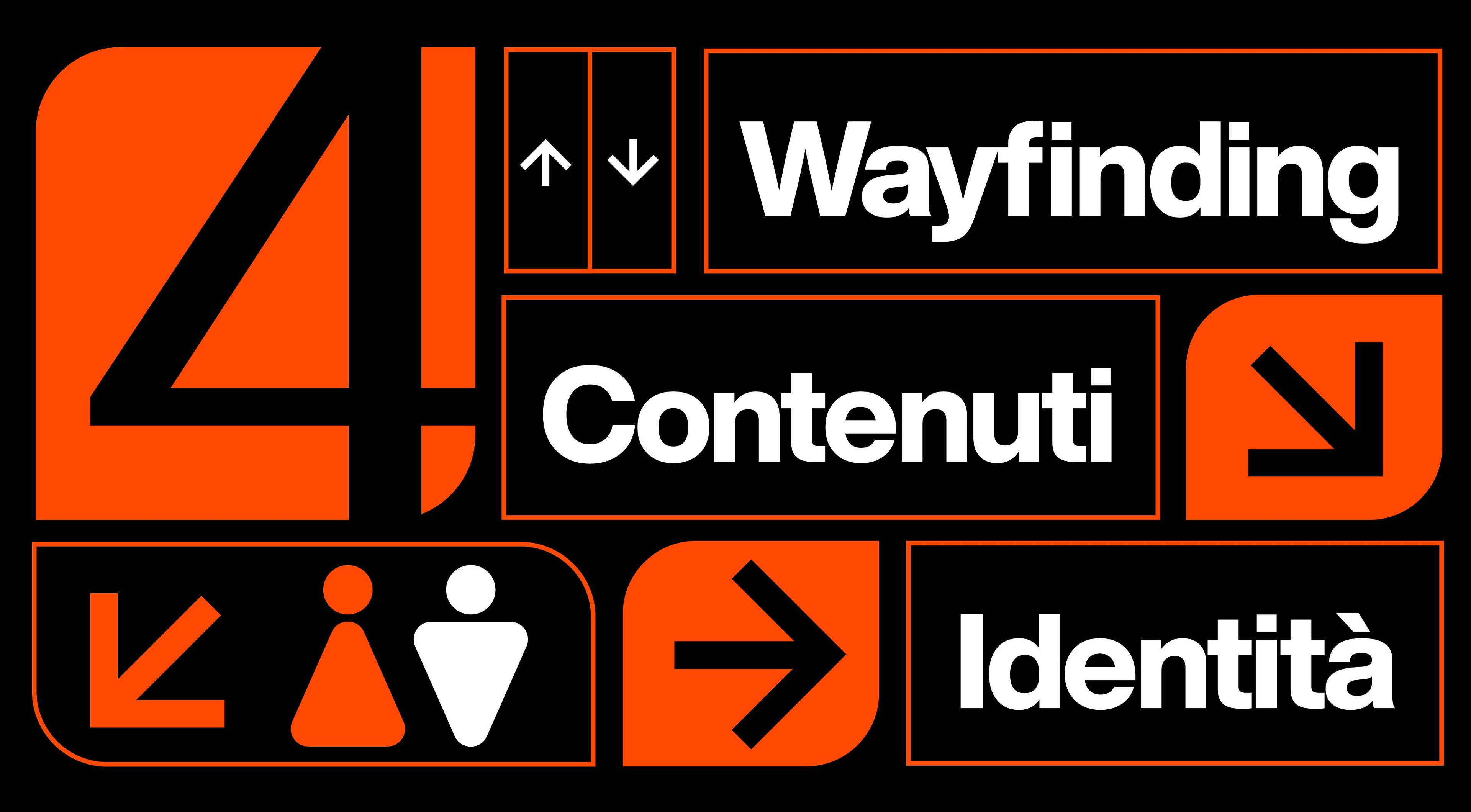
Museum graphics: identity, wayfinding, and content in the exhibition space
Museum graphic design goes far beyond wall panels and object labels. It is the comprehensive visual system that enables a museum, a permanent exhibition, or a display space to become recognizable, legible, and easily navigable.
Within a museum environment, graphic design operates on multiple levels: visual identity, wayfinding, maps, gallery text, informational materials, digital content, editorial publications, and external communication. Every element must fulfill a precise purpose. Decorating the space is not enough: design must help visitors understand where they are, what they are viewing, and how to navigate through the space.
The goal is to establish seamless continuity between identity, wayfinding, and content. High-quality museum graphics do not overpower the exhibited works or objects, but accompany the public without replacing the curatorial path.
A Visual Identity That Goes Beyond the Logo
A museum requires a recognizable identity, but this identity cannot exist solely within its logo. It must actively function across physical spaces, maps, wall displays, ticketing, catalogs, educational collateral, websites, social channels, and internal directional signs.
The case of the Minneapolis Institute of Art, documented by Pentagram, clearly illustrates this principle: the identity was developed as a comprehensive visual language applied to signage, maps, exhibition materials, banners, staff apparel, social media, and merchandising.
This systemic approach is crucial because museums continuously generate diverse materials over time. Temporary exhibitions, educational workshops, public events, publications, special tours, and digital assets must remain instantly recognizable without falling into repetitive monotony.
A robust museum identity system should establish:
- logo usage, color palettes, core typography, and underlying layout grids;
- design guidelines for temporary exhibitions, permanent galleries, and editorial publications;
- functional standards for maps, wayfinding signage, gallery texts, and digital media;
- a visual tone capable of respecting the exhibited works, architectural context, and audience.
For museums, foundations, cultural spaces, and public institutions, Studio Polpo develops branding and visual identity projects designed to thrive within exhibition environments while maintaining optimal clarity and recognizability.
Wayfinding: Guiding Without Distracting
Wayfinding represents one of the most delicate aspects of museum graphic design. Visitors must easily locate entrances, ticket counters, cloakrooms, exhibition galleries, amenities, emergency exits, bookshops, accessible routes, and temporary display areas without having to re-interpret the physical environment at every step.
However, signage within a museum must never feel intrusive. It needs to remain visible when required, yet stay discreet when visitors are actively engaging with the displayed works and artifacts. The key lies in precise calibration: providing guidance without transforming every wall into a billboard.
In the environmental graphic design project for the Museum of the Moving Image, featured by SEGD, the wayfinding system adopts contrasting approaches for exterior and interior spaces: highly visible within the urban landscape, yet refined and minimal indoors, where it provides essential guidance without distracting from the museum's core exhibits.
Striking this balance is essential. Effective museum signage must be clear, aligned with the institution's visual identity, and harmonized with the surrounding architecture. It must account for sightlines, lighting conditions, material choices, foot-traffic flows, decision points, and actual visitor pathways. Drawing clear directional arrows is not enough; one must understand how human beings move through physical space.
Content in the Exhibition Space
Museum graphic design must also give form to curatorial content. Section titles, introductory texts, object labels, fact sheets, floor maps, timelines, wall quotes, digital interfaces, and specialized materials for children or educational groups shape the relationship between the visitor and the exhibition path.
The primary risk is producing excessively lengthy, overly technical, or visually homogenous text panels. Museums are not read like traditional books: visitors enter, observe, move around, backtrack, skip entire sections, or selectively read specific fragments. The design system must intentionally accommodate this fragmented reading style.
The Victoria and Albert Museum (V&A) gallery text guidelines emphasize that visitors are simultaneously exposed to objects, architecture, directional signage, texts, and complex concepts. They recommend constructing a simple yet flexible visual hierarchy to provide clear pathways through layered information.
To achieve this, it is necessary to differentiate various content layers:
- overarching exhibition introduction texts;
- section and gallery wall panels;
- individual object labels and detailed display cards;
- maps, timelines, glossaries, and supplementary deep-dive materials.
Graphic design should not force everyone to read everything. Instead, it must offer customized entry points for diverse audience types: those seeking a quick overview, those looking for in-depth analysis, those requiring practical information, or those visiting with children and educational groups.
Typography, Scale, and Viewing Distance
In an exhibition space, typography cannot be evaluated strictly on a flat page or screen. A typeface that appears elegant in a graphic layout may prove unreadable on a high wall, inside a display showcase, under controlled spotlighting, or within a crowded hallway.
Typographic scale must directly respond to real-world viewing distances. Room titles must be readable from afar, object labels must function at close range, maps must be effortless to consult, and text on digital monitors must maintain strong legibility despite ambient glare, light shifts, or moving crowds.
Consequently, museum graphic design must closely interface with architecture, lighting design, physical supports, fabrication materials, and visitor traffic. A highly distinctive typographic selection may convey personality, but it must be rigorously tested under real exhibition conditions. If visitors are forced to lean in excessively, strain their eyes, or decipher low-contrast text, the design fails to support the overall museum experience.
Legibility is not a minor technical detail; it is a fundamental sign of respect for both the content and the audience.
Coherence Between Exhibitions, Museum, and External Materials
Every museum maintains an overarching institution-wide identity, yet individual exhibitions often require their own unique tone. The graphic design project must carefully coordinate how these two levels interact. A temporary exhibition can feature an autonomous visual character, but it should never feel detached from its host institution.
The same principle applies to external marketing collateral: promotional posters, exhibition catalogs, invitations, social media assets, email newsletters, video teasers, admission tickets, and educational worksheets. If the design language shifts abruptly between external marketing and the physical exhibition environment, visitors perceive a disconnect. Conversely, if every element is overly restricted, individual exhibitions lose their distinct character.
A well-structured design system allows for controlled variations: the museum's core identity ensures overarching continuity, while the exhibition design introduces rhythm, thematic depth, and specificity. Graphics must unify both levels without flattening the content inside a rigid template.
Museum Graphics and Accessibility
Museums welcome diverse audiences spanning different age groups, languages, cultural backgrounds, visual capabilities, attention spans, and levels of subject-matter familiarity. Graphic design must integrate these considerations from the outset.
Accessibility does not mean making design sterile or neutral. It means engineering text sizes, color contrasts, mounting heights, viewing pathways, and display supports with maximum clarity. A legible object label, a clear map, a strategically positioned QR code, an accessible typeface, and robust contrast ratios enhance the museum experience for all visitors.
Similarly, digital tools must be integrated with restraint. Audio guides, video displays, interactive touchscreens, and digital deep-dives can enrich the visitor journey, but they should never serve as the sole method for accessing core exhibition content. Technology succeeds when it seamlessly supports the physical visit rather than replacing sound spatial design.
The Most Frequent Errors
Errors in museum graphic design typically occur when identity, wayfinding, and spatial content are treated as isolated design layers rather than an integrated whole.
Key errors to avoid include:
- treating graphic design as mere spatial decoration rather than a fundamental component of the visitor journey;
- designing wall texts without a distinct visual hierarchy between introductory panels, section briefs, and object labels;
- implementing wayfinding that is either excessively intrusive or too subtle to effectively guide visitors;
- completely disconnecting a temporary exhibition's identity from the museum's master brand and external promotional collateral.
A more subtle mistake is overlooking real-world reading distances. Museum graphics live on physical walls, mounting supports, display cases, maps, and digital screens. All design elements must be prototyped and verified in the physical space, not merely approved on a desktop monitor.
Conclusion
Museum graphics build a clearer, more engaging relationship between the institution, its collections, and its visitors. Visual identity, wayfinding, and spatial exhibition texts are not separate disciplines; together, they define how the public recognizes, navigates, and comprehends an exhibition space.
A strong graphic design system never overshadows the exhibited art, artifacts, or surrounding architecture. Instead, it provides order, orientation, and continuity. It makes the museum recognizable as a whole while allowing each exhibition or gallery route to express its unique character.
If you are developing the visual identity for a museum, a permanent gallery, or a temporary exhibition, Studio Polpo can build a clear, cohesive graphic system tailored to the real physical conditions of the visitor experience.
FAQ
How is "museum graphic design" defined?
It refers to the specialized field of graphic design applied to a museum's visual identity, directional signage, environmental wall texts, object labeling, publications, and communication materials.
What role does wayfinding play in a museum?
Wayfinding helps the public navigate seamlessly between entrances, galleries, amenities, directional paths, exits, and temporary display areas, maintaining visual harmony with both the brand identity and the architecture.
Does museum graphic design only apply to exhibition wall panels?
No. It encompasses the complete visual ecosystem, including brand identity, maps, directional signage, gallery texts, object labels, editorial publications, digital interfaces, and external marketing communication.


