Magazine graphics: how to build an editorial project that is readable, recognizable, and coherent
Magazine graphics is one of the fields where editorial design best showcases its true nature: it is not enough to simply organize content well; one must also give a publication a recognizable visual voice capable of functioning and holding up issue after issue. A magazine is not a collection of isolated pages. It is a system of rhythm, variation, and hierarchies that must remain coherent without becoming predictable.
Because of this, designing a magazine is different from designing a book or a report. A magazine must coexist with seriality and a variety of content. The American Society of Magazine Editors presents awards every year for design and illustration precisely because, in the world of publications, visual quality is not a detail but a decisive part of the editorial experience. Similarly, AIGA describes editorial design as work on hierarchy, sequence, and rhythm: three elements that become essential in magazines.
What truly distinguishes a magazine
The magazine has a hybrid nature. It must be structured like a system, but also open enough to host very different types of content. The same issue can contain cover stories, short articles, interviews, portfolios, columns, and special inserts. The graphic project must make all of this coexist without losing readability and recognizability.
For this reason, in magazine graphics, the following are highly important:
- a solid but not overly rigid grid;
- stable and clear typographic hierarchies;
- consistent treatment of images, columns, and openings;
- a strong relationship between the publication's identity and the variety of content.
It is precisely this ability to hold together system and difference that distinguishes a successful magazine from a publication that is simply tidy.
Readability and identity
In magazine graphics, readability is fundamental, but on its own, it is not enough. A publication can be clear and yet anonymous. It can be well laid out and leave no visual memory. For this reason, editorial quality is born from the intersection of function and personality.
Magazines observed and awarded within the ASME circuits and featured in AIGA Eye on Design often show precisely this dual quality: they know how to be structured without being neutral. This is a useful lesson even for those working on corporate, cultural, or independent magazines.
In practice, a strong project succeeds in:
- making content easy to read and consult;
- attributing a recognizable visual tone to the publication;
- maintaining continuity from issue to issue.
This combination is what makes a magazine perceived as a true editorial project and not just a sequence of correct layouts.
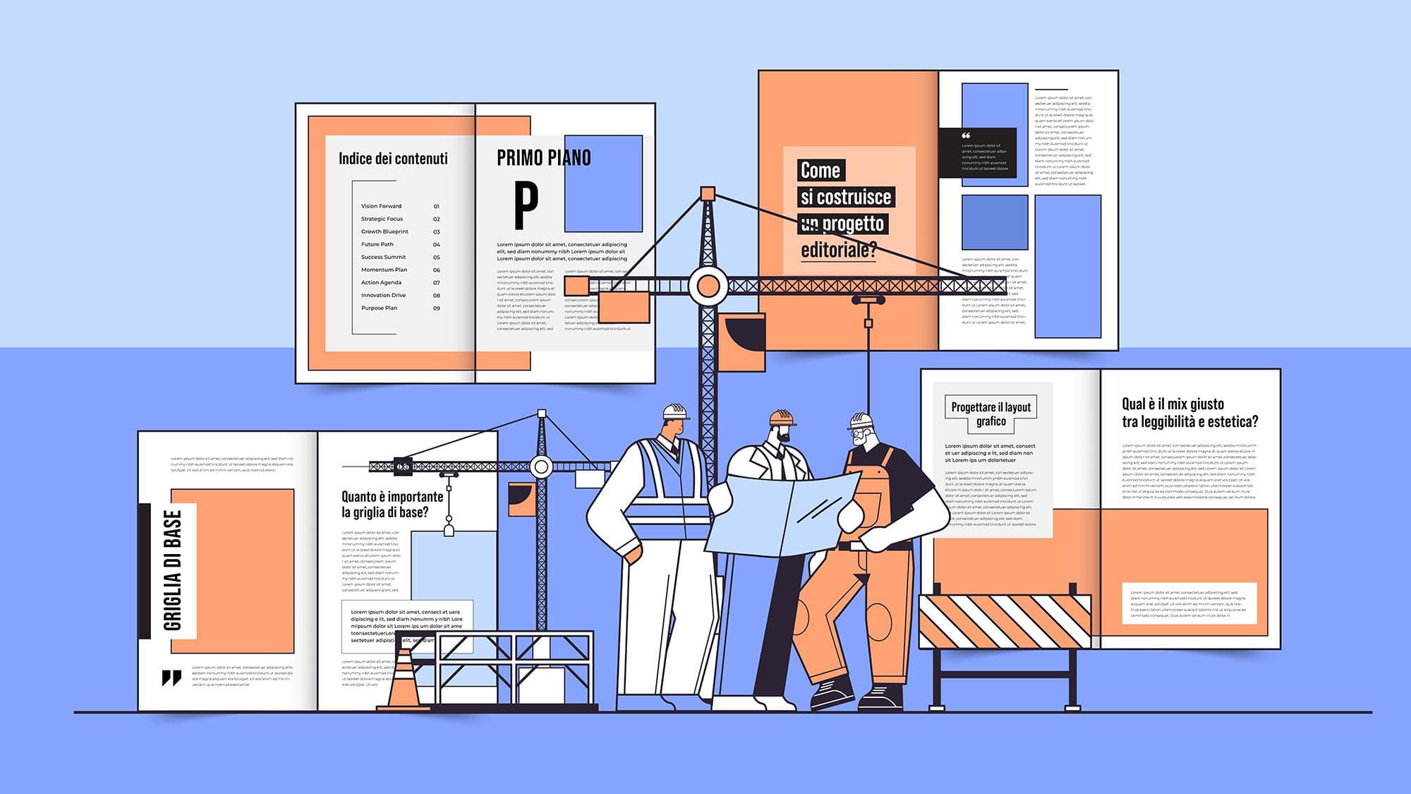
How to build a coherent project
To build a coherent magazine, it is not enough to define a few layout rules. You need a system that decides how the cover, table of contents, columns, openings, texts, and sidebars function. Coherence does not arise from mechanical repetition, but from a clear visual grammar.
Usually, these are the elements to work on:
- cover, as an entry threshold and identity tool;
- editorial grid, to govern variation and continuity;
- typography, to build tone and hierarchies;
- page rhythm, to avoid monotony or noise.
If you are designing a new magazine or relaunching an existing title, focusing first on the editorial system can prevent many long-term issues. Studio Polpo can help you build magazine graphics that hold together reading, rhythm, and identity, without slipping into standardized solutions.
From paper to digital
Today, magazine graphics do not only concern the printed page. Even publications that use print extensively live in digital environments: newsletters, previews, social media, galleries, online content, and promotional materials for the issue. This makes having a strong editorial system even more important.
A contemporary project must therefore maintain consistency between print and digital environments, making the publication recognizable even outside the traditional page and adapting the language without losing tone and authority. It is a crucial step, because magazines today almost always exist as ecosystems rather than single media.
Conclusion
Magazine graphics matter because a magazine needs more than just order. It needs a structure that ensures good reading, but also an identity that makes it recognizable and credible over time. It is this balance between system and personality that makes a serial publication truly strong.
If you want to design a magazine, relaunch a title, or build a more solid and distinctive editorial system, Studio Polpo can help you give your publication a more readable, coherent, and memorable form.
FAQ
Does magazine graphics only concern print?
No. Today it also concerns newsletters, previews, online content, social media, and promotional materials for the publication.
Does the cover matter more than the interior?
Both matter. The cover initiates the relationship, but it is the interior that truly builds the quality of the reading experience.
Can a magazine change significantly from one issue to the next without losing its identity?
Yes, if the editorial system is strong. Coherence is not born from rigid repetition, but from visual rules capable of governing variation.