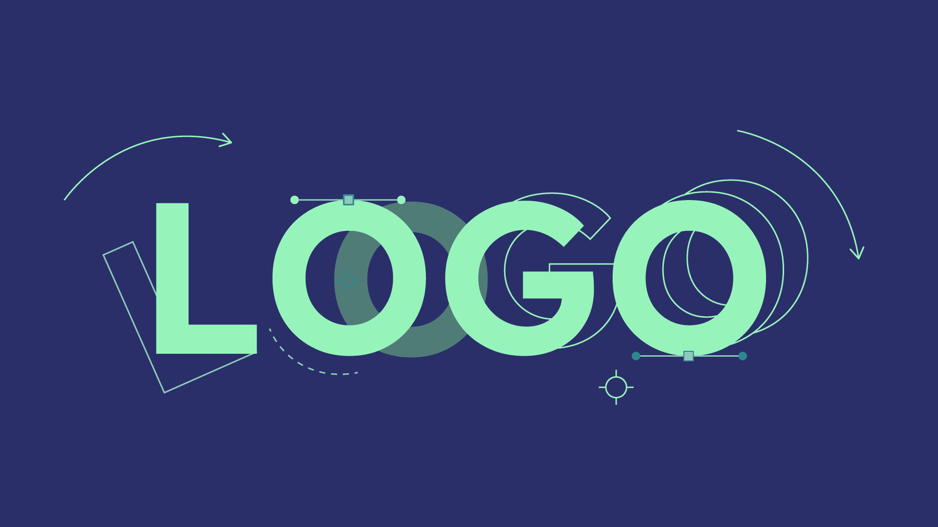
Logo animation and moving brands: why motion graphics strengthen visual identity
For years, many visual identities were designed primarily for the static world: letterheads, brochures, billboards, packaging, signs, and publications. Today, that work remains fundamental, but it is no longer enough on its own. A contemporary brand lives in environments where movement is structural: websites, social media, short videos, presentations, events, interfaces, trade show screens, digital content intros, and campaign assets. In this scenario, logo animation and, more generally, a brand-in-motion system, are not aesthetic details: they are a way to make the brand more coherent with the context in which it must exist. The right question, therefore, isn't "should we animate the logo because it’s trendy?".
The right question is different: how does our brand behave when it enters a dynamic space? If the brand lacks a deliberate behavior, it risks appearing rigid, generic, or clumsily tacked onto moving content. Motion graphics, when well-designed, bridge exactly this gap.
- Transforms the logo from a static element into a recognizable gesture.
- Allows for the definition of rhythm, character, and tone for intros, outros, and transitions.
- Helps make the brand memorable even in very rapid consumption contexts.
What a logo animation really is
A logo animation is not simply a logo that appears with an effect. It is the translation of a visual identity into motion. Adobe, in its materials on After Effects and branding, illustrates this principle well: when a brand is animated, you aren't adding an external filter, you are defining a behavior. And that behavior communicates something about the brand.
- A sharp and geometric entrance can convey precision, technology, and control.
- A fluid and soft opening can evoke accessibility, naturalness, and a human approach.
- A construction via layers or modules can reinforce the idea of a system, network, or method.
- A transition based on patterns, textures, or graphic marks can link the animation to the brand's visual world.
This is why logo animation should never be designed as an isolated element. It should be born from the same rules that guide the rest of the identity: composition, typography, colors, rhythm, tone, and brand promise. When movement originates there, the result feels natural. When it is added afterward, the content might look technically correct but feel culturally foreign to the brand.
When it actually makes sense to use it
Not every brand needs to use logo animation in the same way. However, many can benefit during moments when the identity enters dynamic touchpoints.
Where a brand-in-motion system brings the most value
Once a good logo animation is defined, the next step is asking where it can generate real value. Often, the best opportunities aren't just in "big" videos, but in the brand's many daily contact points. Intros and outros for recurring formats, visuals for events, sales presentations, campaign teasers, animated headers, onboarding content, loops for booths and screens: every occasion where the brand appears in a dynamic context can benefit from a coherent grammar of movement.
This approach is particularly useful during rebrandings or identity refreshes, as it helps the audience perceive the change not just as a new graphic shape, but as a more contemporary and recognizable brand behavior.
- Videos and recurring editorial formats.
- Events, presentations, and trade shows.
- Social campaigns and digital teasers.
- Websites, onboarding, and interactive environments where the brand must live non-statically.
Common mistakes in logo animation
Logo animation is often undervalued or, conversely, overloaded. The first mistake is turning it into a small showreel of effects, completely losing the link with the brand. The second is using it as an isolated element, without building any continuity with other brand assets. The third is ignoring the context in which it will be viewed: an animation perfect for a video opening might be too slow or too intrusive for a web hero section or a very short social post.
There is also a more subtle error: confusing "memorable" with "complex." In reality, the strongest logo animations are often those that condense the brand's character into a simple gesture. When the solution becomes too elaborate, recognizability decreases instead of increasing.
- Too many effects, too little identity.
- Beautiful animation but not reusable across other touchpoints.
- Excessive duration relative to the consumption context.
- Poor legibility of the brand during movement.
- Intros and outros for institutional videos, branded content, or sales presentations.
- Openings and closings for social content, teasers, campaigns, and editorial formats.
- Animated visuals for events, trade shows, opening titles, screens, and exhibition environments.
- Hero videos, loading states, or website content where the brand must be present non-statically.
- Rebranding or identity refreshes, when the brand needs to appear more contemporary in digital contexts.
An interesting use case involves brands that have a good static identity but a fragmented digital presence. Often, every piece of content seems to live on its own: a reel has one tone, a presentation another, a teaser yet another. Introducing a grammar of movement, even a simple one, allows for continuity and recognizability. In this sense, logo animation is less of a "wow piece" and more of an entry point into a coherent system.
Movement must reinforce, not distract
One of the great misconceptions of logo animation is thinking that the more evident the animation, the better it works. In reality, value almost always lies in the opposite: in finding a gesture that is coherent, clean, and right for the brand. Even Nielsen Norman Group, discussing the role of movement, insists that animation should be discrete, brief, and meaningful. This applies even more to a logo, as the mark is already a condensation of identity: it doesn't need to overdo it to get noticed.
- A good logo animation is legible at first glance.
- It never compromises the brand's recognizability.
- It doesn't weigh down the content it is placed in.
- It can be repeated over time without becoming intrusive or dated too quickly.
The useful question to ask is: is the movement adding a signature or subtracting clarity? If the answer is the latter, the animation needs simplification.
If you want to transform your content, campaigns, and visual identity into a clearer, more coherent, and memorable motion graphics system, Studio Polpo can help you build truly useful assets for your channels.
How to transform a logo animation into a daily asset
For many companies, the true value of logo animation doesn't emerge in the institutional video, but in daily life. When the animated brand becomes part of templates, openers, closings, transitions, and editorial packs, the brand acquires a consistency that the audience perceives even without realizing it. This is the step that moves logo animation out of the "special piece" logic and into the system logic.
In practice, this means thinking about long and short versions, complete openings and micro-gestures, formats for events, and variants for social media. The brand animation thus becomes a modular signature, capable of entering different contexts without losing recognizability.
- Full version for institutional videos and openings.
- Short version for social, paid, and rapid content.
- Visual micro-gestures to apply to titles, patterns, or brand transitions.
Rebranding, refreshes, and continuity over time
The relationship between logo animation and rebranding is particularly interesting. When a brand changes or updates, the audience doesn't perceive the new asset solely from the graphic sign, but also from its behavior. A well-designed movement can signal that the brand has become more contemporary, precise, human, or structured. In this sense, logo animation tells the story not just of "how the brand looks," but "how it presents itself" over time.
Similarly, even without a full rebranding, a small system of brand motion can help refresh the perception of an existing identity, making it more suitable for current channels without betraying its nature.
- In rebranding, movement helps make the change perceivable.
- In refreshes, it allows for updating the brand without jarring disruptions.
- In ongoing work, it increases consistency over time and reduces visual fragmentation.
The most interesting point, especially for more evolved brands, is that logo animation can be just the first piece of something broader: a brand-in-motion system. This system can include transitions, titling, openings, lower-thirds, typographic animations, shape behaviors, micro-patterns, visual loops, and variants for different formats. In practice, you move from a single animation to a grammar of movement.
- The logo becomes the central gesture, but not the only one.
- The brand acquires visual continuity even in short and digital formats.
- The marketing team can work with more coherent assets that are easy to reuse and recognize.
This type of approach is particularly effective in contexts where content production is continuous. Think of a brand that frequently publishes videos, case studies, interviews, product clips, event updates, or educational content. If every video opens differently, brand memory weakens. If a system exists, every piece of content reinforces the previous one.
Performance, accessibility, and good use in digital
When logo animation lives on a website, digital product, or interface, other criteria come into play. Movement should respect the context of use and not become an obstacle. An animation that is too long, too aggressive, or repetitively invasive can worsen the experience. This doesn't mean giving up on movement, but designing it with measure.
How to defend brand consistency even in rapid content
A frequent risk for brands that produce a lot is dispersal. Every piece of content is born for a specific need and, over time, the brand loses a recognizable visual voice. Logo animation and brand motion serve this purpose too: defending consistency as production increases. A little goes a long way if the system is well-designed: a specific way the logo enters, a typographic logic, a recurring transition, a coherent rhythm, a few well-governed visual signs.
- More content must not mean more disorder.
- A small set of movement rules can significantly raise the perceived quality.
- Consistency, over time, strengthens brand memory more than a single spectacular piece of content.
- On the web and interfaces, it is better to prioritize short, light animations.
- The brand should not impede reading or slow down access to main content.
- It is useful to consider preferences for reduced motion when animation lives in interactive environments.
This attention makes the project more mature. A strong brand isn't one that always imposes maximum impact. It is one that knows how to choose the right degree of presence for every context.
A detail that matters: movement must stay true to the mark
In a good logo animation, the movement never betrays the nature of the brand. Even when the gesture is creative, the mark must remain legible, coherent, and recognizable. This balance between expressiveness and fidelity is what transforms an ordinary animation into a true extension of the visual identity.
- The movement must enhance the logo, not make it disappear behind the effect.
If you are evaluating how to use motion graphics to strengthen your brand, simplify complex messages, or make your content more effective, Studio Polpo can help you find the most suitable format, language, and system.
A good logo animation isn't an aesthetic trick. It is a way to give the brand continuity in all those contexts where movement is now a natural part of communication. When designed well, it strengthens the brand, increases memorability, and makes the identity more alive without losing rigor. Studio Polpo can help you transform a logo or a visual system into a brand that knows how to move with coherence, measure, and personality, so that every piece of content from teaser to presentation, from website to event truly works in favor of your identity.
FAQ
Is logo animation only for big brands?
No. Even smaller entities can benefit, especially if they produce video content, social media posts, or materials for events.
Does it always have to be complex?
No. Often the best solutions are the most essential, provided they are coherent with the brand's character.
Should it be designed separately from the branding?
Ideally, no. it works much better when it is born directly from the visual identity rather than being a later addition.
Can it become part of a larger system?
Yes. It is often the first step in defining a true grammar of a brand-in-motion.