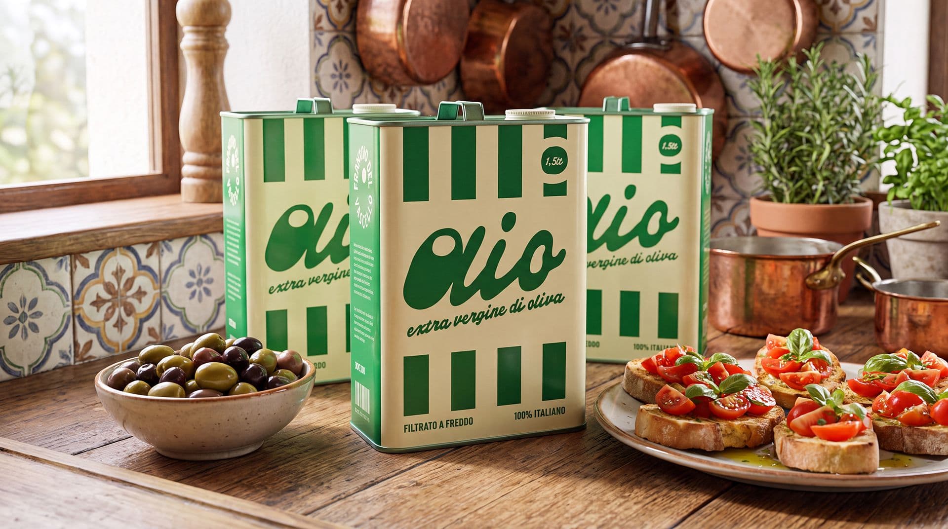
Label design for wine, olive oil, and artisanal products: how to stand out without losing authenticity
Label design for wine, olive oil, and artisanal products must manage a delicate balance. On one hand, the label needs to stand out: capture attention, make the product recognizable, and communicate quality and positioning. On the other hand, it must not look artificial, overly polished, or detached from the product's true nature.
For many products tied to a territory, agricultural production, or artisanal manufacturing, authenticity is a central part of the perceived value. It is not enough to build an elegant label. You need to bring out the origin, material, method, care, and personality without turning everything into a generic stage set.
This theme is particularly important for wine and agri-food products, where place, reputation, and tradition can be decisive elements. The European Commission explains that the geographical indications system protects the names of products originating from specific regions, with qualities or reputations linked to the production territory. Even when a product does not fall under a formal designation, the label can still help make the relationship between product, place, and identity visible.
Authenticity does not mean nostalgia
A frequent error is thinking that an authentic label must necessarily look old, rustic, or "handmade." In some cases, a historical language can be coherent, but it is not a rule. Authenticity is not born from a vintage style itself: it comes from the coherence between graphics, product, history, price, and audience.
A high-end extra virgin olive oil can have an essential and contemporary label. A natural wine can work with illustration, irregular typography, or more spontaneous marks. An artisanal product can use very clean graphics if that cleanliness effectively conveys the care, precision, and quality of the workmanship.
The point is not to "look artisanal," but to credibly communicate what the product truly is. When the graphics overforce the narrative, the effect can become the opposite: the consumer perceives a construction rather than real quality.
Origin, territory, and visual narrative
For wine, olive oil, and artisanal products, territory should not be treated as a decorative element. A hill, a village, an agricultural variety, a landscape, a dialect name, or a production detail can become visual material only if they have a concrete link to the product.
The story can be told through many elements:
- product name, designation, and geographical origin;
- colors, materials, and textures consistent with the territory;
- illustrations, marks, or typographic details linked to the brand's history.
These elements must be chosen with measure. Inserting too many local references can make the label confusing or folkloric. Using too few can result in a loss of identity. The quality of the project lies in selecting what truly matters and transforming it into a legible form.
In the case of wine, this attention must also coexist with the information required by the category. The OIV international standard for wine labeling distinguishes between general measures, mandatory information, and optional information. This confirms an important point: the label must tell a story, but it must also organize precisely what the consumer needs to be able to read.
Standing out without looking fake
Differentiation does not coincide with special effects. A label can emerge even through a highly controlled typographic choice, an intelligent use of white space, an unexpected color, a unique paper, or a composition that is quieter compared to its category.
For artisanal products, wine, and oil, the graphics must avoid two extremes. The first is anonymity: labels that are correct but similar to many others, incapable of leaving a trace. The second is an excess of style: labels built to look premium, natural, or traditional without a real link to the product.
The article Hip and Authentic: Defining Neo-Retro Style in Package Design, published in the International Journal of Design, analyzes the so-called neo-retro style in packaging. The research shows how elements such as ornaments, textures, typographic variations, muted colors, and references to artisanal production can evoke values like authenticity and craftsmanship—the care of artisanal making. However, the same research warns that these codes can also simulate heritage and craftsmanship.
This is a central point: using visual codes associated with authenticity is not enough. Those codes must be consistent with the product, the producer, and the way the brand wants to be perceived.
Typography, materials, and small marks
Typography plays an incredibly strong role in labels for wine, oil, and artisanal products. A serif typeface can communicate tradition, but also contemporary elegance. A sans-serif can look clean, technical, or editorial. A custom-drawn script can convey uniqueness, but it risks becoming fragile if used without control.
Materials speak too. The paper, embossing, hot stamping, texture, and the choice of a more tactile or smoother label all contribute to the perception of the product. These are not neutral details: they can reinforce perceived quality or create inconsistency.
During the design phase, it is best to evaluate together:
- typeface, legibility, and brand tone;
- paper, finishes, and relationship with the container;
- balance between visual narrative and essential information.
For a small production, these aspects are even more important. Often, there are no large advertising campaigns supporting the product: the label is the first available narrative. If you are working on a line of wine, oil, or artisanal products, Studio Polpo can help you transform origin, materials, and identity into a distinctive label without losing credibility.
Small productions and limited lines
Small productions have an advantage: they can afford a more specific voice. They do not necessarily have to please everyone, but they must speak well to their specific audience. A label for a limited production can be more narrative, more illustrated, more editorial, or more experimental, as long as it remains understandable.
This does not mean working without rules. Even a small line needs consistency: name, logo, formats, variants, colors, and texts must build a system. If every product changes its language, the brand struggles to establish itself. If everything is too identical, however, the variants become difficult to distinguish.
For wine and oil, the problem is often seen when a range grows: new vintages, new blends, new varieties, gift formats, special editions. Without a graphic structure, every new label risks being an isolated solution. With good direction, however, each product can have its own personality while remaining within a recognizable family.
Labels between the shelf, the shop, and digital media
A label for artisanal products no longer lives only on the physical shelf. It can be photographed for an e-commerce platform, appear in an Instagram post, be included in a catalog for buyers, travel in a newsletter, appear on a technical sheet, or become part of a video narrative.
Because of this, the design must work both up close and from a distance. It must have details to discover, but also a structure that is legible in small sizes. It must be consistent with the physical container, but also hold up when viewed on a screen. A label that is highly refined in person can lose power online if it has low contrast, overly small text, or a weak primary mark.
The design process should therefore immediately consider the real contexts of use:
- physical sales, tastings, trade fairs, and local shops;
- product photography, e-commerce, and catalogs;
- social media, digital content, and commercial materials.
Standing out also means being recognizable in the places where the product is encountered. The consumer will not always have the bottle or packaging in hand: often, they will see a photo, a story, a post, or a commercial proposal first.
Most frequent errors
Many errors stem from a superficial view of authenticity. A textured paper, a vintage font, a small illustration, or a natural color is added, but without building a coherent system. The result can look pleasant, but weak.
The most frequent errors include using artisanal codes in a purely decorative way without a relationship to the product; confusing elegance with generic design, resulting in clean but unmemorable labels; and overloading the front with too many narrative elements, making it difficult to understand the name, category, and value.
There is also a more strategic error: designing the label as an isolated object. Wine, oil, and artisanal products often need a clear range identity, even when the catalog is small. The logo, labels, commercial materials, photography, and digital content must all speak the same language.
Conclusion
The design of labels for wine, oil, and artisanal products must differentiate without constructing a mask. The goal is not to look more authentic than others, but to make visible what makes a product credible: origin, care, material, method, history, and positioning.
A good label can be contemporary without losing its roots, elegant without becoming cold, and artisanal without looking improvised. The graphic project serves precisely to find this measure: giving shape to a recognizable identity that is suited to the market and faithful to the product.
For producers, farms, wineries, oil mills, and small brands, working effectively on the label means building a more solid first point of contact with the audience. Studio Polpo can guide this journey with a visual project capable of uniting identity, narrative, and real-world applications, from the packaging to digital content.
FAQ
What should a label for wine, oil, or artisanal products look like?
It must be recognizable, legible, and consistent with the product. It is not enough to just communicate craftsmanship: the graphics must make the origin, quality, brand tone, and market positioning clear.
Does an artisanal label necessarily have to have a vintage style?
No. A vintage style only works if it is consistent with the product. An authentic label can also be essential, contemporary, or highly editorial, as long as it does not feel artificial in relation to the brand's history.
Why rely on a studio to design a label?
Because a label is not just a decorative surface. It must function on the physical product, online, in photos, in commercial materials, and within a coherent range.