Infographics: what they are, what they are for, and why they make data clearer and more memorable.
Infographics are visual tools designed to transform data, processes, and complex information into clearer, more immediately understandable, readable, and easy-to-remember content. They don't just exist to "beautify" content: they serve to organize it, simplify it, and guide the reader toward what truly matters.
In a magazine, newspaper, report, exhibition, or financial statement, information can be abundant, technical, and difficult to digest. A good infographic helps build order: it shows relationships between data, highlights proportions, clarifies steps, and makes the comprehension of visualized information more immediate.
The Nielsen Norman Group, in an article dedicated to designing effective infographics, describes them as tools that translate data into a more understandable and engaging visual medium, integrating text, images, and graphic representations. This is a useful point because it immediately clarifies their role: not to replace the content, but to make it more accessible and readable.
What infographics are
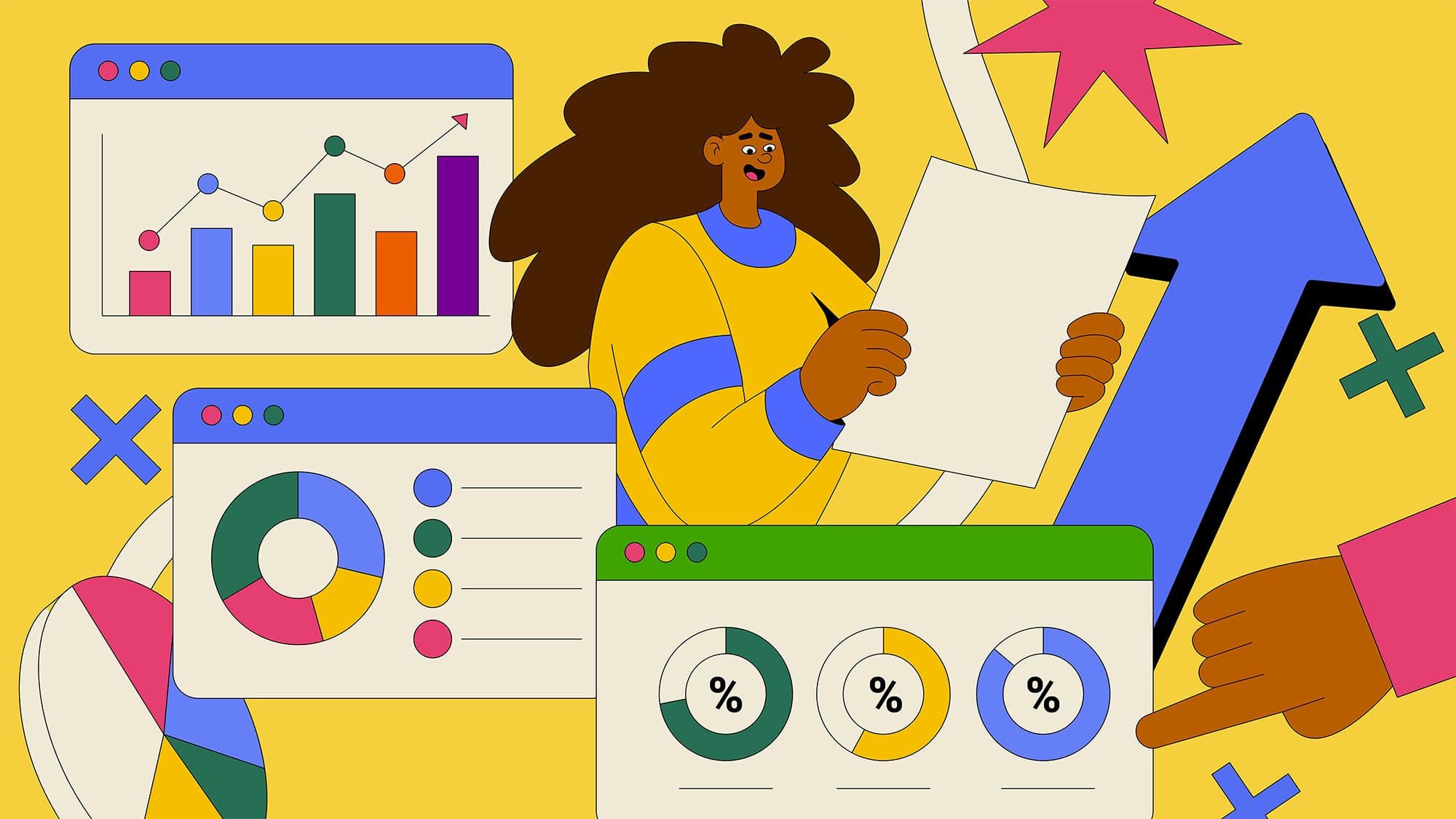
In extreme synthesis, an infographic is a visual representation of information, data, or concepts. It can use charts, icons, maps, illustrations, diagrams, numbers, short texts, and visual hierarchies to explain something in a faster and more orderly way.
It can serve to tell the story of:
- Statistical data;
- Research results;
- Complex processes;
- Comparisons between different elements;
- Chronologies and pathways;
- Organizational structures;
- Technical or educational information.
The point is not to insert many graphic elements, but to build a visual form that truly aids understanding. An infographic works when the viewer can more quickly grasp the meaning of the information and remember its main steps.
For this reason, the work is not just about the final design. Even before the visual part, there must be a phase of selection, synthesis, and organization of the content.
What they are used for, in practice
Infographics are used when content risks being too long, too technical, or too fragmented. They help transform dense information into a simpler and more readable structure, without oversimplifying it.
In practice, they can be useful for:
- Explaining a process step-by-step;
- Making data and percentages clearer;
- Comparing scenarios and results;
- Summarizing research and reports;
- Accompanying articles, dossiers, and editorial content;
- Making complex topics more accessible to different audiences.
This is especially true when the audience lacks the time, technical skills, or availability to read many pages of text. The infographic does not eliminate complexity; it organizes it. If well-designed, it allows the reader to engage with the content with less effort and a clearer view of the whole.
Infographics for magazines and newspapers
Magazines and newspapers are among the contexts where infographics best demonstrate their value. In the editorial field, the reader often encounters data, timelines, comparisons, maps, research results, technical sheets, and explanations of complex phenomena. The infographic helps transform this content into a more immediate form without sacrificing precision.
On a newspaper page or in a magazine article, an infographic can:
- Summarize data that would be difficult to read in continuous text;
- Support an investigation or in-depth analysis with additional information;
- Make a temporal sequence clearer;
- Give visual rhythm to the page without reducing the content's value.
This is particularly important because an editorial infographic must not only attract attention. It must respect the pact of trust between the publication and the reader. If data is confused, merely decorative, or presented ambiguously, the result is not only graphically weak: it risks weakening the credibility of the article and the publication itself.
Therefore, in magazines and newspapers, the quality of an infographic depends on the balance between visual clarity, informative rigor, and consistency with the editorial project.
Why they make data clearer
Data, on its own, does not always communicate. A table may contain correct information but be difficult to read. A series of numbers may be precise but fail to tell you what is important to observe.
The strength of a good infographic lies in its ability to build hierarchies: it decides what to show first, what to relate, and what to leave in the background.
An effective visualization must:
- Choose the most suitable format for the type of data;
- Avoid unnecessary decorations;
- Make the relationship between elements evident;
- Use colors and graphic marks with a clear function;
- Maintain correct proportions and comparisons.
The free training path from data.europa.eu dedicated to data visualization explains that data can be used to create practical visualizations capable of telling a story, accompanying the audience through a reading path. This is a useful source because it confirms that the value of visualization lies not in showing numbers in a more attractive way, but in making them more understandable, readable, and interpretable.
Infographics and data storytelling
An infographic doesn't necessarily have to tell a story in a narrative sense, but it must guide the reading. It must lead the viewer from a starting point to a conclusion, or at least toward a main piece of information.
This is where data storytelling comes into play: the ability to communicate information and results through a combination of data, visualizations, and narrative. Harvard Business School Online defines data storytelling as the ability to effectively communicate meaningful information derived from a set of data through narrative and visualizations.
This approach is useful because it shifts the focus from isolated data to the meaning of that data. A good infographic shouldn't just ask: “what numbers do we have?”. It must ask, above all: “what do people need to understand?”.
If you are working on editorial content, a magazine, a report, or a presentation with a lot of information, Studio Polpo can help you transform data and text into a clearer, more orderly, and more readable visual system.
When an infographic is truly effective
An effective infographic is not necessarily the most spectacular one. It is the one that manages to make content more understandable without distorting it. Quality lies in the balance between synthesis, precision, and legibility.
Usually, it works when:
- It has a clear objective;
- It selects only truly useful information;
- It uses a consistent visual structure;
- It maintains a readable hierarchy;
- It does not sacrifice accuracy for graphic effect;
- It can be understood even by those who are not familiar with the topic.
This is an important point. A bad infographic can oversimplify, confuse relationships between data, or use graphics to make weak information seem more convincing. A good infographic, on the other hand, does not force the content: it makes it clearer.
Where infographics are used
Infographics can be used in many different contexts, but they play a particularly strong role in publishing. Newspapers and magazines use them to accompany news, investigations, in-depth reports, dossiers, scientific pages, and economic, sporting, or cultural content.
They are particularly useful for:
- Magazines and newspapers;
- Corporate reports and financial statements;
- Commercial or institutional presentations;
- Editorial content, catalogs, and dossiers;
- Exhibitions, museums, and display paths;
- Materials for events and conferences;
- Technical or educational documents.
In each context, the way the infographic is designed changes. An infographic for a newspaper must be fast, accurate, and immediately readable. One for a magazine can have more space, more narrative rhythm, and a more distinct graphic treatment. One for a report must withstand closer and deeper reading, while an infographic for an exhibition must function within physical space.
The context in which an infographic is placed is not a final detail. It influences structure, rhythm, word count, dimensions, and the level of synthesis.
Most frequent mistakes
Many infographics are weak because they try to do too many things at once. They want to explain everything, show everything, and decorate everything. The result is often visually cluttered but unclear content.
The most frequent mistakes are:
- Starting with graphics before clarifying the message;
- Inserting too much data without a hierarchy;
- Using icons or illustrations merely as fillers;
- Choosing charts not suited to the type of information;
- Using colors without a precise function;
- Sacrificing legibility and precision for a stronger visual effect.
The problem is often not a lack of data. It is a lack of selection. A good infographic requires decisions: what to show, what to remove, what to highlight, and which reading path to build.
Conclusion
Infographics are useful because they help make data, processes, and complex information clearer and more memorable. They do not replace the content: they organize it, make it more readable, and help the audience grasp its meaning.
They are particularly important in magazines and newspapers, where they must support editorial work with clarity, precision, and visual strength. But they can also improve reports, presentations, exhibitions, educational materials, and institutional documents.
If you want to transform data, research, or complex content into clearer, more consistent, and recognizable infographics, Studio Polpo can help you build a visual project capable of making information more accessible without losing rigor.
FAQ
What are infographics?
They are visual representations of data, information, or processes. They use charts, icons, diagrams, short texts, and visual hierarchies to make content clearer and easier to read.
Are infographics also useful for magazines and newspapers?
Yes. In publishing, they are very useful for accompanying articles, investigations, and deep dives because they help explain data, chronologies, comparisons, and complex information more immediately.
Why rely on a graphic design studio for an infographic?
Because an effective infographic requires synthesis, hierarchy, visual clarity, and attention to content precision. A studio can help transform complex information into a readable, consistent system tailored to its context of use.