I ♥ NY: When a Logo Becomes the Symbol of a City
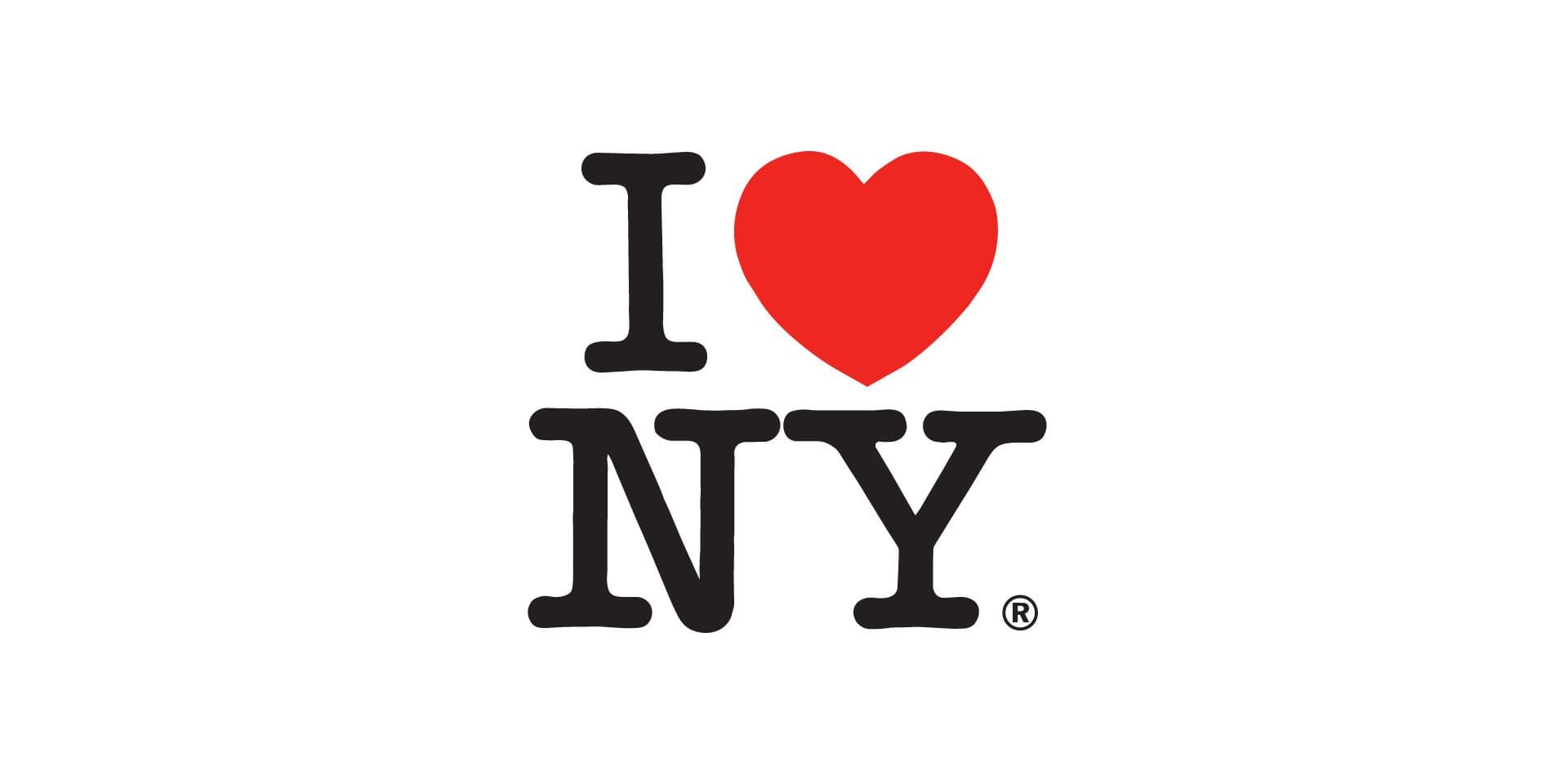
The I ♥ NY logo is one of the most famous examples of visual identity applied to a place. It consists of just a few elements: one letter, a heart and two initials. Yet it has become much more than a tourism logo. Today, it is a cultural symbol, a pop icon, a model imitated around the world and one of the most recognisable images associated with New York.
Milton Glaser’s design highlights an important principle: in city branding, the strength of an identity does not depend on how much information is packed into a logo. It depends on finding a simple, memorable and open form that people can identify with.
I ♥ NY does not depict New York through its skyline, yellow cabs, skyscrapers, bridges or landmarks. It does not describe the city. It declares it. It turns a place into an emotional statement that is easy to read, remember, wear and repeat.
A Logo Created to Promote Tourism
The logo was created in the 1970s as part of a campaign to promote tourism in New York State. The New York State Library notes that the I Love NY slogan and logo were developed to promote tourism and first used in 1977; the trademark is still owned by Empire State Development today.
The context is important. New York was going through a difficult period: economic crisis, image problems, social tensions and a public perception far removed from the polished image of a global destination. The logo was therefore not conceived as an abstract celebration of an already thriving city, but as a visual response to a moment of vulnerability.
MoMA holds the original concept layout and notes that Glaser designed I ♥ NY at a time when the city was facing the threat of bankruptcy, rising crime and garbage strikes.
This origin makes the project even more interesting. The logo does not try to hide the city’s complexity behind a reassuring image. Instead, it takes a different approach: it creates a simple gesture of belonging.
Why Is It So Simple?
The strength of I ♥ NY lies in its extreme reduction. There are no complex illustrations, institutional symbols, coats of arms, landscapes or explanations. There are only four elements, arranged in a compact composition.
The heart replaces the word “love”. This makes the message immediate, almost universal, but also visual. You do not simply read a sentence: you see an emotion. The letters NY work because New York already has a strong, short and internationally recognisable abbreviation. The “I” makes the message personal: not “New York is beautiful”, but “I love New York”.
According to Cooper Hewitt, the logo consists of the capital letter I, the red heart and the letters NY, set in the American Typewriter typeface.
The choice of typeface is crucial. American Typewriter feels less cold than a geometric typeface and less institutional than a classic serif. It feels written, declared, almost typewritten. This helps make the mark direct, familiar and easy to reproduce.
Representing the Relationship, Not the City
Many urban identity projects try to represent a place through its visible elements: landmarks, landscapes, architecture, maps and local colours. I ♥ NY does the opposite. It does not show New York. It shows an emotional relationship with New York.
This is a powerful choice. A city is too complex to be contained within a single image. New York can mean many things: finance, art, music, cinema, immigration, the subway, neighbourhoods, chaos, ambition, street life and popular culture. Glaser avoids choosing a single fragment and instead creates a mark capable of holding many different meanings.
The logo works because it leaves room for interpretation. It can be used by a tourist visiting the city for the first time, by a resident, by someone who has moved away, or by someone who dreams of New York through films and music. It does not describe the experience: it allows each person to project their own onto it.
This is one of the most useful principles in city branding. Sometimes a place identity does not need to say everything. It needs to find a form capable of activating memory, desire and a sense of belonging.
From Tourism Campaign to Pop Culture
The success of I ♥ NY also lies in its ability to move beyond official communication. The mark appears on T-shirts, bags, posters, souvenirs, mugs, stickers, campaigns, imitations and reinterpretations. It has become an object that people buy, wear and carry elsewhere.
This transition is fundamental. An institutional logo often remains tied to the organisation behind it. I ♥ NY became a formula. The “I ♥…” structure has been imitated for cities, neighbourhoods, people, products, teams, causes and events. The heart is no longer just a graphic symbol: it has become part of a shared visual language.
In city branding, reaching this point is rare. An identity becomes truly powerful when it is no longer confined to official materials but is adopted by people. Not every place brand needs to become a global icon, but every project should ask whether people can see themselves in that symbol.
For cities, territories and cultural projects, Studio Polpo can develop visual identity systems capable of turning a place or an idea into a recognisable visual language, avoiding generic or purely decorative solutions.
The Difference Between Simplicity and Banality
I ♥ NY looks easy, but it is not banal. Its simplicity is the result of precise synthesis: a short phrase, an intuitive visual substitution, a compact composition and a balanced relationship between text and symbol.
This is one of the most difficult aspects of design. A simple mark can feel obvious after it exists. Before it exists, however, it requires a clear decision: removing everything that is unnecessary. In the case of New York, it would have been natural to use the skyline, the Statue of Liberty, yellow cabs or skyscrapers. Glaser instead chose a more elementary and more open visual code.
The difference lies in memorability. An overly descriptive logo may work as an illustration but be less memorable. An overly abstract logo may look elegant but feel cold. I ♥ NY finds a middle ground: it is clear, emotional, concise and easy to reproduce.
When a Logo Becomes a System
Although it was created as a logo, I ♥ NY quickly became a system. It works in black and white or with the red heart, at small or large scale, in print or on products, in official campaigns or on commercial objects. Its structure is so simple that it can be applied and recognised almost anywhere.
Adaptability is a design quality in itself. A place identity often needs to work across very different media: posters, signage, merchandise, social media, tourism websites, events and institutional materials. If the mark is too complex, every application becomes fragile. If it is too neutral, it leaves no lasting impression.
I ♥ NY demonstrates that a strong identity can emerge from a minimal formula, provided it has:
- an immediate message;
- a compact visual form;
- a shareable emotion;
- a structure that is easy to apply and remember.
These elements help explain why the logo has moved far beyond its original role as a tourism campaign.
The Most Common Mistakes
The most common mistakes in city branding projects arise when designers try to imitate the success of I ♥ NY without understanding the logic behind it.
Mistakes to avoid include:
- copying the “I love” formula without having a genuinely distinctive idea;
- confusing simplicity with generic design;
- using obvious tourist symbols without developing a point of view;
- assuming that merchandise can compensate for a weak identity.
There is also a subtler mistake: trying to represent everything. A city is too complex to fit entirely inside a logo. The strength of a mark can come precisely from what it chooses not to show.
Conclusion
I ♥ NY became the symbol of a city because it turned New York into a simple, personal and repeatable statement. It does not describe the city through its clichés. It does not try to sum it up with a landmark. It creates a relationship: I love New York.
This is why the project remains so important for anyone working in city branding. It shows that an urban visual identity needs to be recognisable but also open; simple but not generic; official but capable of being adopted by people.
Not every place needs a pop icon like I ♥ NY. But every city, neighbourhood or urban project can learn something from this example: a good logo does more than identify a place. It makes visible the way people can feel connected to that place.
If you are working on the visual identity of a city, territory or urban cultural project, you can contact Studio Polpo to build a clear, recognisable graphic system capable of living beyond the individual logo.
FAQ
Who designed the I ♥ NY logo?
The logo was designed by Milton Glaser in the 1970s for a tourism campaign promoting New York State.
Why is the I ♥ NY logo so famous?
Because it condenses an emotional relationship with New York into an extremely simple form: one letter, a heart and two initials. It is easy to read, remember, reproduce and reinterpret.
What can I ♥ NY teach us about city branding?
It shows that a city’s visual identity does not necessarily need to describe everything. It can work better when it finds a simple, recognisable mark that people can adopt as their own.


