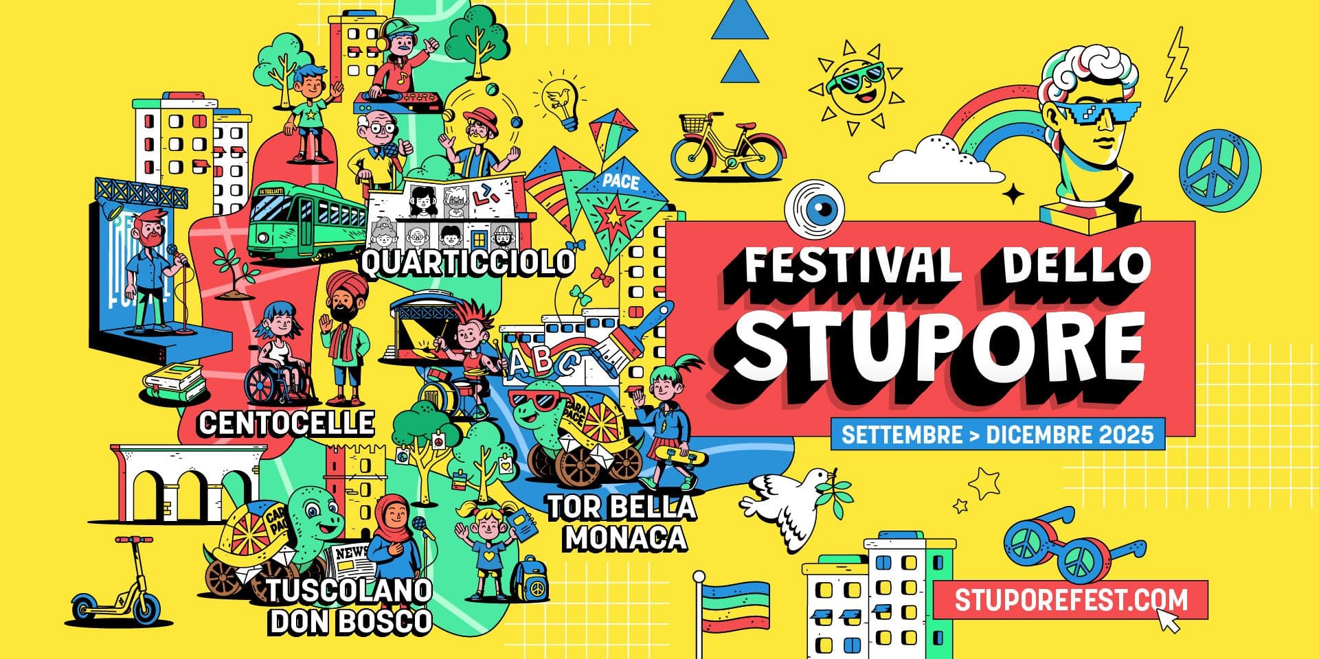
Graphics for festivals and exhibition series: how to build continuity between program, audience, and space
Graphics for festivals and cultural exhibition series must bring together many elements: program, audience, venues, guests, dates, partners, digital materials, print, signage, and event setups. It does not work on a single piece of content, but on a sequence of events that must be recognizable as parts of the same project.
Compared to a single event, a festival or series carries a different kind of complexity. There are more moments, more locations, more information, and often different audiences. Design must provide continuity without making everything look identical, helping people understand the program and orient themselves among its parts.
A strong visual identity must therefore function as a system: stable enough to be recognizable, yet flexible enough to accommodate new events, guests, formats, and content.
Festivals and Series Are More Than Events
A festival does not coincide with its poster. An exhibition series does not coincide with its calendar. Both are cultural projects built over time through a series of communications, appointments, and audience relationships.
The difference lies in continuity. The audience might encounter the project through a post, then see it again on a poster, consult the program, arrive at a venue, read an informational panel, attend a talk, receive a newsletter, or view content after the event. All these touchpoints should convey the same identity.
An Eye on Design article dedicated to festival branding illustrates this complexity: not just a logo, color, or website, but a set of elements including printed materials, signage, screens, operational details, and objects distributed during the event.
For this reason, graphic design must be conceived as a system of touchpoints. Some are highly visible, like posters and social media. Others are more subtle, like badges, passes, maps, house programs, or guest materials. Yet all contribute to the overall perception of the festival.
The Program as a Visual Structure
The program is one of the most critical elements in communicating festivals and exhibition series. It is not just a list of events: it is how the project makes itself readable. Dates, times, guests, titles, venues, sections, and categories must be organized with a clear hierarchy.
A series of talks may need to distinguish cycles, topics, and speakers. A widespread, multi-venue festival must make locations and schedules easy to understand. A program with many activities must help the public make choices. If design does not establish order, the program becomes a tedious list.
To function properly, the system should define:
- fixed elements, such as title, logo, palette, and typography;
- variable elements, such as dates, guests, venues, and sections;
- criteria for distinguishing events, categories, and pathways;
- formats for calendars, full programs, and individual event announcements.
This structure allows the program to be updated without starting from scratch every time. If a new guest arrives, a time changes, or a venue is added, the system must absorb the modification without losing consistency.
Speaking to Different Audiences
Festivals and series often do not speak to a single audience. They may target communities already close to the topic, curious visitors, industry professionals, students, institutions, sponsors, families, local citizens, or casual attendees. Graphic design must create access without flattening the content.
CultureHive, presenting a guide by The Audience Agency, describes audience development as work aimed at growing audiences, increasing participation, and building deeper relationships with people.
A festival must not only inform those who have already decided to attend. It must help diverse audiences enter the program: understanding if an event is for them, recognizing the themes, navigating the offerings, and feeling invited to participate.
Design can make this access clearer. It can distinguish levels of depth, highlight pathways, and make visible free events, school activities, workshops, specialized talks, or broader public moments. Recognizability does not just serve to "build a brand": it serves to make the project more legible.
Continuity Between Communication and Space
A festival or series does not live only in promotional materials. It lives in physical space: entrances, desks, halls, pathways, panels, backdrops, maps, directional signs, stages, screens, sponsor areas, and info points.
When the audience arrives, communication becomes an experience. Graphics seen online must find continuity in real space. If the program is clear on the website but confusing on site, the identity loses strength. If the signage does not follow the same visual language, the space appears less cared for.
A contribution published in MD Journal and available in the Politecnico di Torino archive reflects on wayfinding in cultural spaces, highlighting signage not only as a functional tool, but also as an element capable of narrating and making cultural environments accessible.
For festivals, exhibition series, and widespread cultural projects, Studio Polpo can develop visual identities and coordinated materials capable of connecting communication, programming, and physical space, maintaining consistency across digital assets, print, and environmental setups.
The System Must Hold Variations
A festival's design must be recognizable, but not monotonous. Each event can have a different title, guest, theme, venue, or tone. If the system is too rigid, everything becomes flat. If it is too loose, the audience loses the thread.
The solution lies in distinguishing what remains stable from what can change. A primary color, grid, font, or method of handling images and titles can provide continuity. Color variations, icons, modules, photographs, or illustrations can instead help differentiate sections and individual events.
This logic is especially important for series. A talk series can last weeks or months: each release must be autonomous, yet traceable to the same overarching frame. The audience must be able to recognize the project even when the speaker, theme, or location changes.
From Single Editions to Visual Memory
Many festivals are recurring. Each edition has a theme, an image, a calendar, and a specific context, but it should also build a memory over time. Those who attended the previous year should recognize a sense of continuity; those discovering the festival for the first time should perceive an already solid identity.
This balance is built with care. Changing everything every year can feel fresh, but risks weakening recognition. Repeating the exact same image forever can make the project feel static. A good system allows for evolution: keeping certain elements, transforming others, and leaving room for the edition's specific theme.
That is why it is useful to design not just the current edition, but a framework capable of growing. Design must be able to accommodate new dates, new venues, different partners, unexpected materials, digital content, and future productions.
The Most Frequent Errors
In the case of graphics for festivals and exhibition series, the most common errors occur when a strong image is designed that is poorly suited to the complexity of the program.
Errors to avoid include:
- building everything around the poster, without planning for programs, signage, and digital assets;
- using an overly rigid system that fails to distinguish events, sections, and audiences;
- changing style with every piece of communication, losing continuity between program and physical space;
- forgetting that the festival must also function in subsequent editions.
Added to these is a more subtle mistake: designing only for those who already know the subject. A cultural series must also speak to outsiders, to those who encounter the project by chance, and to those who need to quickly understand if an event pertains to them.
Conclusion
Graphics for festivals and exhibition series serve to build continuity between program, audience, and space. It must not only make a poster look attractive, but organize a system of materials capable of accompanying the project before, during, and after its events.
An effective identity makes the program readable, helps diverse audiences orient themselves, connects digital communication with physical space, supports the evolution of future editions, and allows the festival to become recognizable over time.
If you are designing an exhibition series, a festival, or a complex cultural program, you can contact Studio Polpo to build a clear, flexible, and recognizable visual system capable of living across print, digital media, and physical environments.
FAQ
What is the purpose of graphic design for a festival?
It serves to make the project recognizable, organize the program, guide the audience, and maintain consistency across digital materials, print, and physical space.
What is the difference between graphics for a festival and graphics for a single event?
A festival or series must manage multiple events, dates, guests, venues, and audiences. Therefore, it requires a more flexible and continuous system.
How do you maintain continuity between different editions?
By keeping certain elements stable, such as structure, typography, or recurring marks, while varying other elements tied to the theme, program, or specific year.


