Graphic props for period films: how to build historical coherence between typography, printing, and materials
In period films, graphic props have a delicate task: they must look as though they belong to the time of the narrative without drawing too much attention to themselves. Letters, documents, newspapers, signage, labels, tickets, posters, ledgers, letterheads, and packaging build a silent but fundamental part of the film's visual world.
When they work, the viewer does not analyze them. They accept them. A telegram, a receipt, a newspaper page, or a medicine box appear credible because typography, printing, paper, weathering, and visual language hold together. When something is wrong, however, even the smallest detail can break the illusion: a font that is too modern, paper that is too white, a print that is too clean, or a layout that belongs to a different era.
Designing graphic props for period films does not mean copying "a vintage style." It means building coherence between the historical period, location, social class, the object's function, the scene in which it will appear, and its distance from the camera. A document intended for a close-up does not require the same level of detail as a poster in the background, but both must belong to the same universe.
Research before style
The first mistake would be starting with the aesthetics. Before choosing fonts, textures, or papers, it is necessary to understand what the prop needs to tell: who produced it, in what year, in what country, for what use, with what tools, and for what type of person or institution.
An administrative document, a theater playbill, a private letter, and a commercial label do not answer to the same rules. The tone, layout, medium, print quality, amount of information, and level of care all change. Research serves to prevent everything from ending up inside a generic "antique effect."
The graphic designer Iskander Amyatt-Leir, interviewed by Creative Lives in Progress, talks about his interest in projects set in the past and cites research among ephemera, archival objects, and museum references as part of his way of working.
In a project for cinema, this phase should clarify at least:
- the year, location, and social context of the narrative;
- the function of the prop in the scene and its distance from the camera;
- printing techniques, mediums, and visual languages plausible for that period.
Research does not serve to fill the project with citations. It serves to narrow the field. Knowing what was already possible, what was common, what was rare, and what would be anachronistic allows one to design with more freedom, but within a credible perimeter.
Typography: choosing an "era-appropriate" font is not enough
Historical typography is one of the most delicate aspects of graphic props. A font may look ancient but belong to a very different period than the one represented. Or it may be a modern digital reissue of a historical typeface, with proportions, cleanliness, and details that betray its contemporary origin.
For this reason, it is not enough to search for "vintage fonts." One must ask what type of composition was plausible: movable type, manual lettering, typewriter, dry transfers, photocomposition, commercial printing, office forms, painted signs, stamps, lithography, offset. Each technology produces different shapes and brings with it a certain way of organizing the page.
The St Bride Foundation makes historical typographical specimens available online, including a collection of type catalogs prior to 1831. These materials show how much the history of typography is made of very specific shapes, weights, proportions, and ornaments that are difficult to reconstruct by relying solely on a generic impression of "old."
In period films, the typographical choice must therefore hold together both accuracy and readability. A typeface can be coherent but poorly suited to the camera. A document can be historically plausible but unclear to the viewer. The project lies in finding a balance: making the prop look authentic without sacrificing the narrative function of the scene.
Printing and reproduction techniques
Typography does not live separate from printing. The same layout changes completely if imagined as letterpress, lithography, offset, photocopy, inkjet print, typewriter, or rubber stamp. In period films, this difference is decisive.
A nineteenth-century document should not have the same sharpness as a contemporary digital print. A receipt from the 1950s should not look like it came out of a modern laser printer. A popular poster can afford imperfections, misalignments, and irregular inking; institutional letterhead may have a very different level of control.
Historical coherence is also born from these details:
- margins, alignments, folds, and processing marks;
- ink pressure, registration, absorption, and irregularities;
- the format of the medium, paper weight, color, and degree of wear.
Not all props need to be dirty or worn out. A freshly delivered note, a newly put up poster, or a brand-new letter within the story must appear new for that era, not old to us. Weathering must be measured based on the object's biography: where it has been, who used it, how much time has passed, and what role it has in the scene.
Materials: paper, stamps, envelopes, labels
Material coherence is often what makes a graphic prop convincing. Paper, envelope, glue, stamp, ink, fold, binding, edges, holes, staples, tape, labels, and seals tell the story of the period just as much as the design.
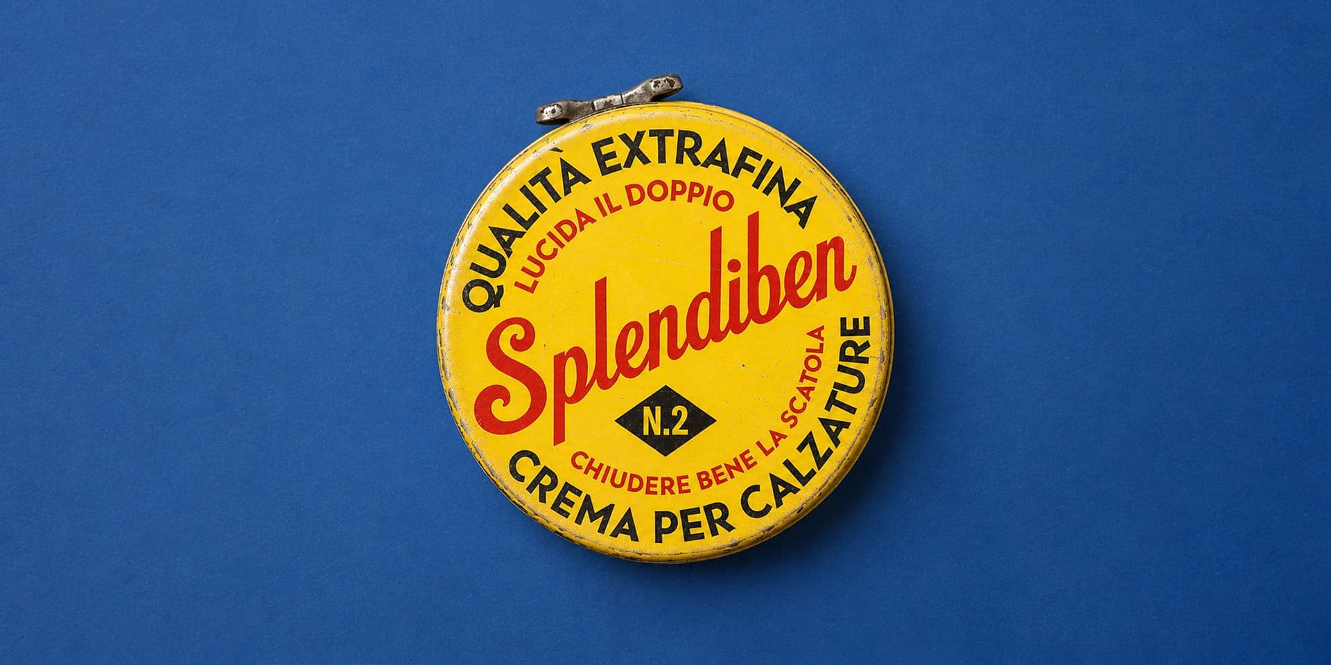
A telegram is not just text with a font. It is a medium with a format, a hierarchy, a type of paper, a print quality, and a bureaucratic language. A product box is not just illustrated packaging: it is an object that must look as though it was produced, distributed, bought, opened, and kept within that world.
The John & Griselda Lewis Printing Collection at the University of Reading collects printed materials from the 14th century to the 1990s, related to the history of printing, ephemera, and graphic design. Its breadth shows how much minor documents — notices, commercial papers, forms, ephemera, everyday print items — are precious for understanding how graphics lived in daily life. (collections.reading.ac.uk)
For a period film, this dimension is central. The graphic prop must not just look "well-designed." It must look as though it was produced with tools, materials, and habits compatible with the time of the story.
Hero props and background props
Not all graphic props have the same importance on scene. Some are hero props: they are read, touched, framed closely, shown to the audience, or used by a character in a narrative way. Others remain in the background: posters, signs, documents on a desk, labels on a shelf, open newspapers, tickets, files, logs.
This difference influences the design. A hero prop must withstand a close-up: text, materials, details, folds, stamps, and finishes must be meticulously crafted. A background prop can be more simplified, but not accidental because of it. If it appears in quantity or builds the atmosphere of a space, it still contributes to the overall credibility.
The risk is focusing all attention on the protagonist document and leaving the rest in an approximate style. In a period film, however, coherence is often born from the sum of minor elements. A desk, a shop, an office, a street, or a kitchen become credible because every graphic object speaks the same historical language.
For film productions, series, documentaries, or content set in specific eras, Studio Polpo can develop graphic projects and visual systems capable of holding together historical research, typography, printed materials, and narrative needs.
Historical coherence does not mean museum reconstruction
A film is not an archive. Even when working on a precise era, it must build a visual world readable to the contemporary viewer. Historical coherence does not always coincide with the most philologically accurate reconstruction possible.
Sometimes it is necessary to simplify. Sometimes it is necessary to make a document more readable that in reality would have been more confusing. Sometimes text must be perceived in a second, not actually read. Sometimes the color must dialogue with photography, production design, and costumes more than exactly reproducing a historical sample.
The point is to avoid gratuitous anachronism. A prop can be stylized, synthesized, or slightly reinterpreted, but it must remain credible within the system of the film. If the direction, photography, and production design build a realistic world, the graphics cannot look like a decorative citation. If instead the film has a more expressive tone, even the props can take on a more interpretative quality.
The right question is not just: "was it made like this?". It is also: "does it work for this scene, with this light, with this character, inside this film?".
Written language and invisible details
In period graphic props, it is not just the visual aspect that counts. The written language matters too. A bureaucratic formula, an address, a currency, a date, an institutional acronym, a way of greeting in a letter, or a commercial wording can make a document more credible or betray it.
These details will often not be read in their entirety, but they exist. And when the camera gets close, they become important. A date written in the wrong format, an anachronistic phone number, an administrative designation that did not yet exist, or an overly contemporary advertising tone can create friction.
Work on graphic props therefore requires attention to:
- linguistic formulas and vocabulary of the period;
- plausible data, numbering, addresses, currencies, and acronyms;
- coherence between the text, character, location, and function of the document.
This precision does not serve to show cleverness. It serves to make the graphic work disappear into the film. The viewer must believe in the object, not think about who designed it.
From design to production
Once the design is defined, the prop must be produced. This is where graphic work meets print proofs, paper, cutting, folding, weathering, duplicates, and set management. An object that appears only once may still require multiple copies: one for the actor, one for close-ups, a backup, and one to get dirty or torn.
Production must also consider timing and actual use. A newspaper may be flipped through. A letter may be folded and opened multiple times. A label may need to adhere to a bottle. A poster may be glued to a wall. A document may be wetted, burned, torn, or stained according to the needs of the scene.
For this reason, it is important to design while already thinking about handling. A graphic prop is not a flat image. It is a scenic object. It must work in front of the camera, but also in the hands of the actors, under the light, on the set, and within the rhythm of production.
The most frequent mistakes
Mistakes in graphic props for period films often arise from an overly superficial idea of the past. A texture is added, the paper is yellowed, a "retro" font is chosen, and it is thought to be enough. But historical credibility is made of relationships: between era, technology, materials, function, and narrative.
The most frequent mistakes are:
- using typographical characters that are not compatible with the era represented;
- weathering all materials in the same way, even when they should be new within the story;
- designing the prop as a graphic image, without considering printing, the medium, and use on set.
To these is added a more subtle mistake: confusing recognizability with stereotype. Not everything that is ancient must be brown, worn out, calligraphic, or full of ornaments. Every historical period has many different visual voices. The quality of the project lies in choosing the right one for the film.
Conclusion
Graphic props for period films build an essential part of the visual credibility of a narrative. Typography, printing, and materials must work together to make every object look born inside the world of the film, not added by the production.
Historical coherence does not depend on a single element. It is born from many choices: font, composition, paper, ink, printing technique, written language, format, wear, narrative function, and relationship with production design, costumes, and photography.
A good graphic prop does not necessarily have to make itself noticed. It must withstand the gaze when the camera gets close and disappear when it stays in the background. If you are working on a film, a series, or an audiovisual project set in a precise era, you can contact Studio Polpo to develop graphic materials coherent with the period, tone, and production needs.
FAQ
What are graphic props for period films?
They are graphic materials created to appear on scene in a story set in the past: letters, newspapers, labels, posters, documents, signs, packaging, ledgers, tickets, and other printed objects.
Why is typography important in period films?
Because every period has different tools, characters, compositions, and reproduction techniques. A font that is too modern or an anachronistic layout can make the film's world less credible.
Do graphic props always have to be historically perfect?
Not necessarily. They must be credible and coherent with the film. Sometimes a very accurate reconstruction is needed, other times a more readable synthesis, as long as it does not break the historical illusion.