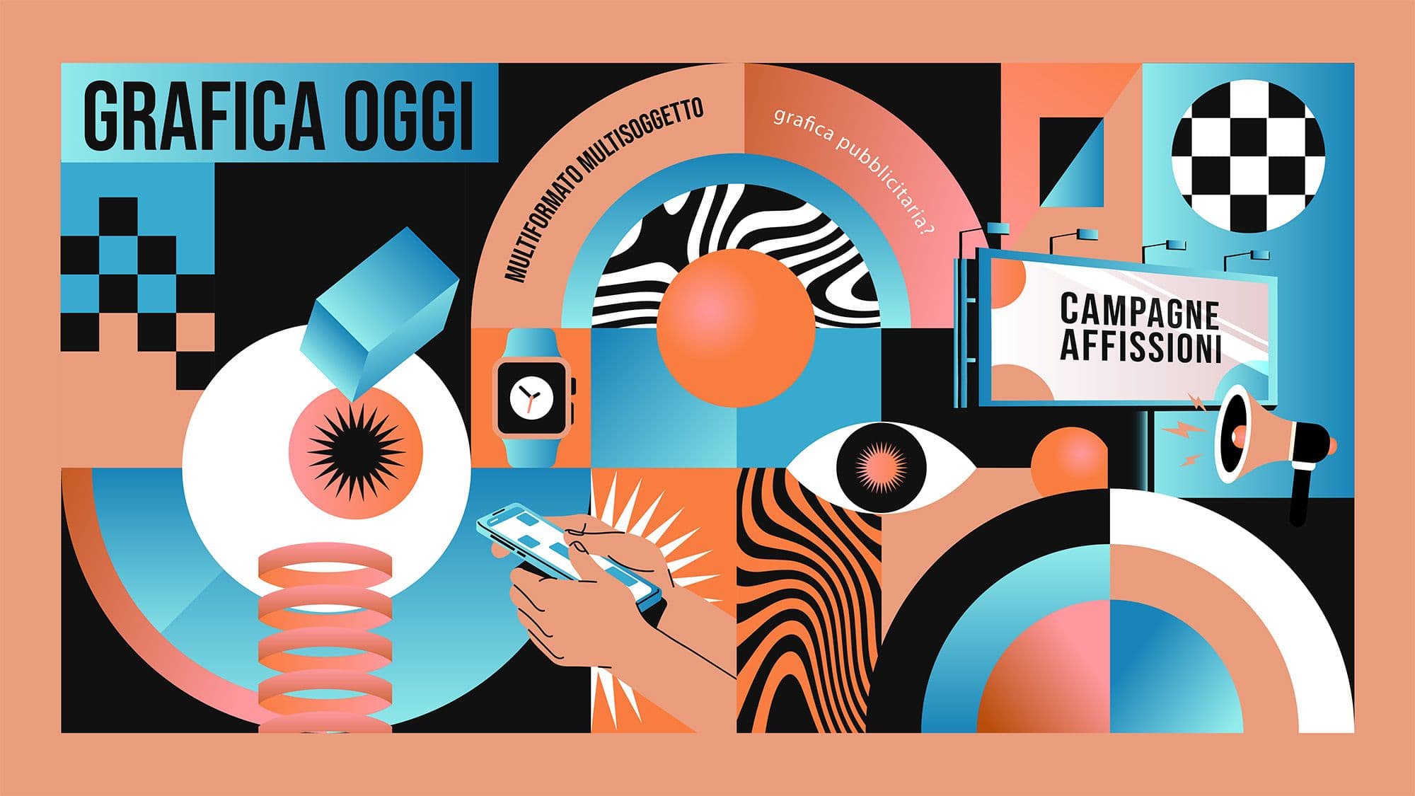
Graphic design for advertising today: how it is evolving across digital campaigns, out-of-home media, and multi-format content
Those looking for advertising graphic design today are often not just looking for a "beautiful" visual. They are looking for a way to make a campaign clearer, more recognizable, and more suitable for the contexts in which it will be seen: social feeds, outdoor screens, landing pages, display ads, point-of-sale materials, billboards, and video content. The difference compared to a few years ago is that the visual project must function in a much more fragmented environment, where every message is read at different times and on different devices.
For this reason, advertising graphics can no longer be thought of as an isolated file. They must work as a visual system: a set of choices that holds together hierarchy, adaptability, recognizability, and continuity. Analyses published by Think with Google on top video creatives clearly show that the most effective brands don't just appear in a channel: they design stories and cues capable of remaining legible even when formats change.
Why the context has changed today
The main change concerns attention, but it goes beyond that. The relationship between creativity and distribution, between message and medium, and between brand and consumption speed is also shifting. In this framework, advertising graphics have become less ornamental and more structural: they serve to create order, build priorities, and make the campaign recognizable in increasingly rapid transitions.
The primary change is indeed about attention. A campaign might be seen on the move, without audio, from a distance, in a few seconds, or during very rapid browsing. In this scenario, advertising graphics must do two things at once: stop the eye and facilitate the reading of the message. It is a challenge that is more strategic than aesthetic, because it forces a choice on what truly needs to emerge and what can stay in the background.
- immediately establishing the primary element to be noticed;
- functioning well even with very short exposure times;
- maintaining coherence when the medium, size, and format change;
- remaining legible without becoming rigid or repetitive.
Digital campaigns, billboards, and multi-format content
Today, the point is no longer choosing a privileged medium and adapting everything else accordingly. The point is to build a campaign that is born ready to live in many forms. This requirement has raised the level of graphic design because it needs more mature systems that are less dependent on a single starting format.
For years, it was thought that every medium needed an almost separate language. Today, differences remain, but they must be managed within the same creative family. A billboard visual is not a Story, and a Story is not a banner, but all three can belong to the same narrative if the system has been well-conceived. Kantar emphasizes that recognizable brand elements such as style, visual codes, and recurring signals, help creativity perform better over time and across different contexts.
The point, therefore, is not to make everything identical. The point is to ensure that every format feels like part of the same conversation. When this happens, advertising graphics stop being a last-minute adaptation and become the layer that holds the campaign together.
Use cases: where the change is truly visible
Looking at use cases helps to understand that the change is not abstract. It is visible in moments when a campaign must maintain strength and precision despite changes in medium, duration, context, or viewing distance.
The change is particularly evident in three situations. In digital campaigns, where the message must emerge in just a few moments. In billboards and outdoor advertising, where distance and exposure time demand very strong hierarchies. And in multi-format content, where the same campaign must exist in static visuals, short clips, vertical adaptations, and supporting materials. In all three cases, "doing graphics" is not enough: you need a structure that holds up.
If you are working on a campaign that will live across multiple materials, this is the right time to understand which elements must remain fixed and which can change. Studio Polpo can help you build advertising graphics that don't stay locked in a single format but truly hold their own across ADV, billboards, digital, and supporting content.
What makes advertising graphics effective today
Effective advertising graphics today don't just strike; they must also select, guide, and clarify. In this sense, the best project is the one that makes the message stronger without forcing the audience to make a useless effort to decode it.
Today, effective advertising graphics hold together impact and utility. It is not enough to have a strong image if the message is not understood. And it is not enough for the message to be understood if the brand disappears. Kantar’s analyses on attention and creative effectiveness remind us that attention only truly counts when it is consistent with the brand, context, and content.
- a sharp visual hierarchy that makes the main message emerge immediately;
- a clear relationship between image, text, and call to action;
- recognizable brand cues, without always depending on a logo placed at the end;
- a construction flexible enough to generate adaptations without losing quality.
The most frequent mistakes
Common mistakes almost never stem from a lack of taste. Rather, they arise from "short-sighted" design that looks at the individual output rather than the overall life of the campaign. When this happens, the work may look correct but struggles to build continuity.
- designing a visual thinking of only one format and then forcing it onto all others;
- overloading the creative with too many elements, reducing the impact of the main message;
- separating graphic work too much from strategic work, as if design only arrives at the end;
- using strong images but lacking a hierarchy capable of guiding the reading.
Even though many today simply look for "graphics," the real need often remains this: finding a visual form capable of sustaining a campaign, a promotion, or a commercial narrative. In this sense, advertising graphics is not a definition to be discarded, but a field that has expanded. If a campaign must live well across digital, billboards, print materials, and video content, you don't just need "someone to do the layout." You need a visual project that holds everything together with order and criteria.
In many cases, the real difference is not made by the campaign budget, but by the quality of the system that supports it. Creativity thought through more deeply manages to produce more variants, last longer, and leave a more solid impression even when the available means are not massive.
If you want your next campaign to have a clearer, more recognizable, and easier-to-adapt form, Studio Polpo can help you build a visual system that is truly useful: not just for the main release, but for all the materials that will support it over time.
FAQ
Are advertising graphics only for large campaigns?
No. They are useful even for small or local campaigns, especially when materials must live on multiple formats and maintain consistency.
Does the visual or the message matter more today?
Both matter, but they only work when designed together.
Can billboards and digital share the same layout?
Yes, if there is a clear visual direction. They don't have to be identical, but they must belong to the same system.