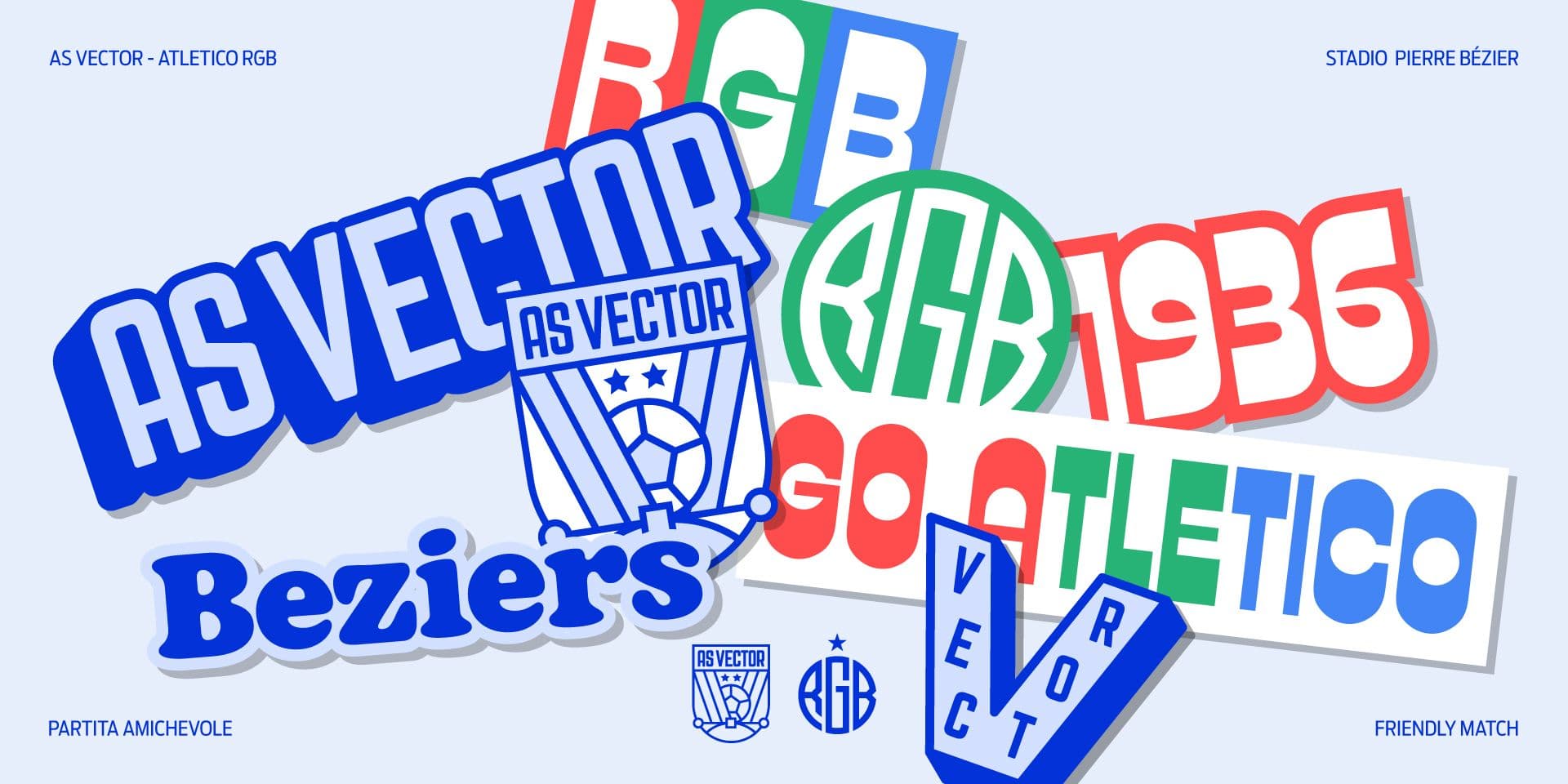
From matchday to narrative: how football teams use graphics, irony, and pop culture on social media
Some football matchday graphics are no longer limited to just announcing a match. They are not simple cards with date, time, and opponent, but small digital posters built around an idea. The match becomes a subject to be interpreted: a city, a rivalry, a popular reference, a cinematic quote, an ironic joke, a fragment of football culture.
This is where matchday graphics stop being a recurring format, always the same as themselves, to become a narrative. Every match can indeed suggest a different imagery: a traditional dish, a music cover, a film, a nostalgic object, a monument, an idiom, a historical episode, or a joke that speaks directly to the fans. The graphics do not just communicate "today we play," but build an emotional and cultural context around the match.
Football Business Inside describes football clubs as entities increasingly close to media companies—businesses that produce content with strategies shifting from simple sponsorship to the production and distribution of content. In this scenario, the content linked to the match does not end with the 90 minutes: it begins before the kick-off, accompanies the wait, continues during the match, and remains active even after.
When a match becomes a visual concept
The most interesting matchday graphics are born when the match is treated as a unique concept, not as a simple sporting appointment. The designer does not start only from the information to be included, but from a broader question: what does this match represent?
The answer can come from many elements:
- the city of the opponent;
- a recognizable symbol of the rival team;
- a reference to the club's history;
- a geographical, gastronomic, or cultural element;
- a sporting rivalry;
- a visual language taken from cinema, music, advertising, or publishing.
This type of work works because it transforms a recurring content into a specific episode. The match is no longer a box on the calendar, but an opportunity to build an image with its own personality.
The difference compared to a standard graphic is clear. In an informative card, clarity matters most. In a narrative matchday graphic, interpretation matters too. It must remain readable, but it must add a point of view.
Irony, quotation, and recognition
Irony works very well in football because fans live on rituals, nicknames, rivalries, jokes, and shared references. A graphic can activate this heritage without over-explaining it: an object, a phrase, a texture, a composition, or a typographic cut that refers to something known is enough.
Quotes can come from:
- films and television series;
- music covers;
- video games;
- advertising posters;
- vintage sports newspapers;
- memes;
- local imagery linked to cities, neighborhoods, or fan bases.
The point is not to quote for the sake of quoting. A matchday graphic works when the viewer feels a small pleasure of recognition: they understand the reference, catch the joke, recognize the club's tone. This makes the content more commentable and shareable.
The quote, however, must be calibrated. If it is too obvious, it feels lazy. If it is too cryptic, it doesn't land. If it is too aggressive, it can cause problems. The strength lies in the measure: using pop culture and irony without losing control over the tone.
Pop culture and club identity
Pop culture is not just an archive of references to take ideas from. For a team, it can become a way to define its tone: more cultured, more ironic, more popular, more nostalgic, more local, or more international.
A club can choose to work on:
- very accessible references, suitable for a wide audience;
- more refined quotes, designed for those who love to recognize details;
- local imagery, linked to the city and the fan base;
- vintage languages, to recall memory and tradition;
- contemporary aesthetics, to speak to younger audiences.
This does not mean distorting the team's identity. On the contrary, it means using it as a filter. The same cultural reference can work for one club and feel out of tone for another. A team with more institutional communication will use irony differently than a team used to a more direct, pop, or provocative tone.
Telling the story of the opponent
One of the most interesting aspects of creative matchday graphics is the way they treat the opponent. The other team is not just a name to put next to the club logo. It can become the trigger for the story.
The reference can be born from:
- a symbol of the city;
- a color or a historical jersey;
- a nickname;
- a local tradition;
- a stadium;
- an element of the rivalry;
- a shared memory between the two fan bases.
This type of narrative is delicate. It must be recognizable without becoming a caricature. It must be able to play with the opponent without being gratuitous or excessively provocative. In football, especially on social media, the tone is part of the content: a wrong joke can become more visible than the graphic itself.
When it works, however, the reference to the opponent gives depth to the post. The match becomes an encounter between imageries, not just between teams. It is a small form of sporting storytelling: the content prepares the match emotionally, makes it more specific, distinguishes it from all the other matches of the season.
From a single graphic to a series
A very successful matchday graphic can attract attention, but the true value is born when this approach becomes a series. Every match can have a different idea, but all must belong to the same visual universe.
A well-designed series holds together:
- variety of concepts;
- consistency of tone;
- recognizability of the club;
- constant graphic quality;
- publication rhythm;
- ability to surprise without disorienting.
This is a difficult balance. If every graphic changes too much, the feed loses identity. If everything stays too similar, the story fades out. The solution is not to always repeat the same layout, but to build flexible rules: a recognizable palette, a certain use of typography, a consistent way of treating images and textures, a visual grammar that can host different ideas.
Narrative matchday graphics work exactly like a collection of small posters: every episode has a theme, but the audience recognizes the voice of the one telling it.
From social media to product
The strongest matchday graphics do not necessarily live only in the feed. They can leave the post and become products, posters, t-shirts, editorial content, stadium materials, or collectibles. When a graphic is recognizable enough, it can become a physical memory of the match.
This transition is important because it changes the value of the content. A graphic born to announce a match can become:
- a memory of the day;
- a purchasable object;
- a content to be shared;
- a sign of belonging;
- a small extension of merchandising.
In this sense, the matchday is not just digital communication. It can become a point of contact between social media, the fan base, the stadium, and the product. The content works best when it is not thought of as a disposable image, but as a part of the club's visual ecosystem.
The role of art direction
In narrative matchday graphics, art direction is the true center of the project. It is not enough to find a fun idea. You have to decide how to translate it into an image, how much to push the quote, how much to leave to readability, what tone to use, and how to maintain consistency with the club.
Art direction works on:
- choice of cultural reference;
- ironic, nostalgic, epic, or pop tone;
- typographic style;
- photographic or illustrative treatment;
- balance between information and narrative;
- continuity with the season's communication.
Content Stadium, in an article republished by ESB Marketing Netzwerk, highlights how sports content on social media is moving more and more towards entertainment, humor, and shareable formats. The same article emphasizes that many football organizations use fun or lighter content to reach broader audiences, especially on platforms where language is faster and more informal.
For a team, art direction serves precisely to prevent every piece of content from looking improvised. Creativity becomes more effective when it has a clear design framework.
Why this approach works even outside of the major leagues
Narrative matchday graphics are not reserved only for big clubs. A club with less budget can still build more recognizable content if it works well on tone, local references, and visual consistency.
In fact, for teams with a very rooted community, territorial references can be even stronger. A small stadium, a local rivalry, a symbol of the city, an idiom, a local festival, or an element of the neighborhood can become narrative material.
A sustainable system can include:
- simple graphics for ordinary matches;
- more polished concepts for special matches;
- local references that are easy to recognize;
- a consistent style during the season;
- formats adaptable to social media, print, and merchandising.
There is no need to imitate the communication of the biggest clubs. There is a need to find a language suited to one's own history, audience, and resources. A well-thought-out graphic can give professionalism even to a smaller team, especially when it comes from a clear idea.
Most frequent errors
When a matchday graphic tries to be narrative, the errors are different from those of standard graphics. The problem is not just readability or layout quality. The problem is the relationship between idea, tone, and context.
The most frequent errors are:
- using pop references without a real link to the match;
- building a visual joke understandable only to a few;
- imitating a viral language without adapting it to the club's identity;
- pushing too hard on provocation towards the opponent;
- losing essential information inside the concept;
- changing style with every post without a recognizable direction.
The point is not to be creative at any cost. It is to build content that makes sense for that match, for that team, and for that audience. A good narrative matchday graphic should not just surprise: it should seem inevitable, as if that reference were the right way to tell exactly that match.
Conclusion
The most interesting football matchday graphics are those that transform the match into a visual narrative. They don't just say that a game is being played: they interpret the match through irony, pop culture, local references, sporting memory, and art direction.
When this work is done well, the content becomes more recognizable, more shareable, and closer to the fans' language. Graphics are not just an informative support, but a way to give personality to the season and build a stronger relationship with the audience.
For a team or a sports club, working on more narrative matchday graphics means giving more value to every match, even when the calendar is full and contents risk looking alike. Studio Polpo can help you build a visual system capable of transforming matches into more memorable, consistent, and recognizable content.
FAQ
What makes a matchday graphic narrative?
A matchday graphic becomes narrative when it does not limit itself to communicating the opponent, date, and time, but builds a visual idea linked to the match: a quote, a local reference, a joke, or a recognizable imagery.
Do irony and pop culture always work in football?
No. They work when they are consistent with the team's tone, understandable for the audience, and linked to the match context. If they are forced, they risk appearing gratuitous.
Do you need a large budget to make creative matchday graphics?
Not necessarily. Even with limited resources, an effective system can be built by working on clear ideas, local references, typographic consistency, and a visual direction that is sustainable over time.