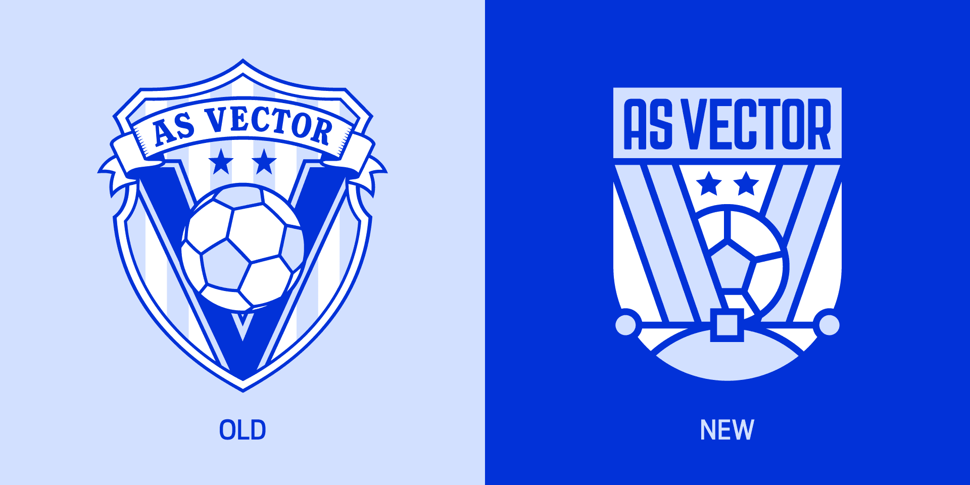
Football team crest restyling: why more and more clubs are updating their logo
The restyling of a football team's crest is one of the most delicate subjects in sports branding. A crest is not just any logo: it represents history, belonging, the city, the fanbase, victories, defeats, and collective memory. For this reason, any change, even a minimal one, can spark intense debate.
In recent years, however, more and more clubs have begun to update their visual identity. Some have done so with light interventions, simplifying details and improving legibility. Others have chosen more radical transformations, moving from traditional crests to more essential marks designed to perform better in the digital sphere.
The reason is clear: today, a team's crest must live on many more platforms than in the past. It doesn't just appear on the jersey or match tickets, but also on social media, apps, e-commerce, matchday graphics, videos, merchandising, sponsor presentations, icons, animations, and mobile content. Research published in Soccer & Society observes that, with much of the brand experience now distributed digitally, many clubs are updating their crests or entirely rethinking their visual identity.
Why so many clubs are updating their crests
Many football crests were born in a completely different context than today's. They were designed for jerseys, official documents, match programs, tickets, scarves, and printed materials. Today, they must also work in small, dynamic formats that are very quick to read.
A restyling can serve to:
- improve legibility in digital formats;
- simplify overly complex details;
- make the crest more suitable for animations and social content;
- create a more coherent visual system for merchandising and communication;
- update an identity perceived as dated;
- strengthen the club's positioning as a contemporary brand.
This does not mean erasing history. A good restyling should start from the club's most recognizable elements: colors, symbols, shield shape, founding year, references to the city, nicknames, heraldic marks, or details linked to the fanbase.
The challenge lies in understanding what can be simplified and what, instead, must remain. In football, removing an element can be perceived not just as a design choice, but as a symbolic loss.
Crest or logo: why the difference matters
In common language, people often speak of a team's "logo," but in football, the term "crest" carries a different weight. A logo belongs to the language of branding; a crest also belongs to tradition, belonging, and collective identity.
This difference is important because it explains many of the fan reactions heard in recent years. For a company, updating a logo can be a standard positioning choice. For a team, intervening on the crest means touching something that many people feel belongs to them.
A football crest often contains:
- club colors;
- city or territorial symbols;
- historical references;
- heraldic elements;
- founding year;
- shapes consolidated in the fans' memory.
Problems arise when the restyling is perceived as a transition from a sporting symbol to a corporate brand. This is a very current tension: clubs must grow as global brands, but they cannot lose the emotional bond with their community.
Therefore, an effective restyling should not only ask if the new mark "works better." It should also ask what it communicates, what it preserves, and how it will be read by those who experience that crest as part of their identity.
The role of digital
Digital needs are one of the primary reasons many clubs are rethinking their crests. A highly detailed mark might look beautiful on a jersey or a large panel, but it can be weak when reduced to a few pixels, animated in a story, or placed in a crowded social media graphic.
A contemporary crest must work:
- in large and small sizes;
- on light and dark backgrounds;
- on jerseys, apps, social media, and video;
- in static and animated versions;
- alongside sponsors and partners;
- within complex graphic systems.
Digital doesn't necessarily dictate minimalist crests, but it requires greater control. Lines that are too thin, minute details, unreadable text, and overly complex shapes can create rendering issues.
The Juventus case is one of the most famous and radical examples. In 2017, the club presented a new identity based on an essential mark, built around the black and white stripes, the scudetto shape, and the letter J. The club described the new logo as a synthesis of its core elements, designed for a new phase of its identity.
The point is not that every team must make such a stark choice. But the Juventus case shows how significant the jump between a traditional crest and a contemporary brand can be. For some clubs, it might make sense. For others, a more measured update is much more appropriate.
Tradition and recognizability
A crest restyling only works if it can distinguish between tradition and habit. Not everything that is historical is untouchable, but not everything that is old should be eliminated. Some elements can be simplified, while others must stay because they are the heart of recognizability.
The questions to ask are:
- which elements truly identify the team;
- which details are secondary or hard to read;
- which symbols have a strong value for fans;
- which parts of the crest still work well;
- which aspects make it difficult to use in new formats.
More cautious than the Juventus approach was the one chosen by Newcastle United. In 2025, the club launched a consultation with fans to update the crest, indicating a "Refine & Revive" direction as the recommended path—meaning refining and breathing new life rather than revolutionizing. In official communications, the club asked supporters what to keep, what to update, and how to preserve the spirit of history while building for the future.
This kind of process highlights a decisive aspect: the restyling of a crest is not just about the final design. It is also about how the change is explained, shared, and accompanied.
The risk of rejection by fans
In football, a restyling can be technically correct and still fail if it is perceived as detached from the fanbase. Fans do not evaluate a crest solely as a graphic object. They evaluate it as a symbol of belonging.
The most frequent critical points are:
- simplification perceived as impoverishment;
- loss of historical symbols;
- an overly corporate tone;
- lack of transparency in the process;
- absence of community involvement;
- changes that are too radical compared to the club's visual memory.
This does not mean fans should decide every design detail. It does mean, however, that a club must know the emotional value of the crest well before modifying it. The graphic project and the communication strategy must move forward together.
A well-managed restyling doesn't just present a new mark. It tells the story of why that mark is changing, what it preserves, what it improves, and how it fits into the club's future.
When restyling is truly necessary
Not all crests need a restyling. In some cases, the risk of losing recognizability may be greater than the benefit. In others, an update becomes almost inevitable because the crest can no longer handle the contexts in which it must live.
A restyling can be useful when:
- the crest is hard to read in small formats;
- it contains too many details that are difficult to reproduce;
- it doesn't work well on digital and video;
- it creates application problems on merchandising and technical materials;
- it is inconsistent with the rest of the visual identity;
- the club is redefining its positioning.
In many cases, a revolution isn't necessary. A cleaning job can be enough: redrawing shapes, correcting proportions, improving typography, rationalizing colors, and creating secondary versions for specific uses.
The quality of the project lies in finding the right level of intervention. A restyling that is too timid might not solve the problems. One that is too radical can create distance.
The crest within a visual system
A crest never lives alone. It must function within a broader identity: color palettes, typography, patterns, photographic treatments, social graphics, commercial materials, signage, website, matchday graphics, jerseys, and merchandising.
For this reason, restyling should consider:
- the primary version of the crest;
- simplified or monochromatic versions;
- usage rules on different backgrounds;
- social and mobile applications;
- use on kits and merchandising;
- integration with sponsors and partners;
- any animations and video content.
A contemporary crest must be flexible but not generic. It must adapt to many contexts without losing its identity. This is where the work of a graphic design studio can make a difference: not just in drawing a symbol, but in building a system capable of working over time.
If a sports club is considering an update to its identity, Studio Polpo can help determine whether a light restyling, a rationalization of the visual system, or a deeper intervention on the crest and communication is needed.
Most frequent errors
The restyling of a football crest can become fragile when approached as a simple style exercise. The problem is not just drawing a more modern mark, but understanding what that mark represents.
The most frequent errors are:
- eliminating historical elements without a clear reason;
- making the crest too generic;
- chasing short-lived graphic trends;
- underestimating the emotional relationship with fans;
- designing the logo without thinking about real-world applications;
- failing to build a credible narrative around the change.
A good restyling should not look new at all costs. It must look right. It must improve legibility, use, and coherence without erasing what makes the team recognizable.
Conclusion
The restyling of a football team crest is a complex process because it brings together graphics, identity, history, digital needs, merchandising, and belonging. It is not just about the aesthetics of the logo, but about how a club presents itself today and will continue to be recognized tomorrow.
More and more teams are updating their crests because communication contexts have changed. Social media, apps, video content, matchday graphics, e-commerce, and merchandising require more legible, flexible, and coherent marks. But every intervention must respect the club's memory and the relationship with the fans.
If you are considering the restyling of a crest for a team, a sports organization, or a football project, Studio Polpo can help you build a visual identity that is more contemporary, solid, and recognizable, without losing the link to the history that makes it unique.
FAQ
Why should a football team update its crest?
To improve legibility, coherence, and flexibility in new communication contexts: social media, apps, video, merchandising, e-commerce, and sponsor materials.
Does restyling a crest mean completely changing the logo?
No. It can be a light intervention, a simplification, a rationalization of the visual system, or a deeper change. It depends on the state of the existing identity and the club's objectives.
How can rejection of the new crest by fans be avoided?
It requires respect for the club's history, clarity in the process, and attention to the most important symbolic elements. The change must be explained, not imposed as a simple aesthetic choice.