Editorial design trends: typography, layout, and visual directions to watch today
Talking about trends in editorial design is always a delicate matter. On one hand, real movements exist regarding typography, layout, materials, and the relationship between print and digital. On the other hand, the risk is turning the topic into a list of passing fads. For a client, however, observing trends only makes sense if it helps understand one thing: how the way editorial content is designed and perceived is changing.
Today’s landscape shows an interesting tension. On one side, there is a growing desire for visual systems that are warmer, more tactile, and more recognizable. On the other, the need for readability, structure, and typographic discipline remains incredibly strong. The analyses and conversations published by PRINT and Communication Arts clearly show this double push: more visual personality, but also more attention to clarity and formal quality.
The useful part, for those commissioning a project, is understanding which of these signals are truly relevant.
1. Typography: More Present, but No Less Readable
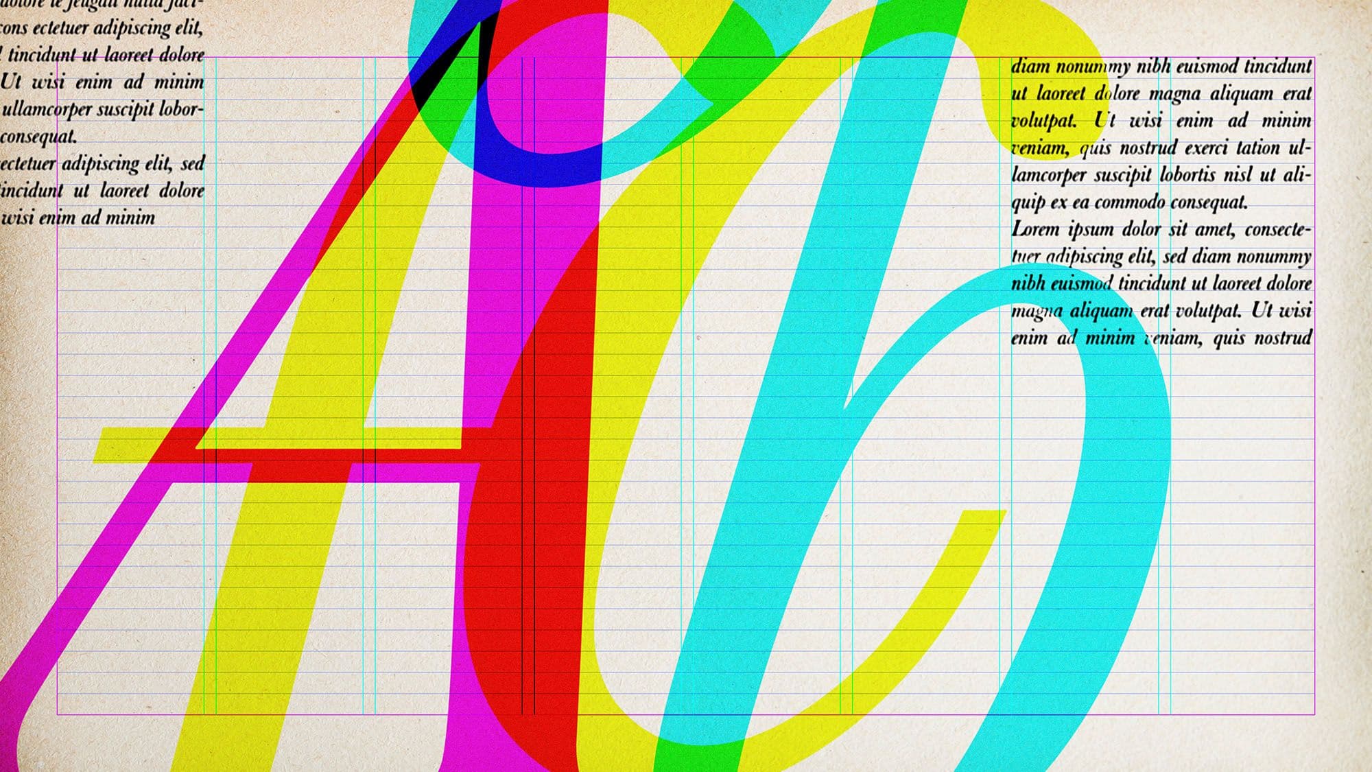
One of the clearest trends is the return of typography as a strong identity element. Not just as a tool for reading, but as an expressive component of the project. This is seen in books, magazines, catalogs, and even reports, where titles, hierarchies, and font sizes become part of the overall personality.
The point, however, is not simply to "use bold fonts" or follow a typographic fashion. The point is to create a dialogue between character and readability. In this sense, D&AD is interesting because it highlights how many contemporary directions seek visual systems that are recognizable but not gratuitous capable of supporting content, tone, and context of use.
In practice, today we observe:
- Bolder typographic hierarchies;
- A more conscious use of scale and contrast;
- Greater attention to the rhythm of the text, not just the choice of font.
2. More Flexible and Less Rigid Layouts
A second trend concerns layout. Grids remain fundamental, but they are used with greater elasticity. Contemporary editorial design tends to avoid both expressive chaos and excessive rigidity. The structure is there, but it is not perceived as a cage.
This is especially true for:
- Magazines, where controlled variety is needed;
- Catalogs, where text and images must coexist with more breathing room;
- Reports, where sections and information levels require adaptation.
The Society for News Design also continues to award projects where hierarchy, rhythm, and visual storytelling make the editorial product indispensable for the reader. It’s a useful signal: trends truly work when they strengthen reading, not when they disrupt it.
3. More Space for Whitespace and Reading Rhythm
There is also a decisive return of whitespace as a design tool—not as a simple void, but as an active element in building rhythm. In a world saturated with messages, breathing room becomes a resource. This is particularly evident in art catalogs, photography volumes, institutional publications, and certain premium reports.
Using more whitespace does not mean impoverishing the content. It means:
- Providing hierarchy;
- Creating legible pauses;
- Allowing text and images to emerge correctly;
- Strengthening the perception of care and quality.
The trend is interesting because it signals a shift: we are no longer just trying to "fit everything in," but to better select what needs to stand out.
Looking at trends is useful, but applying them without criteria risks producing publications that are dated even before they are released. Studio Polpo can help you understand which visual directions make sense for your editorial project and which should be set aside because they are inconsistent with the content, the brand, or the audience. The value lies not in chasing the fad of the moment, but in transforming the right signals into a form truly suited to your project.
4. More Adaptable Systems Between Print and Digital
Another strong trend involves designing systems that work across multiple media. Even when a publication is born for print, today it is often presented, promoted, or consulted digitally. This pushes for the construction of more adaptable layouts, hierarchies, and features.
The insights currently emerging from PRINT publications and cases observable in Communication Arts point precisely in this direction: editorial design now moves in a hybrid environment. Consequently, several factors matter greatly:
- Modularity of layouts;
- Typographic stability;
- Recognizability across different media;
- Balance between experimentation and readability.
For companies and institutions, this is crucial because, increasingly, the same publication must be printed, sent as a PDF, displayed on a website, or presented in snippets on social media.
5. Materiality and Human Tone
In parallel, many editorial projects are regaining a warmer and less impersonal tone. This does not necessarily mean analog nostalgia, but rather a greater attention to texture, paper, the relationship between typography and image, the use of less cold colors, and the construction of a more sensitive identity.
It is an interesting response to a digital environment that is often highly standardized. This is also why the most effective editorial projects today don't stop at being "clean": they seek a recognizable character. The point, once again, is not to sacrifice readability. A project can have texture, tone, and personality, as long as it remains clear.
What is Actually Worth Observing
For a client, not all trends carry the same weight. Some are useful for updating a publication’s language. Others risk aging quickly. What is truly worth observing is whatever improves the relationship between the content and the reader.
In concrete terms:
- More conscious typography;
- Sharper hierarchies;
- More elastic layouts;
- Greater strategic use of whitespace;
- More consistent systems between print and digital.
These are not simply stylistic trends. They are signals of a broader evolution in editorial design: less formula, more project.
Mistakes to Avoid When Chasing Trends
Trends become a problem when they are treated as shortcuts.
- Copying solutions seen elsewhere without asking if they make sense for your own content.
- Increasing typographic expressiveness at the expense of readability.
- Using layouts that are too unstable for documents requiring order.
- Applying "trendy" choices only to the most visible pages, leaving the rest of the document at a weaker level.
The result is often a project that is visually interesting but not solid as a whole.
Trends are useful if they help make better decisions. They are not useful if they lead to generic or overly time-dependent solutions. Studio Polpo works on editorial design with this logic: observing contemporary directions but translating them only when they truly improve the relationship between content, reading, and identity.
If you are designing a magazine, a book, a catalog, or a report and want a language that is updated but not ephemeral, the point is not to chase trends. It is to understand which of those signals can become part of a stronger and more lasting project.
FAQ
Is following editorial design trends always a good idea?
Only if the project remains consistent with the content and the audience. Trends are useful as signals, not as automatic rules.
Does expressive typography always make a publication better?
No. It can strengthen identity, but it must always coexist with readability, hierarchy, and reading comfort.
Do print and digital require two completely different designs?
Not always. Increasingly, it is better to design an editorial system that can adapt well to both contexts.