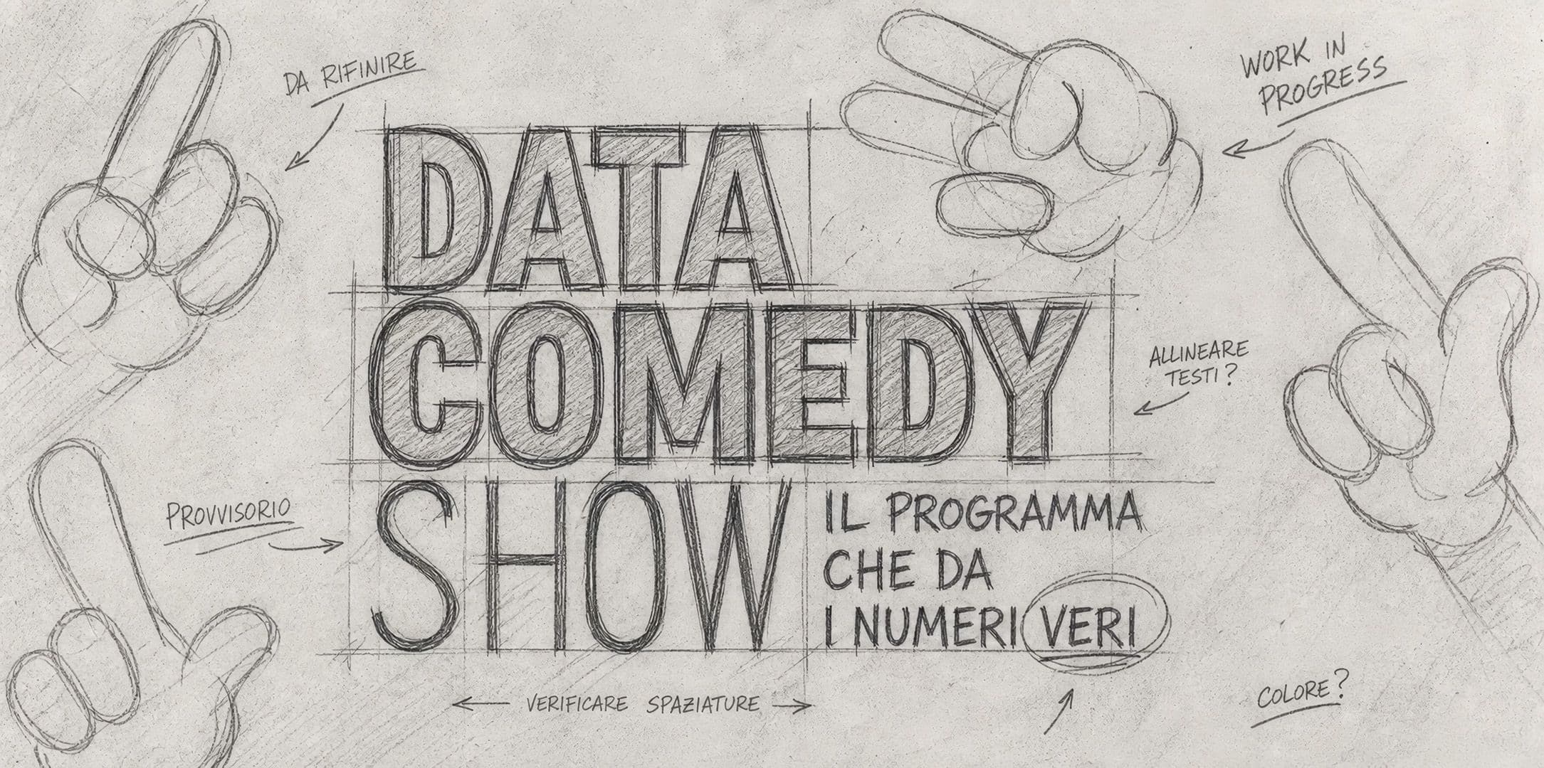
From concept to broadcast: how a television title sequence is designed
Designing a television title sequence does not simply mean animating a logo or editing a few images before the start of an episode. A title sequence is a short audiovisual project: it must synthesize the tone of the program, prepare the viewer, respect broadcast timings, and dialogue with the show's entire graphic system.
The journey starts from the concept, but it does not stop at the creative idea. One must understand the format, choose a visual language, define rhythm and duration, design typography and animations, build any necessary variations, and verify readability and technical constraints, all the way to delivering the final files.
For this reason, the title sequence is one of the points where motion graphics, art direction, and television production meet most clearly. A lot must happen in a few seconds, but without causing overload: the title sequence must introduce, suggest, and create recognizability.
The brief: understanding the program before designing
The first phase is the brief. Before talking about style, colors, or animation, it is necessary to understand what kind of program is being designed. An effective title sequence is born from a few concrete questions: what is the structure of the format? What is the tone? How long is the title sequence? Where will it air? Do a logo, graphics, or show materials already exist? Should the title sequence open every episode, introduce a segment, accompany a special, or also function in a short version?
In this phase, the visual solution is not yet being sought. Information is gathered and the scope of the project is defined. A title sequence for a talent show has different needs than one for a cultural magazine; a sports program does not have the same rhythm as an in-depth current affairs segment; a cooking show, a quiz, or a music broadcast require different visual codes because the audience, timing, content, and expectations change.
The most important initial questions are:
- what tone the program should have;
- which elements must be recognizable from the very first seconds;
- which materials are already available and which need to be created from scratch.
A good brief makes it possible to avoid purely decorative choices. If the format is well understood, every graphic decision can be connected to a function: introducing an atmosphere, giving rhythm, presenting the title, accompanying the music, or creating recognizability.
From brief to concept
After the brief comes the concept, which is the guiding idea that steers the entire title sequence. It is not yet the storyboard, it is not yet the animation, and it is not yet the editing. It is the principle that holds together images, rhythm, typography, colors, and transitions.
A concept can start from an object, a gesture, a place, a visual metaphor, a typographic treatment, or an editing logic. In a travel show, for example, the concept can be born from maps, routes, and changing landscapes. In a music format, it can start from rhythm, light, or the relationship between the stage and the audience. In a cooking program, it can work with matter, transformation, ingredients, and gestures. The important thing is that it is not generic.
In the book Title Sequences: Function with Form, published by Elsevier/Focal Press, the design process is described as a sequence of steps including research, a creative brief, treatment, storyboard, style frames, and preliminary testing. This is an interesting approach because it clearly distinguishes the guiding idea from its visual formalization: first, you define what the sequence needs to communicate, and then you build the way that content will take shape on screen.
For a television title sequence, this means that the concept should not be limited to an aesthetic reference or a visual effect. It must become a design direction: what we see, in what order, with what rhythm, and with what relationship between the title, images, music, and movement.
Look & feel: shaping the visual language
Once the concept is defined, work begins on the look & feel: color palette, typography, image treatment, textures, graphic rhythm, any illustrated or photographic elements, and the style of the transitions. This is the stage where the idea begins to become an image.
Here, it is important not to separate graphics and movement too much. A typeface might work well statically but lose its impact in animation. A color might be effective on a static board but barely readable on screen. An effect might look interesting in a test but become overbearing if repeated throughout the sequence.
The look & feel serves to verify the direction before entering full production. It can be presented through static boards, references, short animation tests, or keyframes. The goal is to define a visual grammar shared with production, direction, and the client.
For television programs, formats in development, or content intended for broadcast, Studio Polpo can design title sequences and motion graphics projects capable of transforming a concept into a coherent, recognizable visual language suited to the format.
Storyboard, rhythm, and duration
After the look & feel, the title sequence must be organized in time. This is where the storyboard, animatic, editing, music, and duration come into play. A title sequence is not a sequence of beautiful images: it is a progression.
The storyboard allows one to understand what happens and in what order. The animatic, even if simple, helps verify rhythm, pauses, transitions, typographic entries, and the relationship with the music. In television, duration is not a detail: a title sequence of a few seconds requires a different construction than a longer, more narrative opening.
The rhythm must be consistent with the program. A quiz show may require a fast-paced and highly recognizable sequence. A cultural segment may need a more measured rhythm. A live event may look for energy and immediate impact. A youth program can work with more direct shapes, sharper colors, and more explicit movements. The rule is not to go fast or slow: it is to find the right tempo for that specific format.
Motion design: when the title sequence takes shape
The motion design phase transforms boards, storyboards, and visual choices into animation. This is where movements, entries, exits, transitions, accents, pauses, logo behavior, and text treatments are defined.
Every movement should have a reason. A transition can serve to change scenes, create rhythm, suggest a narrative shift, or guide the eye toward the title. Animated text can provide energy, but it must remain readable. A logo can appear forcefully, but it should not look like a final addition detached from the rest.
During this phase, work is often carried out through successive versions. Timings are corrected, overly complex passages are streamlined, weak points are reinforced, and the relationship with music and sound is verified. Motion design is not just execution: it is a true design phase in its own right, where the identity of the title sequence is refined second by second.
Title sequence, variations, and the graphic system
A title sequence rarely remains an isolated element. It often needs to generate short versions, bumpers, closings, animated logos, full-screen cards, in-show graphics, or promotional materials. Even when the requested project is only the main title sequence, it is wise to think from the very beginning about how that language can be extended.
Videomaker, in an article dedicated to designing a coherent graphics package, demonstrates a very practical principle: the intro, lower third, and other graphic elements must share backgrounds, contrasts, readability, and visual logic, so as not to look like isolated pieces. Even though the article has a technical-operational focus, the point is useful for a television title sequence: a good opening should already contain the rules from which the other materials of the program can be born.
From a title sequence, the following can be born:
- full version and short version;
- animated logo, bumpers, and transitions;
- adaptations for promos, socials, trailers, and digital materials.
Thinking this way saves time in the subsequent phases. The program does not end up with a beautiful opening and improvised internal materials, but with a visual foundation that can grow and adapt.
Testing, revisions, and broadcast
Before final delivery, a title sequence must be viewed under conditions as close as possible to the actual broadcast. It is not enough to check it on a workstation monitor. One must verify text readability, margins, duration, compression, color, audio, compatibility with any subsequent graphics, and the correct positioning of elements.
The Netflix Partner Help Center, in its directions on title safe and safe action, recommends adhering to SMPTE guidelines for the placement of text and graphics, keeping titles within 90% of the 16:9 frame and essential action within 93%. Even if this is not a rule that applies to every channel or platform, it is an important reminder: a title sequence must function not just as an animation, but also as a readable, verifiable material suitable for distribution.
This phase also serves to manage revisions in an orderly manner. Changes can concern rhythm, the logo, duration, text, music, readability, or technical details. A clear process avoids endless corrections and allows for a distinction between creative, operational, and technical modifications.
Delivery of files and final materials
Broadcasting requires correct, organized files that can be easily used by production. Delivery can include the master title sequence, alternative versions, files with alpha channels, exports in different formats, any separated elements, and useful materials for future adaptations.
Precision matters greatly in this phase. A poorly named file, an un-updated version, an incorrect duration, or an element not exported in the requested format can create problems right up against the deadline. For this reason, the design of a television title sequence does not end with the final animation: it ends when the material is ready to be used.
A good final package should simplify the work of whoever needs to broadcast, archive, adapt, or reuse the title sequence. If you need to design a television title sequence or update the moving identity of an existing program, you can contact Studio Polpo to evaluate the necessary concepts, formats, and materials together.
The most frequent mistakes
Mistakes in designing a title sequence often stem from a start that is too rushed. Production jumps straight to animation without having clearly defined the tone, concept, duration, available materials, and final destination.
The most frequent mistakes are:
- starting with style before understanding the format;
- designing a title sequence that is beautiful but difficult to adapt;
- forgetting technical constraints, variations, and delivery materials.
To these is added a less obvious mistake: wanting to explain everything. A title sequence does not need to contain every piece of information about the program. It must introduce a world, create anticipation, and give a recognizable shape to the title. If it tries to say too much, it risks losing precision.
Conclusion
Designing a television title sequence means transforming a format into a brief, recognizable audiovisual experience suited for broadcast. The journey starts from the brief, moves through the concept, look & feel, storyboard, motion design, revisions, and technical delivery.
Each phase plays a precise role. The brief avoids generic solutions. The concept provides direction. The look & feel defines the language. The storyboard organizes time. The motion design builds rhythm and movement. The technical phase ensures that the title sequence truly functions in the context in which it will be broadcast.
A good title sequence is not just an opening. It is the first fragment of the program's identity: a few seconds in which graphics, sound, rhythm, and image must work together to prepare the viewer for the broadcast.
FAQ
How is a television title sequence designed?
It starts with the brief and the concept, then defines the look & feel, storyboard, rhythm, motion design, variations, and final files for broadcast.
How long should a TV title sequence be?
It depends on the format, the network, and the function of the title sequence. Some programs require very short openings, while others can afford more narrative sequences.
Should the title sequence also be thought out for socials and promos?
Yes. Even when the primary destination is television broadcasting, it is wise to design a language that can be adapted to short versions, promos, social media content, and digital materials.