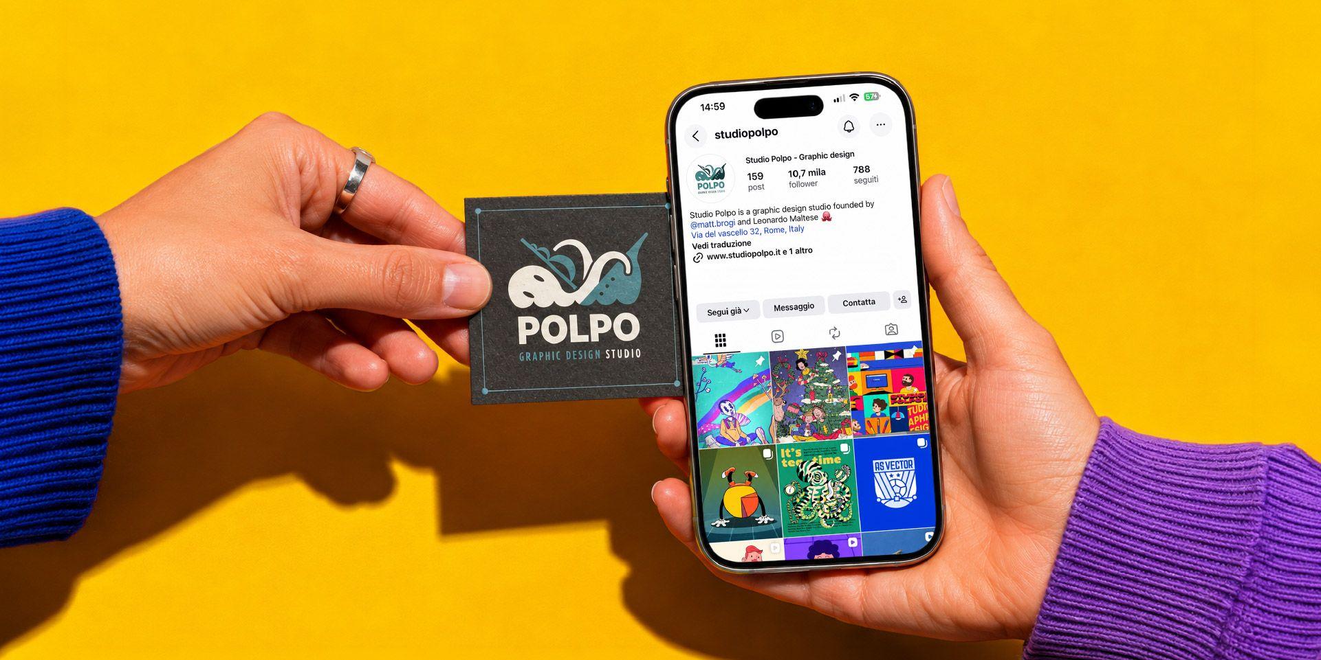
From business cards to Instagram: how a brand's first impression has changed
For decades, the business card served as the primary physical touchpoint between a professional and a prospective client. A few square inches of cardstock were tasked with conveying a name, title, logo, contact details, and an underlying standard of professionalism. Format, paper stock, print finish, typography, and information hierarchy all worked in tandem to establish a brand's initial impression.
While that functional role remains relevant, it is now distributed across a broad range of digital touchpoints. Today, a brand's first impression might originate on an Instagram profile, a LinkedIn page, a search engine query, a website landing page, a PDF presentation, an email signature, an online portfolio, or a direct messaging channel.
The relevant question is not whether the traditional business card is obsolete. Rather, it is recognizing that every brand is now encountered through an interconnected sequence of touchpoints. When these individual elements fail to speak the same visual language, public perception becomes fragmented.
The Business Card as an Element of Synthesis
The business card has always fulfilled a specific function: rendering an encounter memorable. Its purpose was never to tell an exhaustive story, but to leave a clear, retrievable impression. Name, title, mark, telephone, email, and address were organized into a compact information design system.
Today, a well-crafted business card is far more than a carrier of contact details; it serves as a micro-specimen of a brand's overall identity. It demonstrates how a brand handles typography, spatial layout, physical materials, visual hierarchy, and tone. Within seconds, it communicates whether a practice is rigorous, improvisational, institutional, creative, technical, artisanal, or premium.
A Distributed First Impression
The key shift today is that initial contact rarely concludes with a physical handoff. Following a meeting, individuals naturally cross-reference the brand online: exploring an Instagram feed, reviewing a LinkedIn profile, browsing a website, evaluating past case studies, downloading a presentation deck, or checking reviews.
This reality alters the underlying design challenge. A business card no longer needs to carry every piece of information, but it must seamlessly connect to secondary channels. It can direct users toward a website, a curated portfolio, a social media channel, a dedicated landing page, or a QR code—functioning as an entryway rather than an end point.
Consequently, the first impression has evolved into a multi-stage sequence:
- physical or digital introduction;
- initial online search;
- evaluation of website, social profiles, or portfolio;
- decision to engage, inquire, or disengage.
Throughout this sequence, every step either reinforces or erodes trust. An elegant business card followed by a chaotic Instagram layout creates immediate friction. A polished website paired with an unformatted PDF proposal produces the exact same disconnect. Systematic consistency is not a cosmetic detail; it is a structural component of credibility.
Websites and Social Media as Modern Touchpoints
A website is frequently the critical threshold where an initial impression is confirmed or broken. It must swiftly clarify who you are, what you offer, who you serve, and why your work matters. It does not need to reveal every detail instantly, but it must provide immediate orientation.
Nielsen Norman Group said that users decide whether to leave a web page within the first 10–20 seconds. Today, driven by mobile-first habits and increasingly fragmented attention spans, that evaluation window has shrunk even further: a brand now has only a few split seconds to convince a visitor to stay or leave.
This places website UX design directly in line with business card logic: a concise set of visual elements must deliver a crystal-clear impression. Logo placement, headlines, imagery, portfolio selection, copy tone, scannability, and structural hierarchy must work together seamlessly.
Instagram fulfills a different function. Rather than acting as a static directory, it operates as a dynamic storefront. The first elements a user registers are the profile image, bio copy, grid layout, highlighted stories, recent posts, and general visual cohesion. Even before reading captions, a viewer forms an immediate judgment: Is this brand active? Is it well-curated? Does it possess a distinct tone? Does it show real work or generic filler?
LinkedIn, PDFs, and Digital Presentations
For B2B organizations and professional service firms, LinkedIn functions as a primary business card. Corporate pages, individual team profiles, published posts, cover graphics, descriptions, and linked assets establish professional credibility well before an introductory call occurs.
LinkedIn explicitly highlights logos, cover imagery, and concise descriptions as fundamental elements for building a strong initial brand impression on company pages.
Digital presentation decks carry an equivalent strategic weight. PDF overviews sent after a meeting, company profiles, pitch decks, and commercial proposals frequently represent the second major brand touchpoint. In these documents, graphic design must validate the initial brand promise through layout clarity, structural organization, consistent typography, and meticulous attention to detail.
For companies, professional practices, and cultural organizations, Studio Polpo develops comprehensive visual identity systems engineered to maintain design continuity across business cards, digital profiles, presentation decks, and commercial collateral.
Bridging Print and Digital Environments
Transitioning between physical print and digital environments does not mean copying the exact same layout across every medium. A business card, a website homepage, an Instagram post, and a LinkedIn slide deck operate under different reading speeds, aspect ratios, and functional goals. Systematic cohesion stems from shared principles, not literal replication.
Core brand assets must remain instantly recognizable: logo marks, color palettes, typographic choices, photographic direction, spatial relationships, visual hierarchies, and verbal tone. Secondary elements should adapt fluidly to their medium: an Instagram bio requires extreme brevity, a business card demands minimalism, and a website should guide progressive discovery.
A cohesive design system establishes:
- clear rules for logos, color palettes, fonts, and imagery;
- standardized templates for print, web, social media, and PDFs;
- consistent guidelines for contact info, links, QR codes, and calls to action.
These parameters prevent a brand from reinventing its visual rules for every new piece of collateral. Every touchpoint fulfills a distinct role, yet all touchpoints build the exact same brand perception.
The Cost of Visual Fragmentation
Most visual identities do not fail due to a poorly designed logo; they fail due to fragmented touchpoints. The business card feels premium, but the website is outdated, the Instagram feed is erratic, the LinkedIn profile is incomplete, presentation slides mix conflicting styles, and email templates lack structure.
This fragmentation conveys a specific message: a lack of operational oversight. Even when underlying services are exceptional, a disorderly visual presence reduces perceived reliability. This is not about achieving superficial perfection, but about delivering a unified experience across every interaction.
This challenge is particularly acute for boutique practices and independent firms. When an audience lacks prior familiarity with a brand, every visual detail carries extra weight. Initial touchpoints must immediately clarify positioning, quality, tone, and professional domain.
Does the Printed Business Card Still Matter?
Yes, but its operational role has shifted. The business card is no longer the sole mechanism for introducing a brand. However, it remains valuable during in-person meetings, industry conferences, trade shows, commercial pitches, institutional settings, or high-touch relationships where physical presence carries weight.
Its strength lies in its tactile nature. It is held, stored, and passed from hand to hand. It communicates intentionality through paper selection, print quality, weight, and special finishes. Today, however, it must function within a broader ecosystem—directing recipients toward an updated website, a structured portfolio, a curated social profile, or a clear contact portal.
A well-designed business card does not compete with digital channels. It introduces them, acting as a physical gateway to the rest of the brand identity.
Common Strategic Errors
The most common mistakes occur when touchpoints are designed in isolation without an overarching brand framework.
Key errors to avoid include:
- investing in premium business cards while neglecting the website and social channels;
- using inconsistent visual styles across print collateral, Instagram, LinkedIn, and pitch decks;
- crowding layouts with excessive contact details instead of offering a single clear call to action;
- treating social media feeds as random content dumpsters rather than extensions of the brand identity.
A more subtle error is assuming a first impression happens in a single isolated moment. In reality, it is a sequence of micro-touchpoints—where each step must validate the credibility of the last.
Conclusion
From business cards to Instagram, a brand's first impression has transformed because the number of touchpoints has multiplied. It no longer relies on a single artifact, but lives within a dynamic system of physical and digital assets: websites, social platforms, LinkedIn profiles, PDFs, email signatures, online portfolios, presentation decks, and content streams.
The core objective of a visual identity system is to unify these disparate elements—not by forcing identical layouts onto every format, but by maintaining a consistent tone, quality level, and visual logic across every application. A strong brand is not one that blindly repeats a template, but one that preserves systematic integrity across every point of contact.
If you are looking to align your brand's touchpoints, you can contact Studio Polpo to design a flexible visual system engineered to perform seamlessly across print, web platforms, social media, and digital presentations.
FAQ
Does the printed business card still matter today?
Yes, particularly for in-person meetings, events, trade shows, and professional settings. Today, however, it works best when integrated with a website, portfolio, social channels, or a contact page.
Can Instagram be considered a modern business card?
Yes, in many contexts. The bio, profile image, grid layout, highlighted stories, and content tone collectively form a rapid first impression of the brand.
How do you maintain a consistent first impression for a brand?
It requires shared design rules for logos, color palettes, typography, imagery, copy tone, and digital assets—adapted across different communication channels without losing brand recognition.


