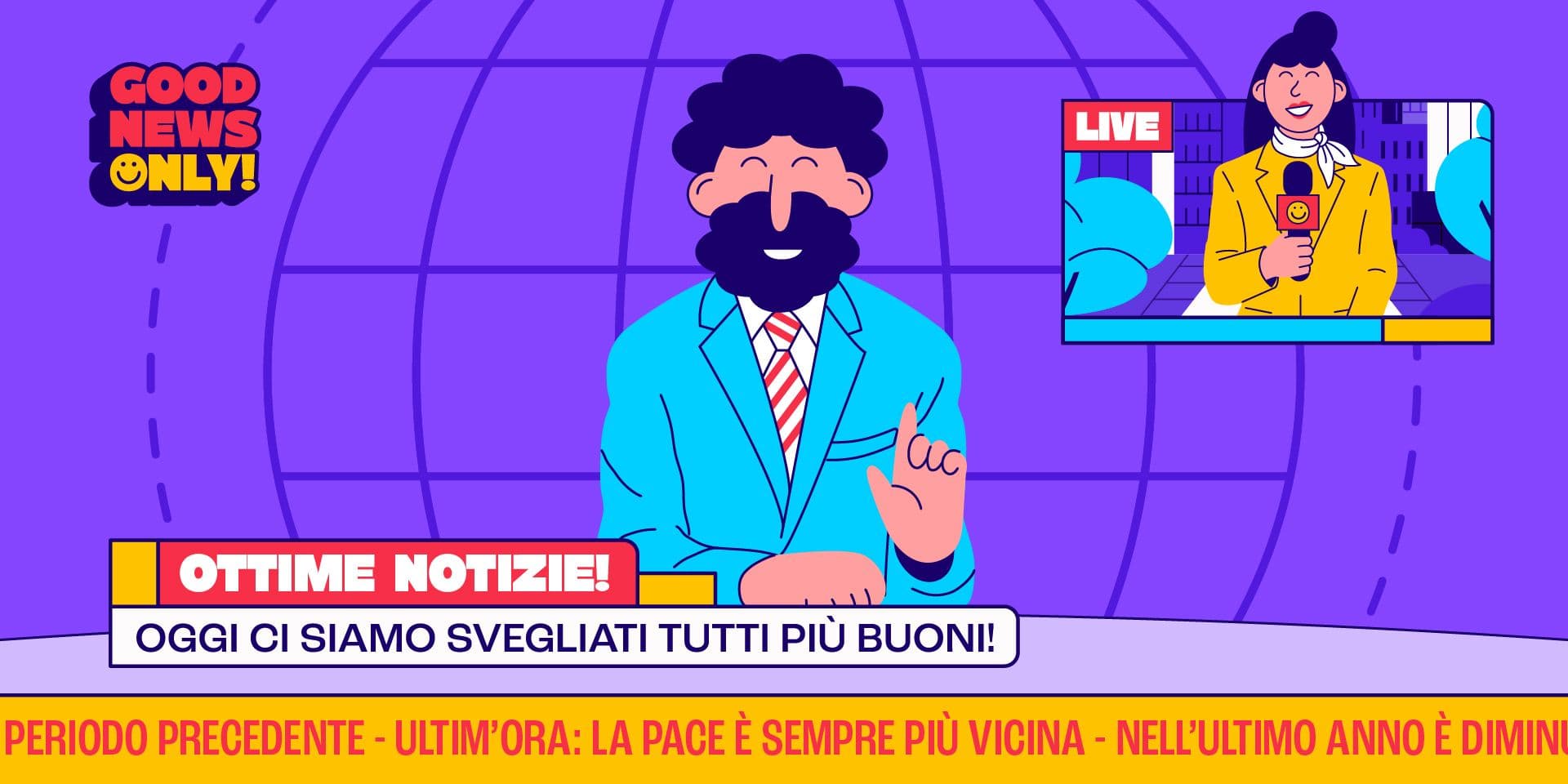
Broadcast graphics: why a television show needs a coherent visual system
Broadcast graphics is the collection of visual elements that shape a television show: the intro sequence, animated logo, lower thirds, full-screen cards, transitions, in-show graphics, promos, and on-air assets. It is not a collection of separate pieces, but a system that accompanies the program from beginning to end.
An opening title sequence can establish the tone of the show, but it is not enough to build a solid identity. During the episode, you need elements capable of organizing information, making sections and segments recognizable, and presenting guests, data, locations, titles, and narrative shifts. If these elements do not speak the same language, the program risks looking unpolished and uncreative.
The Ravensbourne BBC Motion Graphics Archive collects examples of opening titles, promotional trailers, stings, idents, and in-show graphic sequences. It is clear evidence of how much television graphics are made up of many coordinated elements, not just spectacular openings.
Why the intro sequence is not enough
The intro is often the most visible element, but a broadcast also lives in every moment that follows. After the opening come dialogues, video reports, video contributions, interviews, studio transitions, data, recaps, bumpers, and sign-offs. In each of these moments, the graphics must support the structure of the show without causing distraction.
A coherent broadcast system serves to make the show perceived as a unified project. The viewer should not notice every graphic choice, but they must feel a sense of continuity: the same tone, the same logic, the same care. A lower third should not look like it was designed by a different hand than the intro. An informational full-screen card should not break the language of the show.
Broadcast graphics thus become an internal grammar. They establish how names appear, how information enters, how you move from one section to another, how the logo is animated, how much space text and images occupy, and what visual rhythm accompanies the episode.
The elements of a broadcast system
A graphic system for television must accommodate many different mediums. Some are recurring, while others depend on the type of show, the duration, the channel, the format, and the amount of information to be displayed.
The most common elements are:
- intro, animated logo, bumpers, and transitions;
- lower thirds, full-screen cards, section titles, and information graphics;
- promos, social media assets, thumbnails, and digital adaptations.
The point is not to produce a massive quantity of graphics, but to define a language clear enough to generate all these materials. If the intro uses a certain rhythm, typography, and image treatment, the internal elements should also derive from that same logic.
This allows the production team to work with more order. When a system exists, every new card or adaptation does not require a decision from scratch. You start from shared rules and build coherent variations.
Consistency between episode, promo, and digital
A television show today does not live only at the moment of its broadcast. It can be promoted with trailers, social media content, clips, excerpts, graphics for video platforms, images for digital schedules, and press communication materials. If each channel uses a different language, the show's identity weakens.
Consistency does not mean using the same layout every time. It means keeping the tone, color, typography, rhythm, and visual treatment recognizable. A promo can be faster than the episode, a thumbnail more concise, and social content more direct, but they should all belong to the same system.
Smashing Magazine, in an article dedicated to television graphics package standards, defines these packages as the collection of animated logos, text backgrounds, idents, channel bugs, lower thirds, and other elements that build the branding of a show, a channel, or a documentary. Broadcast graphics, therefore, are not a sum of separate materials: they are a system of recurring elements that help the viewer recognize what they are watching and find their bearings during the broadcast.
For a show, this means designing the graphics while already thinking about subsequent uses: on-air, promotion, social media, platforms, network materials, and short-form content. If you are developing a TV format or want to make an existing show more coherent, Studio Polpo can help you build a graphic system capable of working both inside and outside the episode.
Readability and technical constraints
Broadcast graphics must be recognizable, but also readable and technically correct. A card can be beautifully designed, but if the text is too small, too close to the edge, or lacks contrast, it will not work on air. Television has different constraints than a social media post or a static graphic layout.
The EBU R 95 recommendation on safe areas for 16:9 television production defines safe zones to protect essential image and graphic elements in television presentation. It is a technical reminder, but a highly practical one: broadcast graphics must consider screens, formats, margins, readability, and compatibility.
This especially concerns lower thirds, titles, logos, names, roles, and service information. The graphics must enter the frame without invading it, remain readable even in motion, and not cover important elements of the image. Visual design in television cannot be separated from real viewing conditions.
How the system changes based on the program
Every show requires a different grammar. An in-depth current affairs program may need order, clear hierarchies, and informational graphics. A comedy show can work on rhythm, surprise, and more striking transitions. An investigative narrative may require a more sober language, capable of supporting tension and reconstruction without becoming sensationalist.
The necessary materials also change. A show with many guests will need flexible and recognizable lower thirds. A format with data and rankings will require solid information graphics. A broadcast based on field reports will need to manage locations, names, titles, and scene breaks well. A more narrative production will need cards and transitions capable of accompanying the storytelling.
A broadcast system should therefore define:
- what information recurs most often during the episode;
- which elements must be animated and which can remain static;
- what adaptations are needed for promos, social media, and digital materials.
This initial phase avoids designing only the most obvious element, leaving all other materials to be managed under the pressure of an emergency.
The role of the motion design studio
Working on broadcast graphics does not consist of designing beautiful individual elements. It consists of building a visual structure that can be used in production, adapted to different episodes, and kept consistent over time.
A motion design studio must reason collectively on identity, rhythm, editing, readability, animation, logo usage, and operational assets. The intro can be the starting point, but the system must also foresee what happens during the episode: how a name enters, how a section opens, how a location is flagged, how a block closes.
When this work is done well, graphics do not slow down production; they help it. It provides rules, templates, variations, and recurring solutions. For television productions, production companies, and formats in development, Studio Polpo can design broadcast and motion graphic systems capable of combining visual identity, animation, and broadcast-ready materials.
The most frequent mistakes
Many problems arise when broadcast graphics are treated as a series of separate elements. An intro is made, then a lower third, then a card, then a social graphic, but without a common grammar.
The most frequent mistakes are:
- designing the intro without planning for the internal elements of the episode;
- using lower thirds and cards that are barely readable or outside the system;
- forgetting adaptations for promos, social media, and digital platforms.
To these is added a more strategic mistake: confusing consistency with rigidity. A broadcast system should not make everything identical. It must allow for controlled variations, keeping the show recognizable even when content, sections, and materials change.
Conclusion
Broadcast graphics are the visual framework that holds a television show together. It does not just concern the intro, but all the elements that accompany the program: animated logo, lower thirds, cards, transitions, internal graphics, promos, and digital materials.
A coherent system makes the format more recognizable, helps the production team work with order, and offers the viewer a clearer experience. Graphics should not impose themselves on the content, but support it: organize, distinguish, accompany, and reinforce the tone of the broadcast.
Every program needs a visual grammar suited to its structure. Designing it from the very beginning allows you to avoid improvised solutions and build a more solid identity, capable of working from the broadcast to digital content.
FAQ
What is broadcast graphics?
It is the set of graphic elements used in a television show: intro, animated logo, lower thirds, full-screen cards, transitions, in-show graphics, promos, and assets connected to the broadcast.
Why does a TV show need a coherent graphic system?
Because the intro sequence alone is not enough. During the episode, many visual elements are needed, and they must be readable, recognizable, and consistent with the show's identity.
Are broadcast graphics useful outside of TV?
Yes. Today, a show also lives in promos, social media, digital platforms, clips, and communication materials. A good graphic system must also plan for these adaptations.