Branding: what it really is and why it doesn't coincide with a logo
Many companies think that branding coincides with a logo, a color palette, or a well-designed website. In reality, branding is something broader and more strategic: it is the way an organization is perceived, recognized, and chosen over time. As Nielsen Norman Group reminds us, a brand is not just made of graphic signs but is the sum of experiences, tones, and behaviors that influence people's decisions.
This distinction is especially important for those who must invest in communication. If you start from the idea that branding is only "image," the risk is building materials that are beautiful to look at but weak in terms of clarity, differentiation, and memorability. If instead you start with branding as a system, then the logo, tone of voice, website, presentations, packaging, social media, motion design, and commercial materials all become parts of the same architecture.
- A logo helps you be recognized, but it is not enough to define a brand.
- A visual identity helps you be consistent, but it is not enough to build trust.
- Branding works when strategy, design, messaging, and experience support each other.
This is why branding interests marketing as much as design. It is a discipline that touches on positioning, content, customer experience, internal governance, and trademark protection. It is precisely this breadth that makes branding decisive for companies, professional firms, cultural entities, and entrepreneurial projects that want to emerge from competitive confusion.
What branding is, in practice
A useful definition comes from Adobe: branding design is the way a brand represents itself visually through elements like colors, fonts, logos, and other assets. This definition is correct, but to work well on branding, one must take a step further: understand that visual representation is only the visible part of a larger construction. In practice, branding is the process by which a company defines who it is, how it wants to be perceived, what difference it promises to the market, and how it translates this promise into consistent signs, content, and behaviors. In this sense, branding is not a final file, but a discipline of alignment.
- It aligns positioning, the place the brand wants to occupy in people's minds.
- It aligns identity, the system of signs, tone, and rules with which the brand presents itself.
- It aligns experience, the way the brand is lived across different touchpoints.
The work of McKinsey & Company also insists on a similar point: a strong brand must be relevant, distinctive, and credible for customers. This means that branding serves to translate a competitive advantage into a clear, recognizable, and sustainable form. It is not cosmetics. It is a business lever.
Why branding and logo are not the same thing
A logo is a symbol. Branding is the system that gives meaning to that symbol. This difference, while seemingly trivial, is one of the most important to clarify with clients and internal teams. A mark can be formally correct, memorable, and well-constructed, but if it is not supported by clear positioning and a consistent experience, it remains an isolated sign.
- The logo signs and identifies.
- Branding differentiates, guiding expectations and decisions.
Think of how many brands are remembered not just for their graphic appearance, but for a combination of elements: promise, tone, reliability, user experience, touchpoint consistency, the ability to fit into culture, and the quality of the offer. In this sense, branding works on both a visual and a relational level.
According to Nielsen Norman Group, consistency reduces confusion and increases the comprehensibility of digital systems. The same principle applies to branding: when every element speaks the same language, the brand becomes easier to recognize and interpret.
For a company, this distinction also changes the way creative work is commissioned. Asking for "a logo" is different from asking for "a branding system." In the first case, you buy a sign. In the second, you build a communication infrastructure that can be used on the website, social media, brochures, presentations, packaging, videos, campaigns, and commercial materials.
The elements that truly make up a branding project
A serious branding project does not end with a board showing three logo proposals. It must bring order to different levels of the brand, some more strategic, others more executive. This is where the difference between well-executed graphic design and true identity work becomes clear.
- Positioning: who the brand speaks to, what need it addresses, why it is different.
- Personality: what tone it has, what attitude it communicates, what type of relationship it wants to build.
- Messaging: which key concepts it must make immediately legible.
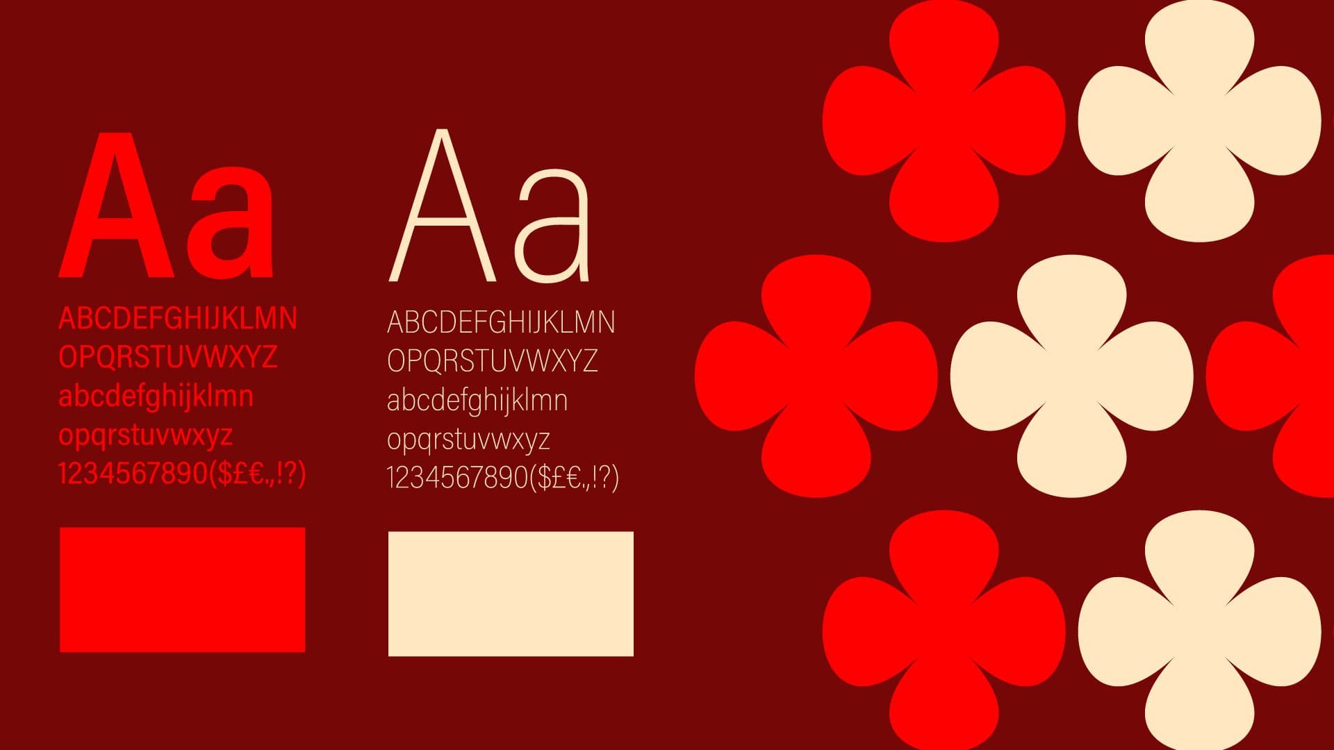
- Visual Identity: logo, typography, palette, grids, composition, imagery, iconography.
- Rules of use: guidelines, brand book, application cases, priorities, and prohibitions.
- Experience: website, materials, environments, presentations, packaging, customer journey.
On this point, the perspective of Adobe Creative Cloud is also useful, defining the brand style guide as the manual that establishes how to use fonts, logos, colors, and tone of voice. A guide of this type isn't just for designers: it's for those who write, those who sell, those who update the site, those who prepare a presentation, and those who publish content. In other words, branding works when it is clear enough to be applied consistently, but also alive enough to adapt to contexts. An identity that is too rigid breaks. One that is too vague disperses.
Want to understand if your brand is recognizable or just well-designed?
If you already have a logo, a website, or communication materials but feel that the brand is not yet truly compact, the problem might not be aesthetic. It might be structural. Studio Polpo can help you understand which elements of your branding are working, where consistency breaks down, and how to transform a fragmented identity into a system that is clearer, more distinctive, and useful to the business.
- We analyze how the brand currently presents itself across different touchpoints.
- We identify inconsistencies between positioning, messaging, and visual identity.
- We build a direction that is more legible, applicable, and recognizable over time.
Why branding affects business, not just aesthetics
Those who work in marketing know that the brand is not a decorative detail. Analyses by Interbrand and Kantar BrandZ treat the brand as a real economic asset, capable of influencing demand, perceived value, pricing power, and growth. It doesn't mean that "doing branding" is enough to sell more, but it means that a clear and consistent brand can make many other activities more effective.
- It makes the understanding of the offer more immediate.
- It reduces communication dispersal between channels, departments, and suppliers.
- It increases recognizability, aiding memory and preference.
- It improves consistency between awareness, consideration, and conversion activities.
On a practical level, this is clearly seen in three cases. First: when a company needs to explain a complex service. A well-constructed branding reduces noise and helps transform a technical offer into a clear promise. Second: when the team produces content continuously. If a system doesn't exist, every material starts from scratch and the brand changes its face every week. Third: when it’s time to grow. Without identity, growth only amplifies confusion.
The Kantar framework of Meaningful, Different, Salient also points in this direction: strong brands are those that are relevant to people, different from the competition, and mentally available when the moment of choice arrives.
Use cases: three situations where branding truly changes the outcome
To understand the value of branding, it's best to move beyond definitions and look at concrete situations. This is where the topic stops being theoretical and becomes operational.
1. Startup or new business entering the market
When a project is born, the temptation is often to start only with a name and a logo. In reality, the most urgent need is another: giving the market a clear and consistent image quickly.
- A legible positioning is needed.
- A concise, understandable, and credible promise is needed.
- A visual identity is needed that can already live on the website, pitch deck, social media, and commercial materials.
Here, the perspective of WIPO is also useful, reminding us how naming, logos, and trademark protection should be thought of in advance, especially when a brand is born online.
2. Structured company communicating in a fragmented way
Many companies don't have a quality problem with individual materials, but a lack of a system. The brochure is well-made, the website is acceptable, the social media is polished, but every touchpoint tells the story of a different company.
- The sales department uses one language.
- The website uses another tone.
- The visual part does not dialogue with the value promises.
- External partners produce assets that are only halfway consistent.
In this scenario, branding becomes primarily a work of alignment. Rather than inventing, one must order. Rather than adding elements, one must build rules.
3. Cultural entity or event building recognizability
Festivals, exhibitions, reviews, book series, and cultural formats live on memory, tone, and continuity. Branding, in these cases, serves to hold together identity, the program, promotional materials, environments, social media, and editorial products.
- It helps the audience recognize the project at a glance.
- It helps sponsors and partners perceive greater solidity.
- It makes it easier to produce consistent materials over time.
It is no coincidence that in Interbrand's work across various brands, the theme of experience consistency often emerges, as in the cited case of LEGO and the construction of a more consistent experience.
Common mistakes to avoid
Branding rarely fails for a lack of taste. More often, it fails due to setup errors. Some are very frequent, especially when the project is approached as graphic production rather than strategic construction.
- Starting with aesthetic references before clarifying positioning.
- Confusing the target with a generic audience, speaking to everyone and distinguishing yourself for no one.
- Creating a visual identity rich in elements but difficult to use in real life.
- Not providing guidelines, leaving every application to improvisation.
- Thinking that branding ends with the delivery of files.
Another frequent mistake is being too descriptive in naming or the mark, sacrificing distinctiveness and protectability. WIPO's guidelines are useful precisely because they remind us that trademark protection is not an administrative detail, but part of building long-term value.
How to set up useful, applicable, and lasting branding
A good branding project must not only be beautiful but also usable. It must be clear to those who manage it every day and solid enough not to lose meaning when it changes channel, format, or context.
- Start with analysis and listening: market, competitors, tone, ambition, goals.
- Define a direction: positioning, key messages, distinctive attributes.
- Build the visual system: mark, palette, typography, rules, hierarchies.
- Test real applications: website, presentation, social media, editorial document, motion, advertising.
- Deliver a guide that allows the brand to remain consistent over time.
This application phase is often what separates theoretical projects from truly useful ones. Effective branding doesn't just live in an elegant PDF. It lives when it can be used well by marketing, sales, partners, developers, copywriters, and designers without losing consistency.
A well-constructed branding also simplifies and speeds up the content creation process, often consisting of fewer materials that are more consistent and manageable with each other. It allows for a streamlining of work in the production of materials and content for the brand.
Shape a brand that people remember
If your brand today appears discontinuous, poorly recognizable, or too generic, it doesn't necessarily mean you have to redo everything. Sometimes you just need to bring back order, clarify the promise, and transform scattered materials into a coherent system. Studio Polpo works on exactly this: building visual identities and brand directions that don't remain theory but become concrete tools to communicate better, stand out, and grow with more consistency.
- Branding for companies that want to position themselves better.
- Visual systems applicable to websites, editorial, motion, ADV (advertising), and commercial materials.
- An approach that holds together strategy, design, and real content use.
FAQ
Does branding serve a small company?
Yes. In fact, it often serves even more, because a small company has fewer opportunities to explain itself and therefore needs to be recognizable, consistent, and clear from the very first contact.
How is branding different from brand identity?
Brand identity is a part of branding. It concerns the system of signs, tone, and rules with which the brand presents itself. Branding also includes strategy, perception, experience, and the management of the brand over time.
When does rebranding make sense?
When the brand no longer represents the current positioning, doesn't work well on digital touchpoints, isn't distinctive enough, or makes commercial and communication growth difficult.
Is a brand book really necessary?
Yes, especially when the brand is managed by multiple people or suppliers. Without rules of use, consistency is quickly lost, and every material ends up looking disconnected from the others.