Books, magazines, art catalogs, and corporate reports: what really changes in editorial design
Putting books, magazines, art catalogs, and corporate reports in the same conversation might seem forced, but it is actually very useful. They all belong to the field of editorial design, yet they answer to very different logics. The way they are read changes, as does the time the reader devotes to them, the relationship between text and images, the function of the document, and even the tone the project must communicate.
This is precisely where the quality of editorial design is measured. Not in adherence to a fixed formula, but in the ability to understand that every editorial product requires a different balance. Pentagram insists that an effective publication must offer the reader a context that is both familiar and surprising, page after page. It is a useful definition that explains well why a book, a magazine, an art catalog, or a report cannot be treated as identical containers.
The book: continuity, rhythm, and duration
A book requires a long relationship with the reader. It is not consumed in a few seconds and does not live by a single glance alone. For this reason, its design must build a form of continuity that accompanies the reader without being too loud or disappearing entirely.
In the design of a book, the following become central:
- the choice of format and margins;
- the consistency of the body text across many pages;
- the rhythm between openings, chapters, titles, notes, and back matter;
- the management of white space, leading, and line length.
A well-designed book does not constantly "shout" the presence of design but makes it felt through how it makes reading stable, comfortable, and recognizable.
The magazine: rhythm, variation, and identity
The magazine works differently. It must maintain its own identity while simultaneously managing heterogeneous content, columns, different visual rhythms, varying photographic styles, and inconsistent levels of depth. In other words, it must be coherent without becoming monotonous.
Here, the following primarily come into play:
- a grid solid enough to provide unity;
- a very clear hierarchy of titles-summaries-captions;
- an image treatment that doesn't feel accidental;
- a recognizable visual voice capable of holding up over time.
Observations from Fedrigoni on contemporary publishing help clarify this point: designing a publication means working on the relationship between content, medium, rhythm, and the reader, not just on the arrangement of text blocks. This is also why the most successful editorial products are never neutral: they give shape to the content and assign it a voice.
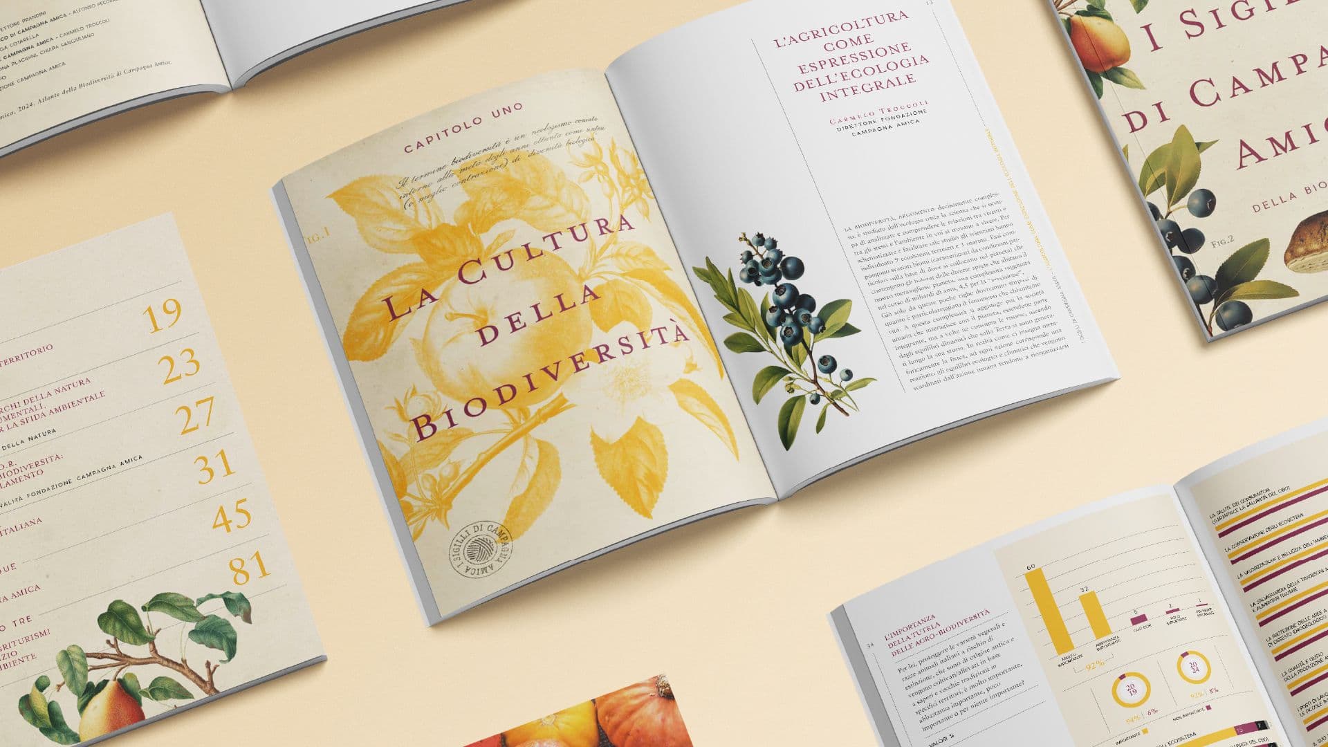
The art catalog: enhancing without invading
The art catalog has a specific responsibility. It must support the works, contextualize them, allow them to breathe, and at the same time build an editorial object with its own authority. The risk in this field is always twofold: either the design becomes too invisible and fails to guide enough, or it becomes too present and interferes with the reading of the works.
For this reason, a good art catalog:
- uses white space as an active element;
- carefully controls the relationship between image and critical text;
- builds captions and apparatus with clarity;
- chooses typography and paper consistent with the tone of the project.
In this context, the graphic design must be sophisticated but never self-referential.
The corporate report: clarity, trust, and order
The corporate report has yet another nature. It is not born to be "browsed with pleasure" in the same way as a magazine or a catalog. It is born to explain, document, reassure, and guide. It could be an annual report, a sustainability report, a company profile, or a strategic document. In any case, it needs clarity, credibility, and order.
magCulture also clearly shows how the strongest publications build recognizability through continuity, tone, and attention to detail. This principle also applies to reports: when the structure is clear, the reader understands faster, stays on the content longer, and perceives greater solidity.
In an effective report, the following matter greatly:
- internal navigation of the document;
- the distinction between key messages and supporting details;
- the balance between data, text, and visualization;
- consistency with the visual identity of the company or institution.
Not all of these products require the same approach, even if they may seem similar at first glance. Studio Polpo can help you understand if your material needs deep editorial design, a graphic reorganization, or a clearer structure to enhance existing content. This is an important step, especially when starting with very valid texts, images, and data that lack a truly readable and coherent form.
So, what really changes?
The most important difference is not in the software used or the graphic style chosen. It is in the function of the publication. A book demands continuity. A magazine demands rhythm. An art catalog demands balance. A corporate report demands clarity and reliability.
This distinction influences every choice:
- how much space to give to images;
- how dense the text can be;
- how visible the structure should be;
- how to build hierarchies and supplemental elements;
- what kind of visual tone to convey.
A good designer doesn't apply the same recipe to all formats. They start from reading behavior and build the most suitable graphic system around it.
Frequent errors when treating different products the same way
One of the most common problems is using the same approach on materials with very different functions. This often happens when working in a hurry or when confusing consistency with repetition.
- Designing a corporate report as if it were a promotional brochure.
- Treating a magazine like a sequence of identical pages.
- Weighing down an art catalog with invasive editorial elements.
- Building a book with "presentation-style" logic, sacrificing reading comfort.
In all these cases, the content loses part of its value—not because it is weak, but because it hasn't found the right form.
An effective editorial project always starts from use
The most useful lesson is this: before designing, you must understand how that document will actually be used. Will it be read in sequence? Consulted by sections? Browsed quickly? Presented to stakeholders? Kept as an object? Downloaded from a screen? Every answer changes the shape of the project.
For this reason, good editorial design:
- observes reading behavior before style;
- translates the project's identity into concrete rules;
- makes the content stronger without overloading it with effects.
This is where editorial design stops being a "finish" and becomes part of the quality of the content itself. Books, magazines, art catalogs, and corporate reports do not ask for the same solution. They ask for the same level of attention. Studio Polpo works on exactly this: understanding the nature of the content, its real use, and its tone to build a form that is coherent, readable, and worthy of the project.
If you have important but unorganized materials, or if you are planning a new publication and want to avoid generic solutions, the right editorial work starts here: from the difference between products, not their apparent similarity.
FAQ
Does a corporate report really require an editorial project?
Yes, especially if it contains data, complex information hierarchies, and multiple levels of reading. Without a solid project, the document risks being heavy or unclear.
Must an art catalog always be minimal?
Not necessarily. However, it must find a balance between graphic presence and the enhancement of the works, without creating unnecessary interference.
Can a book and a magazine share the same visual system?
Only in part. They can share some principles, but they have very different rhythms, functions, and reading expectations.