Art catalogs: how to design a publication that enhances artworks, texts, and identity
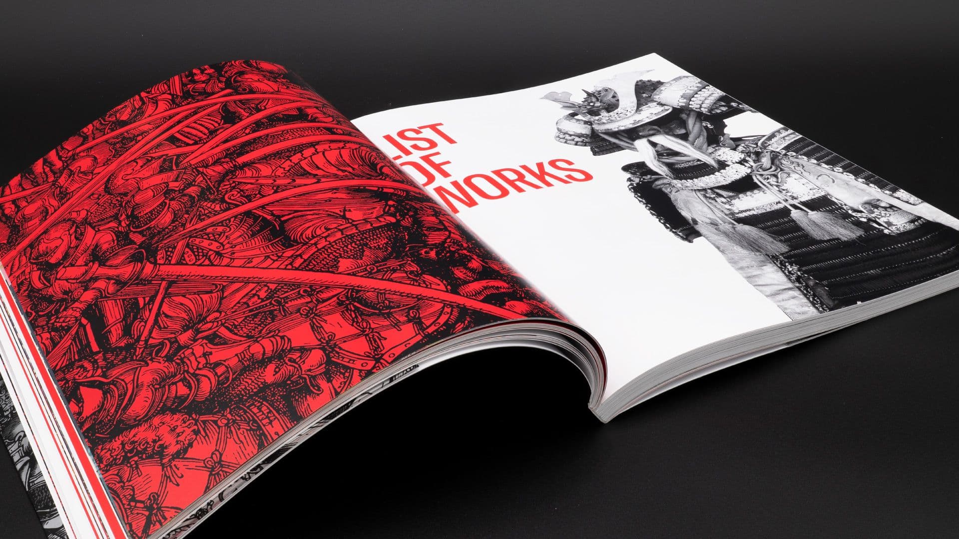
Art catalogs are not simple containers for images and critical texts. They are editorial objects that must provide continuity to an exhibition, a collection, or a corpus of works, transforming them into an authoritative, readable, and recognizable publication. For this reason, the catalog does not live only in a documentary dimension: it also lives in a cultural, narrative, and reputational one.
The Getty guidelines on collection catalogs clearly show how much this format requires a structure capable of making images, entries, sidebars, and essays coexist without random hierarchies. Similarly, the editorial work of the Metropolitan Museum of Art reminds us that the catalog is often one of the most enduring tools through which an exhibition continues to exist and be studied over time.
What makes an art catalog specific
An art catalog has very different needs compared to a brochure or a generic illustrated volume. It must find a balance between artworks, texts, and editorial identity. In a successful project, these three levels do not overlap randomly but engage in a readable dialogue.
In concrete terms, the project must succeed in:
- giving space and precision to the artworks;
- making texts readable without making them marginal;
- building a graphic identity that supports the content without overwhelming it.
This is where the difference between a correct layout and a true editorial project is seen: the art catalog requires a sensitive relationship between the page and the work.
Enhancing the works without invading the scene
One of the most complex aspects is understanding how much the design should make itself felt. If the project is too neutral, it offers little guidance. If it is too present, it competes with the artworks. For this reason, quality is almost always found in restraint.
Usually, a good catalog works on a few fundamental choices:
- careful use of white space and page breathing room;
- grids capable of adapting to different works, formats, and sidebars;
- clear typography with a consistent personality;
- captions and notes designed to help, not to interrupt.
The Getty reflections on digital and hybrid catalogs insist precisely on this principle: the layout must adapt to the needs of the content and not force the content into a rigid cage. This is a useful lesson for printed catalogs as well.
The role of texts and sidebars
In art catalogs, texts are not secondary elements. They can be critical, historical, introductory, or technical, but in any case, they give depth to the project. The problem arises when they are treated as separate blocks from the visual component, creating a fracture between reading and observation.
A well-designed catalog organizes texts so that the reader understands levels and functions without effort. If you are working on an exhibition volume or an artistic publication, focusing on the editorial structure first can avoid many weak or generic solutions. Studio Polpo can help you give shape to a catalog capable of enhancing the works without sacrificing texts, identity, and perceived quality.
The most frequent mistakes
Many art catalogs turn out fragile not for a lack of content, but because of design choices that fail to find the right balance.
Common errors:
- overly rigid layouts that treat different works as if they all behaved the same way;
- critical texts that are compressed and lack breathing room;
- captions and entries left in the background;
- strong covers but weak or overly neutral interiors.
In all these cases, the catalog might be correct, but not truly incisive. It remains a document without fully becoming an editorial product.
Conclusion
Art catalogs still matter because they build a deeper relationship between the work, the reader, and the institution. When designed well, they don't just record: they interpret, order, and give continuity to a cultural project.
If you want to work on a catalog that is not just correct, but truly authoritative, readable, and memorable, Studio Polpo can help you transform materials, images, and texts into a stronger and more enduring editorial publication.
FAQ
Must an art catalog always be very minimalist?
No. It must find the right tone for the project. In some cases, restraint and white space are central; in others, a more evident graphic voice is needed, as long as it does not invade the viewing of the artworks.
Does image quality or editorial structure matter more?
Both matter. Images are essential, but without a clear structure, the catalog risks failing to truly enhance them.
Can an art catalog also work in a digital version?
Yes, but it still requires a precise design. Editorial logic remains fundamental even when the medium changes.